Author: Julian Townsend-Taylor
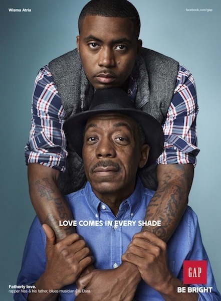
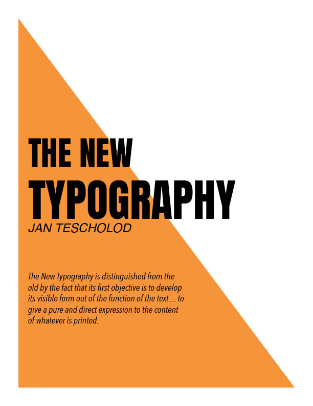
Typography is very essential when it comes to design in the this day and age. Type can communicate in more way then what it say, the font, color, size, width and even how its position are all ways it can mean different things, and thats what Tescholod described as the new Typography. it solves designs problems and give the reader a better understanding of the composition. Here is a little example of that.
Assignment #4
Design is always changing from generation to generation, new and fresh ideas of design principles is always being discovered, new methods and even new technology, but what I feel that is lacking in art from the past is the sense of free thinking. We cannot deny the fact that we still use methods from the past in the present day but that means we can also see the flaws in some of the methods as well. Art in past was majority the same and/or strict to their ideas of how art should be. There was a meticulous method on how art should be presented because someone who was wealthy with more available resources said so. If it is not deemed this way, it isn’t art and once it changes it usually become a revolution. Art had a strategic way. The more time past the more art itself becomes freer and more relaxed. The future of art is in good hand because it allows artist to be their selves without having to follow a strict quota. Art is becoming more expressive then the past ever has been, but we must pay homage to the ones that paved this path for artist of the future.
Typography and photography in the present day play such a huge role in design and in the graphic design world. In Today era, type and photo is used to bring an element of communication. When you combine both type and photography its almost like your completing the story, It allows the people the visualize and understand what they are seeing quickly especially when we are constantly on the move, our brains are able to computing faster when both these elements are present in the composition. Not only does it bring a different element of communication, it also opens various stylistic ways you can combine the two. Type is always advancing, and different fonts tells a different story to the composition and photography is unlimited, so a composition of the two also brings an endless amount of ideas, styles, and narratives. When you are an artist creativity comes naturally and learning new or different principles of designs opens elements of one’s artwork to a new level. Education is essential to life and learning how to use certain elements especially the element of communication to the public or industrially. Type, color, photography, and shapes all play different roles when you are learning about the field (graphic design). Psychology and science also play a role in a design you wouldn’t think of just as an artist but when you a designer these roles play heavily in the field of graphic design. How the eye and brain perceive these elements of design.
Throughout reading these articles the authors had a complete understanding on how design is going to change and advance in the future, almost everything they discussed still plays a role in design today. Moholy-Nagy and Herbert Bayer were both spot on about the role typography and photography was going to play in the future, and me living in that future typography and photography plays an essential role in design and it is literally everywhere we go. The use of typography especially today is used in so many different ways to communicate a different message, in commercials, Advertisement poster/billboards, film and once again photography the use of the font in each one of these categories speaks differently. Also, the Bauhaus ideology still plays a role in the curriculum. Being able to learn about the field and still be creative at the same time but one thing that is different from today then back then is the freedom of expression we have on our art. Also being able to learn to aspect of graphic design and regardless what direction the designer goes all element of graphic design will play a role in ones career.
Assignment #3
All these authors saw the importance technology was going to have on design along with the advancement technology was going to have on our future. Each author knew the importance of technology, but each author also showed a different appreciation for it. Filippo Marinetti was a futurism, he took the importance of technology to the extreme, to the point where he felt like it was useless for someone so young to focus most of their time and study to “useless manuscripts”, rather they should focus on the present and future. Aleksandr Rodchenko and others, on the other hand knew the importance of technology but also knew the importance of using your hand and being an artist, artist has transformed into constructors and engineers. You need to start with the essential languages of design: shapes, lines pattern, color, material and so on. Every plane, building and wall was once a lines, squares and angles before they were the fully functional and stable product. Lastly, El Lissitzky saw the importance technology was going to have on the printing industry and artist. Books weren’t going to be solely for the rich, it was going to be produced for thousands of people, along with the value of a book is always going to stand, which is funny because it completely contradicts Filippo Marinetti ideology on technology.
Each one of these authors/artist has one thing in common and that is technology is beautiful, along with technology is going to improve plenty of artist and they are going to have to learn to adapt to it as well. On the other hand, with a common ground always comes with disagreement and I believe there’s a couple of things these authors would disagree with. For starters I believe both Aleksandr and El Lissitzky have more in common then Marinetti, they both would disagree with his futurism ideas behind his appreciation for technology. Technology and art are not just used for violence and aggression, you do not need to have aggressive attitude to be a poet or artist, there is more then one emotion an artist can bring to his/her work. It is ignorant to think that there is only one emotion an artist needs to display. Anger and aggression do not get planes and building built, anger and aggression isn’t what makes beautiful book covers, with both these things you need a calm, peaceful and precise mind to make any of these compositions. Not only that, books, libraries and museums are essential to both Aleksandr and El Lissitzky, how can you know the right dimensions of planes and buildings? How are you going to know what failed or succeeded? whats the point of print books if they need to be demolished? Bottomline is you cannot succeed without books; you cannot grow without prior knowledge of past successors, knowledge is key.
After readings these articles, language is complexed because language itself is always changing but to put it in simpler terms, language is a way human communicate with one another, either speaking or written. On the other hand, language is different from communication, we communicate with language and without language we cannot communicate. “Language is speech less speaking”. Language varies from person to person and with that the way we communicate we each other also varies, its how reply to each other, it a way of exchanging messages, with either speaking, writing or drawing it is all language. Even Design is a type of language. Designs is a unique type of language that can communicate a composition/concept by using colors, shapes, fonts, pattern, material, texture and even the layout. Just like regular language, a combination of certain word creates meaning and substance, that same idea applies to design. For example, everyone knows skull and cross bones is a designed icon that communicates poison, without even saying the exact words “poisonous” or “danger”, we see it we know it. Even the use of color, different colors mean different things and also the way you use warm color and/or cool colors also gives a different meaning, as a designer you have to know how to use this language to communicate to the public. Design also bring a psychological aspect of language that I thought about while reading the text, “…..the psychological imprint of the sound, impression that it makes on our senses” and that’s exactly how design plays a part of our language. It adds a foundation behind the decision that are made in designing.
Language is always modified and changing over time, and over that period our language creates a type of language using symbols and icon to communicates with the world. Symbols and icon are used in our everyday lives, to give directions, warnings, signals, movement, etc. Bottomline we use symbols and icon so much in our lives it a language we know by just constantly seeing, sometimes without having someone tell us what it means. We use these icons as a universal language to communicate with everyone no matter what language you speak, its used because our brains process figures and symbols faster then words. We don’t have to stop think and read, we can see and keep going. We automatically apply sign, signifier and signified concept to all icons and symbols we see, we automatically know its association. Like the example I used earlier with the skull and cross bones, the skull and cross bones is the signified aka the concepts and sound-image aka signified is danger or poisonous, for the most part its automatically built in our psyche.
After reading these passages, it makes me realize how much thought and effort goes into design as a whole just like language. Not only do you have to think of the social forces of language but the historical aspect of language because that plays a part on how language and the way use it to speak today. We use all these aspect of language in design to communicate. I think we should use more historical aspect in design and use more of historical background to bring more meaning to design. I think the more design grows and the more technology is created we use less and less historical backgrounds.


Recent Comments