Author: Brianna Edwards (Page 1 of 2)
My name is Brianna Edwards. I'm in my first sophomore year in City Tech. I'm not sure on what I want to do yet but I'm thinking of being an illustrator. I've drawn on paper and digital media. I also want to tell my own story through drawings. I still feel like I have many things to learn so I'm looking forward to see how far I can go.
I'm also interested in animation. I have never properly animated before but I've grown up on them and I can't just let them go. So I still watch them now.
Designs/Art by individuals/ underground does best away from the eyes from an audience. An audience that will seek and prefer the non-status que. But eventually a company would use those designs for advertising, allowing it to reach to a mainstream audience. It kind of reflects that idea of underground art being liked by the youth and seen as controversial or misunderstood by older audiences. Usually, a company wouldn’t promote anything that is controversial, but they will jump in if it can make them a profit. According to Heller, the concept of mainstream vs. underground is relevant to contemporary design by the battle these two-art appeal continues to face. “Underground denizens attack the mainstream” and “Outsiders may choose to join the mainstream on their own terms” are examples of the endless cycles against mainstream and underground. People there are in with their community but once their style reaches mainstream then they no longer feel special.
The designs of application icons for my final presentation fits into this dichotomy through mainstream. The series of applications I’ll write about are Google’s mobile applications for android/iOS. If you’ve used google then you probably see theses icon almost every day. These are little different from icons such as the power and Wi-Fi symbols, icons for the face of the application can be changed over a short period of time. In the end these application ids meant to be viewed by the masses that can afford a smartphone. According to Philip Megg, “Designers are engaged in a never-ending race to refine and differentiate their apps while keeping the visual aesthetic fresh and relevant.” Application icons are closely tied to branding of the company.
From my research of Google’s history, I’ve learned that the start of google targets the youth, like the underground design’s audience. The designer for their first logo in 1998 was by the co-founder, Sergey Brin. In the next year, Ruth Kedar was hired to make a few changes to the google logo in 1999 but it generally stays the same. She removed the explanation mark and changed the font. I think for tech companies at the time a three-dimensional look was cool and interesting since most applications at the time followed this trend. “Putting Art and Words Together” by Donna Reynolds mentioned, “Firstly, it creates a loyal audience because their primary aim is making sure their customers are happy— not selling more products.” This means it was important for growing businesses to build trust and an early targeted audience.
Today, Google is bigger than ever. They’ve has to broaden their reach to appeal to anyone at any age. The more people use their products the more ad revenue they receive. Google also created other products such as google, maps, Gmail, documents, drive, calendar and more. Each with different designs that represent the use it provides. They were well designed however their new 2020 update to the icons went a little too far. Don’t get me wrong simple designs can be easy to identify and understand. For instance, Paul Kirschiner said “graphic designer who is capable of translating what we say, write, and think into simple and understandable graphic images.” In the end it’s about communication to an audience. So, when google tries to uniform the deigns, they also sacrifice clarity.
Meggs, Philip B., and Alston W. Purvis. Meggs’ History of Graphic Design, John Wiley & Sons, Incorporated, 2016. ProQuest Ebook Central, http://ebookcentral.proquest.com/lib/citytech-ebooks/detail.action?docID=4505417.
Reynolds, Donna. Graphic Design : Putting Art and Words Together, Greenhaven Publishing LLC, 2017. ProQuest Ebook Central, http://ebookcentral.proquest.com/lib/citytech-ebooks/detail.action?docID=5413273.
Caviglioli, Oliver. Dual Coding for Teachers, John Catt Educational, Limited, 2019. ProQuest Ebook Central, http://ebookcentral.proquest.com/lib/citytech-ebooks/detail.action?docID=6461839.
Some things I don’t understand and was wondering while reading:
Notes
- Are gestures language the same as does body language?
- I wonder this because the reading says “the “language” of bees to the “language” of gesture”
- What really make a language articulate?
- Is this exclusive to written language? They complexity and specific meaning but what about other was of communication.
- “The image is in a certain manner the limit of meaning.” Images are known of having a lot to say, at least a thousand words.
- Are maybe because in the context it is used images are limited by using it to send a specific message.
- I also don’t know when I ever see an advertisement without some kind of imagery.
- They probably exist but it probably has a harder time catch the attention an audience.
- The message takes priority in advertising. People have to know what you are selling.
- From my understanding, the three messages are:
- Linguistic message- image that supports the caption/text
- Coded iconic message- image only source of giving the message
- Non-coded iconic message- no images, only text
- Linguistic messages can be interpretation in different ways
- Italianicity? Does it mean “still life.” A literal take in imagery
- Color can be seen as a sign in an image but is that always the case? Or does this depend on main message.
- How and why does “still life” depends on heavily cultural?
- When an image lacks or is missing signs, should it still be understandable to the topic?
- Maybe signs are bonus that mostly can improve the clarity of the message.
- What is exactly the “code” term is used for?
- For the statement, “we can agree to call it the literal message, as opposed to the previous symbolic message.” I think images can symbolic as well probably even with literal messages.
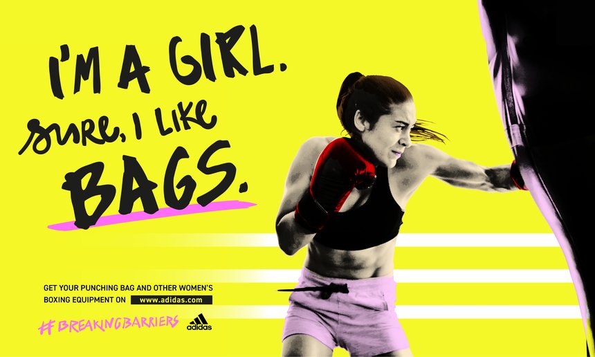
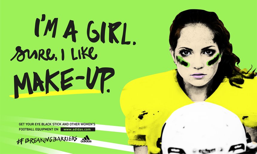
This was an Adidas ad campaign on women sport. It tackle women stereotypes and spin it on it’s head. There were multiple of posters like this but with changes to the words and images relating to the product. The slogan feels like it is speaking towards people that think these stereotypes. I think this ad was successful conveying that message.
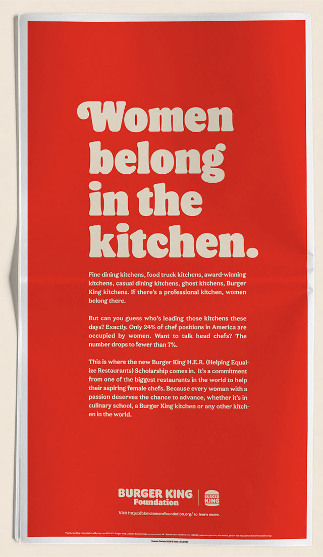
This is a poster by burger king to promote a scholarship for women that are studying to be a chef. The problem is not the serve but the huge slogan. The slogan is common stereotype towards women. while the more important information is a much smaller type size. It’s obvious that they were looking for shock value but it triggers such a negative emotion. It also does not help that they released this on twitter with just that slogan on international women day.

Adidas’ 2017 Boston Marathon advertisement was sent through email. It is clear that the product are clothing with special designs for the design. There is no problem with the design, but with the choice of words in the subject. It says “Congrats, you survived the Boston Marathon!” Adidas failed to take into account of a bombing that happened 4 years ago.
Tools is always used to extend our abilities. It can be as simple at a pencil and paper to the complex machines that can used to the will of a human. How McLuhan described technology and media as an “extension of man” as a way of progress. To expand the way we create, and the way content is presented. Whenever there is new or improved technology it opens the door to new opportunities and continues the cycle of exploring different media. It is a cycle that keeps growing.
The concept of “media” is content within content that has variability for human beings. Media contains a medium content within another content. Media extend human beings by spreading the people way of communication. Not exclusively from length, but also “how” we can socially connect. McLuhan mentions that depending on how a medium is used to create content. The light by itself wouldn’t mean anything but human beings is able to creatively manipulate a medium. Not only does it require the creativity of person and something like using lights to send a message gets the attention of multiple of people in a community. This is the strength of artist and designers. If “medium is the message” they can get job to convey that message using whatever medium of their choosing.
Information is power, especially in modern times. The work of a designer subordinate to the media use to create by pure nature. I don’t think designers would be replace because machines can’t do anything creative. The media that is used by humans could be thought over with consideration and purpose and messaging. For example, the reading said, “it was in the business of processing information, then it began to navigate with clear vision.” Designers can look at things at different angles and use with knowledge of information then they can find an easier and clear way to create a media or controlling it. As technology continue to improve will continue to effect society, the way it’s used will push for more ways of creativity from individuals. McLuhan thinks that technology by itself can never create ideas and content to the same level as an individual. While a computer can predict “patterns” society may like at the time, it can’t be the only thing that can be pushed to gain human interest.
Different people mean different views. But can ideas be what someone should do or could do? Designers can have their own ideas of how someone should design. I think at the time there were design movements had their own way of design and influenced other designers. From the readings of this week, they commonly have views that involves the future.
Imagine if a design is inconceivable to understand. Typography is something that can be creatively used but it still needs to be readable. Jan Tschichold favors functionality in design. To him, design should prioritize clarity than how fancy or beautiful a type looks. For example, in “The New Typography” he said, “This utmost clarity is necessary today because of the manifold claims for our attention made by the extraordinary amount of print.” He is saying that in the future clarity in design (specifically typography) would be desired on print media. This mean getting the attention and understanding of an audience by using more modern typography.
Josef Müller-Brockmann believes that design should implement grids. With a grid system it can give a sense of order to a design. For instance, in “Grid and Design Philosophy”, “Working with the grid system means submitting to laws of universal validity.” Grids requires some mathematic thinking, so it create a “objective” balance that can make sense the grid is followed. It sounds restrictive to mostly use a grid system in a design but then again it can organize disgustable information. He also said, “to rationalize the creative and technical production processes.” At least he is not completely against creativity.
In Karl Gerstner’s point of view of design is to how and what are put together. The elements are there but it’s up to the designer to put them a certain way. In his writing “Designing Programmes” he mentioned, “to pick out determining elements and combine them.” It’s like solving a problem with the existing material a design that is provided to them. Something like color, font, spacing and etc. So, this opens the freedom to find whatever method a designer can think of get an end result. Also, Karl Gerstner would include the use of grids.
Knowledge in art and education keeps growing and changing. To these authors, some elements of art and education from the past was missing. Laszlo Moholy-Nagy believed that humans didn’t understand their purpose of live. To Hernert Bayer, creativity and new styles was absent in the past. Finally, Walter Gropius believed that craftsmanship and a connection to the community was nonexistent due to artist being isolated.
Communication is really important in design. With this element a message can be communicated to an audience of people and what’s a better way to do so by using a combination of typography and photography. Or how Moholy-Nagy calls it, “typophoto.” They play the same rule but do so differently. Typography uses a combination of text while photos visually present the subject in relation to the type. Other media such as film and television open the door for more “visual experience.” There is also the thing of new technology pushing old ones to the side because of their convenience to the public.
Change will always happen in the art world. It can either be slow or fast, but it will eventually pass. One way to face change is to adapt. So, artists should approach future art forms with caution but also still adapt. If one fail to do so, this means they’ll isolate themselves from their community. Another way for artist to approach the future is by keeping their creativity. An artist’s creativity can be their strongest strength, and this can be brought out through just raw talent or the help of education from school. Academies teach them the necessary foundation to help students unlock their creative effort. According to Gropius, creativity itself can’t be taught. It’s up to the individual to use that creativity. In order for Bauhaus ideas to stay relevant during this century it should updated where it includes a variation of arts, then just architecture and craft.
The progression of design naturally comes through time and technology. Another thing that can change design is the views of artists/designers. These authors envisions that their immediate future in different ways. Aleksandr Rodchenko saw the use of technology and geometric shapes. Out with the interpretation and in with functionality. Next, Filippo Marinetti’s envision is more violence, speed, and energy in their future. Finally, El Lissitsky believed they’re future in dematerialization because of his observation of the evolution in art.
These authors lived in a time of industrialize cultures so they would have different views on how technology could play a part in their future. Rodchenko and Marinetti has a more positive on their outlook of technology and it influence their methods of designs. El Lissitsy however thinks technology helps takes the first big step, but it is not what evolves design. Rodchenko and Lissitsy acknowledge that artists relays on technology, however, Rodchenko wants them to implement it more into designs themselves by using geomantic shapes such as squares and circles. and Lissitsy view designers as very reliant on the technology and in return their art does not evolve until the next big invention to replace it.
The element of dematerializing feels so relevant today. We can this in the way we consume video/film entertainment. For example, currently we are transitioning from cable to internet for information. All we need is a stable connection and a phone. From observation, because of the transition to the web, advertisements compete even more for a person’s attention. Out of the three readings, I think the destruction of museums and libraries are problematic. These places hold secrets and answers to our past of people and other living things. I think the point of living is to learn and to destroy is what would get us back and not forward.


Recent Comments