COMD3504 - Section OL02 - Fall 2021

Month: October 2021 (Page 1 of 7)

Assignment 8

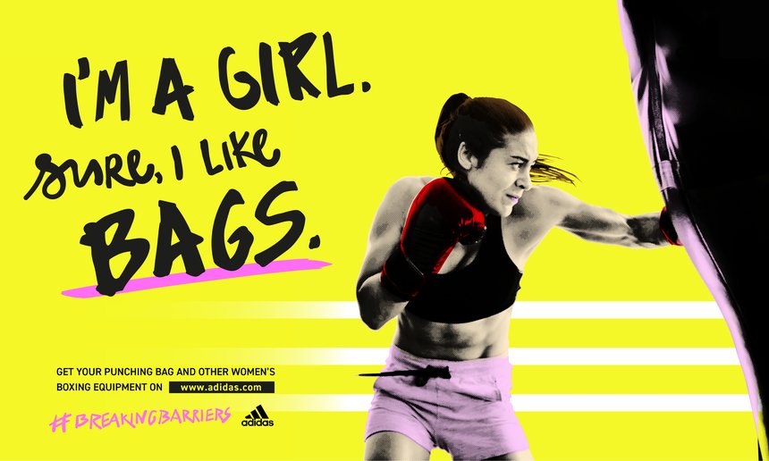
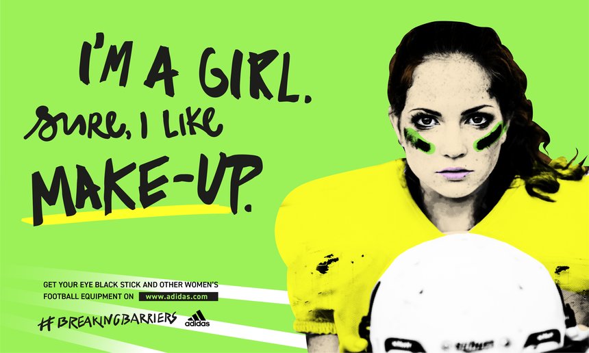
This was an Adidas ad campaign on women sport. It tackle women stereotypes and spin it on it’s head. There were multiple of posters like this but with changes to the words and images relating to the product. The slogan feels like it is speaking towards people that think these stereotypes. I think this ad was successful conveying that message.

https://tinyurl.com/2m3dxjms

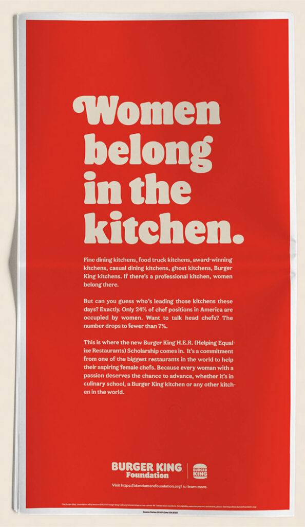
This is a poster by burger king to promote a scholarship for women that are studying to be a chef. The problem is not the serve but the huge slogan. The slogan is common stereotype towards women. while the more important information is a much smaller type size. It’s obvious that they were looking for shock value but it triggers such a negative emotion. It also does not help that they released this on twitter with just that slogan on international women day.

https://tinyurl.com/474xmnxw

Adidas’ 2017 Boston Marathon advertisement was sent through email. It is clear that the product are clothing with special designs for the design. There is no problem with the design, but with the choice of words in the subject. It says “Congrats, you survived the Boston Marathon!” Adidas failed to take into account of a bombing that happened 4 years ago.

Assignment 4

The tool of the spirit of yesterday was the ‘academy.’ It shut off the artist from the world of industry and handicraft, and thus brought about his complete isolation from the community. But lately, the artist has been misled by the fatal and arrogant fallacy, fostered by the state, that art is a profession that can be mastered by study. Typography is communication composed in type. Photography is the visual presentation of what can be optically apprehended. It has given us a new, progressively developing creative basis for typography, too. One man invents printing with movable type, another photography, a third screen printing and stereotype, the next electrotype, phototype, the celluloid plate hardened by light. An effective loosening up can be achieved only by the most sweeping and all-embracing use of the techniques of photography, zincography, the electrotype, etc. Photography is highly effective when used as typographical material. It may appear as an illustration beside the words, or in the form of “photo-text” in place of words, as a precise form of representation so objective as to permit no individual interpretation. typography was for the first time seen not as an isolated discipline and technique, but in context with the ever-widening visual experiences that the picture symbol, photo, film, and television brought. in the united states the art of typography, book design, visual communication at large, in its many aspects, is being shelved as a minor art. Bayer managed to be immensely practical and rational while never losing the ideals he discovered at the beginning of his career. The typographical materials themselves contain strongly optical tangibilities by means of which they can render the content of the communication in a directly visible—not only in an indirectly intellectual—fashion. previously used largely as a medium for making language visible, typographic material was discovered to have distinctive optical properties of its own, pointing toward specifically typographic expression. The form of these new typographic works will, of course, be quite different typographically, optically, and synoptically from the linear typography of today. It may appear as an illustration beside the words, or in the form of “photo-text” in place of words, as a precise form of representation so objective as to permit no individual interpretation. The tool of the spirit of yesterday was the ‘academy.’ It shut off the artist from the world of industry and handicraft, and thus brought about his complete isolation from the community. The theoretical curriculum of an art academy combined 1rith the practical curriculum of an arts and crafts school was to constitute the basis of a comprehensive system for gifted students. The book has been a standard form for a long time. a new spirit invaded the stagnant field of rigidity with the adoption of the dynamic page composition. An important extension was introduced with the recognition of supranational pictorial communication. with its combination of text and pictures, today’s magazine already represents a new standard medium.
Assignment 8

Dove Criticized for Facebook Ad With Black Woman Turning White

Image Origin-https://twitter.com/keithboykin/status/917048777864867840/photo/1

This ad came out in 2017 and was blasted all over the internet for it’s obvious racism towards black people. Dove almost immediately took it down after the backlash they received. Many shared it as a display that racism, subtle or blatant, still very much exists in modern day society.

Image Origin-https://oldnavy.gap.com/browse/info.do?cid=1180206

This ad is a bit more “human friendly”. Old Navy started this campaign in early 2021 for the promotion of women’s body equality. Accompanying the ads, was a series of clothing for all sizes: Lifestyle and Activewear alike.

INMA: Newsworks shares best print ads of 2020

Image Origin-https://www.inma.org/blogs/print-innovations/post.cfm/newsworks-shares-best-print-ads-of-2020

This ad dropped sometime in 2020. Tesco had made a new line of bandaids that better matched skin tone as it came in 3 different skin tones. For a long time this only applied to people with lighter skin tones. They weren’t the first people to come up with this idea, but they thought it was important enough to address it.

Assignment 7

Marshall Mcluhan talks about how technology and media affects design strategies over the years. In his 2nd reading, he says “All media are extensions of some human faculty- psychic or physical. The wheel is an extension of the foot, the book is an extension of the eye, clothing, an extension of skin, electric circuitry an extension of the central nervous system. Media, by altering the environment, evoke in us unique ratios of sense perceptions. The extension of any one sense alters the way we think and act- the way we perceive the world. When these ratios change, men change.” He also makes many references to other inventions in his first reading, as he mentions the electric light, the radio, TV, etc. To this day, technology and media, play a profound way in how we design. As we progress into the future, design become more simple and modernistic for the audiences we design them for.

Assignment 3

These authors lived in the same time as industrialized cultures so they have different views on how technology can be a part of their future. El Lissitsy however thinks technology helps take the first big step, but it is not what evolves design. Working intently in his self-designed leather workman’s “production suit,” Rodchenko utilized new technology and mass production in an attempt to give form not just to revolutionary concepts of functionalism and economy but to ideal Soviet citizens as well. He embraced, redefined, and elevated graphic design as an essential force in society. Rodchenko and his wife, Varvara Stepanova, repositioned artists as agents of social change standing at the center of a brave new world. His work  “Technology is—the mortal enemy of art. technology. . . . We—are your first fighting and punitive force. We are also your last slave-workers. We are not dreamers from art who build in the imagination: With the start of the reconstruction period about 1922, book production” also increases rapidly. Our best artists take up the problem of book design of 1920, is also printed, and also the Mayakovsky book, where the booking form itself is given a functional shape in keeping with its specific purpose. The cinema and the illustrated weekly magazine have triumphed. We rejoice at the new media that technology has placed at our disposal. Lissitzky believed that once something was developed, it would never progress into a higher art form again unless society became tired of it and desired something new. While on another side, Rodchenko and Marinetti have a more positive on their outlook on technology and it influences their methods of design.

Assignment 7

McLuhan’s work illustrates the impact technology has had on our transitional period and how it inspires design. It appears that he was implying that the abrupt transition from a tech-free society to a tech-run world had an impact on us, our families, jobs, government, and so on. Because design may be regarded as an extension of anything from the start, it is entirely accessible to everyone and unclear, making it difficult to stand apart. This is a problem as it implies you could no longer be the only one offering your services; nothing separates you from the competition. With a single click, all of the world’s private concerns may be made public. Despite the fact that technology has expanded around the world, the same basic devotion to a position still persists.

There are dangers in the media we are exposed to. One such example is social media. Social Media allows like-minded individuals to connect and share similar interests and express ideas and display their life to others but also the negatives of social media exists as well such as misinformation, and online hate. These are all preexisting negatives along with the benefits. McLuhan has several images of limbs, wheels, eyes, books, clothing, and skin up, making a connection between them.

Assignment 7 – Taneisha Bailey

McLuhan’s interpretation of media and technology being an extension of humankind extends to humanity in general by the similarities between media and man. McLuhan breaks down into sections different aspects of a human and how that interconnects into electric technology. Individualism is one, another is family, your job, and the government that surrounds you. He bridges a connection between your eyes and books, how a booklet extended through sight as an originator. How an automobile is an extension of your foot in terms of movement. He even references clothing being an extension of the skin as it covers and shields your body. How media can be an extension of our nervous system by projecting and influencing our thoughts and actions.

Hazards that technological progress can possibly bring for individuals and society are the process of control and lack of origination. How tech brings in structural systems and pushes us to think in terms of being one-track-minded and having fixed ideas. How the media can provide society with one big misconception of the life we create around us. If “the medium is the message,” artists and designers can play the role of innovators and the plug that connects a message to a medium. They can take control of the media and create new ways for the masses to relate and make sense of the world that surrounds them by defining their own needs and not the needs and wants of the media that’s trying to control them.

The work of a designer can become subordinate to the media they use to distribute information by designing work the way they were told to instead of in a  way that can challenge the old world order and bring in new means of communication and information. If designers decided to use a medium that does not directly provide instructions on how to process that message that is being told to the public then there is the opening that is needed to help designers become in control of their own medium source.

Assignment 8 – Alex Grenader

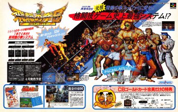
Image sourced from https://www.mobygames.com/game/hiry-no-ken-s-golden-fighter

A Japanese advertisement for Hiryu- No-Ken, a beat-em up/fighting game for the Super Nintendo. Japan’s culture of promoting ridiculously difficult games is no surprise that it is one of their marketing techniques is to challenge players and get them to buy their game. Accompanied by 16-bit artwork, unique character designs and compelling gameplay, many young players were drawn in to buying the game and determined to boast their pride had they accomplished a difficult simulation.
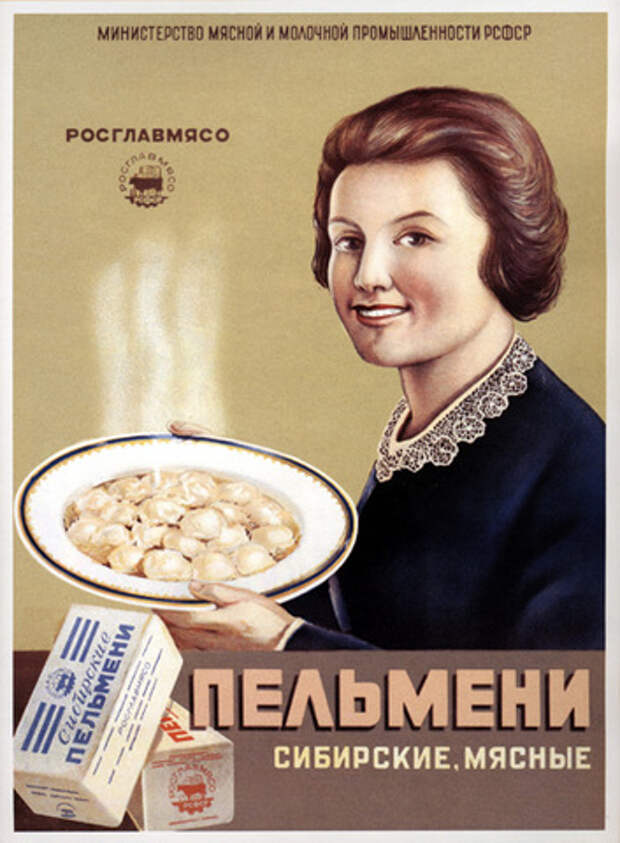
Image sourced from https://www.pinterest.com/pin/569494315381088020/

This is a Russian advertisement promoting a famous Russian dish : Siberian Dumplings. This ad was made after World War II, when Russia was able to settle down and boost their production of agricultural related products. Siberian Dumplings are a staple dish often enjoyed with sour cream and vinegar, a perfect cultural dish to welcome the returning soldiers of the eastern front back home. This dish usually has some broth from the dumplings that can be enjoyed in a soup, with a salad or can make great remedy for colds.
Image sourced from https://dangerousminds.net/comments/graphic_anti-smoking_ads_from_around_the_world

An Australian Anti-Smoking Advertisement that was posted in 2010. As the world began to be severely invested in Tabaco, The Australian government realized that over 65% of Australian Citizens were smokers. This poster was created to combat the amount of tobacco users that either were addicted or died from extensive use. It pretty much drives the point home and is very creative on their approach on how smoking kills people, literally and figuratively.

Assignment 8 for November 2

Our next reading is from a 1981 essay by the cultural theorist, Stuart Hall. In this article, entitled The Whites of Their Eyes, Hall examines the ways in which mass media have portrayed racist ideologies. Here is a PDF:

Your post for this reading will be a little different. Instead of writing 3-4 paragraphs, please identify and document 3-4 advertisements in recent magazines, web pages, posters, billboards, etc. where race, ethnicity, gender or cultural identity play a role in shaping a brand’s message.

Note that identity and race can be used in a seemingly positive, embracing way, or in a cynical, negative manner; or it may be difficult to tell. The most interesting ads are probably the most subtle.

Post ads that you encounter this week, after completing the reading. We’ve all seen some of the widely publicized missteps from companies such as H&M, Dove, Sony, etc. …These are all very obvious. They really don’t require critical examination and we really don’t need to see them again.

Post phone pics, scans or screenshots of your selected ads with short captions describing the image and the source from which the image was found.

Assignment 6

Karl Gernster developed a systematical solution for when he was making Swiss Typography. He viewed Graphic Design as a very technical field, as he states, “This implies: not to make creative decisions as prompted by feeling but by intellectual criteria. The more exact and complete these criteria are, the more creative the
work becomes.” His system helped him to decide what typeface, color, appearance, and expression of his typography.

Jan Tschichold has a similar outlook to Gernster, believing that art and design is a balance of creativity and logic. In his reading, he says, “Every part of a text relates to every other part by a definite, logical relationship of emphasis and value, predetermined by content. It is up to the typographer to express this relationship clearly and visibly through type sizes and weight, arrangement of lines, use of color, photography, etc. The typographer must take the greatest care to study how his work is read and ought to be read”.

Josef MĂĽller-Brockmann, another constructivist, states “Every visual creative work is a manifestation of the character of the designer. It is a reflection of his knowledge, his ability, and his mentality”. He also goes into detail as to why the grid is so important and how it has been helpful in the creative process.

« Older posts