Author: AJ Grenader (Page 1 of 2)
Heller’s comparison of contemporary design between the mainstream and the underground comes from the fact that ideas are constantly manipulated or stolen from others. In the passage, Heller brings about the idea that contemporary design became relevant due to the fact that marketers constantly sought new ways of expression and depended on modern culture to fulfil that requirement. Some ideas were made by artists originally but were either taken or slightly edited to present the illusion of originality. One might say that the original works done by artists were mostly overshadowed by their fake counterparts created by corporate conglomerates with their goal of relevancy being fueled by grabbing the attention of the masses. Heller also stated that the mainstream always tried to cater to the current culture of society while the underground opposes it in any way possible and tries to lead a different path that is both straightforward and innovative in concept and execution. The struggle between these two factions often result in a “silent ideological war” between the content and the techniques used for it. In that sense, it is a way to dispute a style or motto officially and unofficially, that can be monitored by the public eye and serves as entertainment.
The designs that I will use in my presentation correlate to Heller’s text due to the fact that the idea of corporate intrusion has begun to slowly decay what was once creative designs into something entirely murky. All the charm of good logos and art has been stripped out entirely and the senses are dulled. Without the original message being shown in a work, there is nothing that can be interpreted. After all ,“Most people do not know where the design came from, but they recognize it and know what it does when they see it. Of course, the best designed message is no use if people don’t see it.” (2)
The underground designs did not officially come in contact with the designs that come to mind. However, they did spawn as a result to redirect the attention of the masses. It is true that there are only 2 ways the underground seem to handle the mainstream which are to either join it or alter it. Depending on the individual and the ideology being presented, the underground will either conform to it or disengage from it entirely. It is the same concept as joining an organization or rebelling and in that sense, the designs often reflect the problems of the time period. The underground mocks the mainstream for choosing a foolish action to become lazy and uninspiring in the modern age. What many people fail to realize is that designs are made to be understood. Unfortunately. corporations do not think so and firmly believe that graphic design is “the business of making or choosing marks and arranging them on the surface to create an idea.” (1) .
The products of modern design did come from the stem of Modernism and Postmodernism designers who often broke apart good design and stressed chaos and unrest. As a result, they were seen as heroes of graphic design and were praised to the point that they became the mainstream. These roots began to infect what was effective and gradually became ineffective. Heller’s article ties closely to this as he states “Today, designers for mainstream advertising companies, weaned on alternative approaches, have folded the underground into the mainstream and call it “cool” “. This summarizes exactly what the modern era has done in the past 10 years as the decline of Modernism forced its way into the 21st century pallet. It will only get worse in the future due to the fact of modern art “Having failed to gain legitimacy by sucking up to business and adopting to politics, maybe it is time for design to make a challenge” (3). Thus, all good design will be washed away by the business men and the politicians gathering the wrong ideas from the wrong people and creating a new era of design despair.
The Sources I have used.
1). Barnard, Malcolm. Graphic Design As Communication, Taylor & Francis Group, 2005. ProQuest Ebook Central, https://ebookcentral.proquest.com/lib/citytech-ebooks/detail.action?docID=1273176.
2). Reynolds, Donna. Graphic Design : Putting Art and Words Together, Greenhaven Publishing LLC, 2017. ProQuest Ebook Central, https://ebookcentral.proquest.com/lib/citytech-ebooks/detail.action?docID=5413273.
3). Fitzgerald, Kenneth, and Rudy VanderLans. Volume : Writings on Graphic Design, Music, Art, and Culture, Princeton Architectural Press, 2010. ProQuest Ebook Central, https://ebookcentral.proquest.com/lib/citytech-ebooks/detail.action?docID=3387332.
These are the notes I have written upon reading Brothes’ Rhetoric Image :
Notes
- The first sentence seems to be comparing the English word of “Image” to its Latin (?) equivalent “Imitari”
- The author seems to questioning the possibility of an analogical code as opposed to a digital one. Likely wanting to understand image from a physical standpoint than a digital one.
- Borthes suggests that people often misinterpret the meaning of an image with its meaning.
- The definition of image, according to Borthes, is the re-presentation of life or its resurrection.
- When an Ad has an image, it is the most important part of the piece. Images are made with intention.
- Borthes gives an example of by showing an ad of Panzani, an Italian pasta brand, claiming there are many messages to take from it.
- He states that you could look at it from the linguistic side. Because it is an Italian brand, he classifies it as “Italianacity”. He believes that you could simply tell by the language presented as a written sign of the image.
- The “Pure image” is an element of the ad. As he describes it, the image “provides a series of discontinued signs”, pointing out the colors of the labels, the vegetables, the angles of the products and how they all are binded by the net.
- Borthes states by looking at the image, he insinuates the ad is supposed to be a “return from the market” comparing the background and foreground elements, appearing as if this was groceries brought home.
- Supposedly there are 3 basic messages from the Panzani ad are the Linguistic message, a coded iconic message and a non-coded iconic message.
- The way you separate a coded iconic message from a non – coded iconic message is by making inferences and having background knowledge of the image presented. Some may know things off hand while others can be interpreted differently from appearance and comprehension.
- According to Borthes, there is always a structure of an image or a hierarchy. There are always relations of the text to an image and several meaning that can be picked up on first glance and by observing for longer periods of time.
- There are many systems images follow to make a viewer understand it or at least pay attention to it. He exclaims the presence of cultural, symbolic and literal meanings of an image.
- This section specifically talks about the linguistic message of images. Borthes explains that language is a part of images. Many civilizations created images without words to support them. Instead they created words from images.
- Borthes describes how words began to coincide with images in modern forms of media such as film dialogue, comics, picture books and news articles.
- The functions of linguistic messages in images are “anchorage and relay”. Or otherwise known as belonging and conveyance.
- The implication that an image has signifiers is quite clear. People ignore some but pay attention to others and every image has those exact things that either draw people away from it or towards it.
- Brothes says that that most images have “anchorage” and not as much “relay.” He claims it is rare when an image delivers both and they can co-exist. However, sometimes they compete with one another and it can be difficult to decipher its meaning.
- Anchorage is more commonly shown in news articles, photographs and advertisement. On the other hand, relay is shown in films, cartoons and comics.
- This section is called the Denoted image and it primarily discusses how photos as a whole convey literal meanings. The author is fascinated by photograph, claiming they are analogical but still show signs of “naturalness” when taken of an object or place.
- Signifiers in photos are not merely something that “transforms” things but rather it “records” the setting
- Aspects such as lighting, framing, distance, focus and speed are man’s way of connotation and seperates a photo from being “Mechanical”
- According to this section, Brothes proclaims that photos should be taken with a purpose in mind and everything in the photo should look as if they belong there. He reaffirms this by saying there is a naturalness of all the Panzani products being together with in frame.
- There are 4 types of knowledge noted for understanding images : practical, national, cultural and aesthetic. All of these tie in to indivial comprehension or anything recollected by the viewer when approaching an image.
- Borthes gives a definition of lexicon and uses it a lot throughout this last pages. A lexicon to him is ” A portion of the symbolic plane (of language) which corresponds to a body of practices and techniques”. He compares this to people’s idiolects, speech habits of a person.
- There is difficulty in understanding connotation in some pictures. Borthes announces that images may have a semantic nature, but the intentions may always be deceiving which the creator may be aiming for in the long run.
- Rhetoric is varied by substance. They do not change by form, but by the subject of the image. There is always a “formal relation” of each image element.
- According to Brothes, Rhetoric is a system of connotators that work in unison that try to show as many signs, messages and icons as possible.
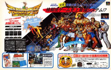
A Japanese advertisement for Hiryu- No-Ken, a beat-em up/fighting game for the Super Nintendo. Japan’s culture of promoting ridiculously difficult games is no surprise that it is one of their marketing techniques is to challenge players and get them to buy their game. Accompanied by 16-bit artwork, unique character designs and compelling gameplay, many young players were drawn in to buying the game and determined to boast their pride had they accomplished a difficult simulation.

This is a Russian advertisement promoting a famous Russian dish : Siberian Dumplings. This ad was made after World War II, when Russia was able to settle down and boost their production of agricultural related products. Siberian Dumplings are a staple dish often enjoyed with sour cream and vinegar, a perfect cultural dish to welcome the returning soldiers of the eastern front back home. This dish usually has some broth from the dumplings that can be enjoyed in a soup, with a salad or can make great remedy for colds.

An Australian Anti-Smoking Advertisement that was posted in 2010. As the world began to be severely invested in Tabaco, The Australian government realized that over 65% of Australian Citizens were smokers. This poster was created to combat the amount of tobacco users that either were addicted or died from extensive use. It pretty much drives the point home and is very creative on their approach on how smoking kills people, literally and figuratively.
Marshall McLuhan is heavily invested with the idea that media often influences mankind’s creation of content. He begins his claim by stating that “Societies have been shaped more by the nature of media by which men communicate by than by the content of communication”. He illustrates to the audience that design is often regulated by the current trends of society during that time period. Artists often depict messages on social commentary and any events that occur with in a nation, covering various subjects and current events, using that as content for their work. McLuhan warns people that design is no longer catering towards the concept of observation but rather tries to invoke psychological and emotional responses, as people were conditioned to not observe but rather “feel” a work or design. This is the so-called “extension of man” as McLuhan puts it. Media is the extension of man and man has created extensions upon himself with such examples being “ A book as the extension of the eye” , “clothing as the extension of the skin” and “electric circuitry as the extension of the central nervous system of man”.
One of the two problems McLuhan mentions in his book is the rise of mechanization. He firmly believes that with the advancements made to technology, the people’s way of life becomes more mechanical. He illustrates this by saying “ From the fifteenth century to the twentieth century, there is a steady progress of work that constitute “mechanization” and “specialism”. These procedures cannot serve for survival or sanity in this new time.” The other problem McLuhan notices is the ever-so-present influence of political, social and economical elements in society. He furiously alerts people that each form of media exhausts the public with its oversaturated content and emphasis on current events, that the entire consciousness of the masses become dulled and bombarded with constant information. “They are so pervasive in their personal, political, economic…social, consequences that they leave no part of us untouched, unaffected, unaltered.” is what McLuhan states about his view on the modern era’s information bombardment.
If artists are to create new messages to their audience, it is imperative that they understand who their target audience is. Depending on their audience’s general knowledge, artists may have to alter their work so that it is easily comprehensible to the people viewing it. Of course, it is a subjective question, where there is no real definitive answer. Artists during the times of the industrial revolution to even present-day depend on technology for mass production and mass distribution to send their messages across from their own town, to the nation and then the world.. There is a constant struggle between Artists who create content out of their own dreams and artists who create content purely as commentary in the society they live in. However, as McLuhn exclaims “All media are extensions of human faculty – Psychic or Physical” and that is true. The longer artists are exposed to the state of affairs in the place they reside, the more possible it is that they reflect that image in their work whether they are conscious about it or not. It is the mind of the artist that has the ability to create the message they want to demonstrate with their own perceptions whether it be for entertainment or announcement.
Jan Tschichold is an advocate of clear and clean design. He begins his case by stating typography has been split between two ideals : “Beauty” and “ Clarity” with the Old Typography favoring beauty and the New Typography favoring clarity. Tschichold discusses his findings on the old typography claiming that “The old typography … recognized only one basic form, the central-axis arrangement, but allowed all possible and impossible construction elements (typefaces, ornaments, etc.)”. He picks apart the old typography’s style as he claims it was mostly “ornamented” and it presented “inorganic” layouts that did not have a logical flow when reading. He demonstrated this on page 36 by comparing a fellow associate’s work on a German poster and does his own take. Tschichold heavily points out that clean typography that is legible and designs that have clean layouts that can be easily tracked and understood by the human brain is what makes good design and most traditional typography and layout are done wrong due to it’s chaotic nature and main goal of appearing beautiful.
Karl Gestner’s thoughts on design were extremely rigid and methodical. Gestner proposed the idea of intense organization and criteria. Gestner believed that intelligence should pave the way for modern design and to do that would require a rubric to understand the problem and complete certain segments of the criteria in an orderly fashion. He rectified the thought that design was a problem that constantly needed a solution, going on to state that “ The more exact and complete these criteria are, the more creative the work becomes.”. He would even go as far as to create a chart as shown on page 59, with immense details and design terminology in a grid format of each possible term that could be applied to any design. Gestner would go on to quote Albert Einstein stating that the table he created was “...a scale of proportions that makes the bad difficult and the good easy.”, implying that his chart could very well be a solution for designers to understand the rights and wrongs and design and what to incorporate to be more effective.
Josef Müller-Brockmann strongly preached about the usefulness of the grid. Brockmann exclaims that the grid system leads to future design due to its organization and simplicity, going on to demonstrate this by saying “The use of the grid system implies the will to systematize, to clarify…the will to cultivate objectivity instead of subjectivity”. He mentions that the grid allows designers to piece together what elements go where on the page and this opens up creativity inside the minds of good designers. It is also worth to note that Brockmann shows his entire grid layout on page 62 where it is 128 x 90.5 cm with one giant header element, followed by an assortment of grids ranging from a 3 by 5 to a 2 by 4 and so forth. He stood by the belief of a measurement system as he thought organization came from proper measurements, symmetry and order. In short, Brockmann preferred a more direct and mathematical approach as opposed to Gestner’s rubric system and Tschichold’s simplistic and analytical approach; however, all of these designers stressed the important common trait of organization which they believed makes excellent design as opposed to traditional type and layouts.
In Beatrice Warde’s book “The Crystal Goblet”, the concept of “Type should be invisible” is constantly stressed throughout her writing. In her articles, she talks about a comparison between two goblets, one that is made of solid gold and decorated in gems while the other is transparent, shaped like a wine glass. This is an analogy of typography in which there is type created for stylistic purposes versus type created for practical purposes. She supports this by stating “…the first thing he asked of this particular object was not “How should it look?” but “What must it do?” and to that extent all good typography is modernist.”. She believes that modernist typography should be created to be simple, illegible and effective and should not be heavily focused on stylistic choices but rather something everyone can appreciate and use.
György Kepes ,on the other hand, discusses the importance of meaningful design. Kepes states the following “ Values is …generally, that which renders anything useful. Values are directives for a satisfactory human life”. What he is implying is that art should have values and almost every work has some type of value. Kepes goes onto informing viewers that works should be organized ranging from traditional paintings, to photographs and even poster designs. It is only when an artwork has a type of value is it cherished by the modern world. The last thing Kepes notes is the comparison between visual signs and meaningful organization. Visual signs are effective when they show a tension between the atmosphere, the figure and the correlation between the two, whereas meaningful organization comes from the derived material presented to the audience and is through visual hierarchy.
Both Warde and Kepes present the same ideas that designs should be created with intended purpose. While Warde has a very minimalistic standard regarding to type, Kepes is constantly looking for new ways for designers to constantly use organization for posters, paintings and photos alike. The Crystal Goblet intends to be an allegory for utilitarianism as type should be created to be easily used by the public, for the public. The Language of Vision relays more ideas to ideas and a breakdown of different forms of media and their intended ways of being efficient and effective.


Recent Comments