Typography comes from the Greek words τύπος and γραφή which translate to type-writing. It is a way to organize and arrange letters in different forms to create a visible language. Typography is everywhere! Look around you. Any typed letters is considered typography. We see them in stores, street signs, bottles, magazines, shopping bags, subways, books, shirts, packages, logos, and the list goes on. There are many diverse amounts of typography you can see by simply walking past a busy neighborhood. And that is exactly what I did. I walked down the streets of downtown Brooklyn, and took pictures of many typography all around. Below are a few of the many examples of the images I was able to take.
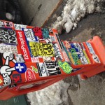
This is photo of an old newspaper stand. There are various typographic stickers put on this stand which makes it different and unique and it really caught my attention. There are some sans serif font types such as the sticker that says “12ozProphet” and “HOMAGE BROOKLYN”. There are also several serif font types such as the white cross that says “NYC” in it and the faded type that says “send help”. Most of the type that is on this newspaper stand is decorative.
 In case you were wondering, I took this photo from the bus stop. When people walk down the street and see signs like these, they read it because they pop out! It’s not something boring or ugly so that you’ll ignore it. In fact, it’s the exact opposite. From a regular person’s perspective, what makes this sign look good is the different colors it uses and the cool font, but as a designer, we think much deeper into it which makes us appreciate it more. Most of us know and use serif type fonts, like Times New Roman, where there serifs point in certain directions and go from thick to thin. Because your eyes see the type in this sign smooth, you may say it is a sans serif font without thinking. But no, this is a serif font but the serifs are proportional in their thickness, and thats the beauty of it!
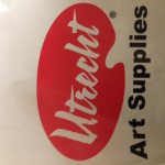
This picture may seem a little dark. Well, I took it from my Utrecht shopping bag. I do have nicer picture to share but I took this photo to show you the purpose of Typography. Utrecht is a very cool art supplies store. I recommend you visit this store if you have any art interests, their supplies really motivate an artistic mind. Anyway, the design of this logo is simple yet genius. Because it is an art supply store, the font looks as if it was painted with a paintbrush, better yet, the type is on what looks like a pallet, which is the thin board that an artist uses to lay and mix colors on. In addition, it is good to know that this is a decorative font type.
There are several more photos that I took that I will leave you to admire on your own…


