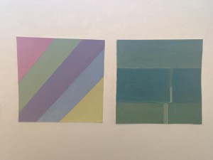
Creating muted colors was quite simple actually. All that I had to do was add white to the colors, and they become muted. Muted colors basically means changing the saturation and value of the color. For example, if I wanted to create a muted red, I would add white to the color red until I reach to what looks like pink, but adding white does not make look pink, it makes it look muted, which is the point. This goes for all of the colors as well. Generally I favor muted colors more than saturated or chromatic grey colors because it sets a more calmer mood, and I like that a lot. I may not have set the perfect example in my collage, but these were my broad and narrow key results.


