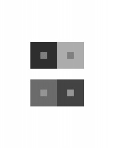
In this project, I used the greyscale key to guid me in creating a color interaction. If I go into detail with how the human eye interprets color, I would talk for hours. But, to explain how I got to my result for this piece, I basically had 2 squares with two different shades of grey, one dark and the other light, and within these squares are two little squares but are both the same shade of grey. Despite the same shade, the little square inside the dark square will appear lighter than the little square within the light square. I repeated the same process but with different levels of grey and got the same result.


