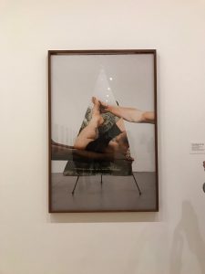
Being: New Photography 2018 exhibition, which showcased the theme of ‘what is means to be human’, had a large collection of work by many talented photographers and it was showcased in MoMa. A lot of them show a clear subject while some provoke you to think deeper. Like I said earlier, most of the compositions had a clear subject but some provoked a deeper thought, and Paul Mpagi Sepuya’s work were some that provoked a deeper thought and his work is what caught my attention. There were two compositions that caught my interest the most and they were ‘A Sitting with Matthew-2015’ and ‘Mirror Study-2016’, both by the talented Sepuya. Both compositions have a clever use of framing. ‘Mirror Study’ is a little hard to grasp and it seems like an illusion which is why it was a little more interesting to me out of the other compositions in the gallery. Along with that ‘A Sitting with Matthew’ was also interesting to me because most of that composition is a large black cloth which curves down and reveals some other subjects in the background. Even in this image you can see the clever use of framing in the mirror and the other images clipped on to the wall. In general, his compositions were different and it provoked some thoughts as I viewed them. Because of the interest setups and composition, I spent most time figuring them out than the others.
Author Archives: Saadman1997
HW#1: Michael Muller: Entertainment Photography
I chose Michael Muller as the photographer who’s photography caught my attention. His website has a large selection of various types of photography and because I’m really drawn into the entertainment industry, I was amazed to see how many of my favorite movie posters were shot by him. After going through his many photographs i noticed how intense the images tend to be, especially the portraits. The photo, or poster, that caught my attention was the poster of ‘Captain America: The Winter Soldier’. This was my favorite Marvel movie of all time which is probably the main reason I chose to speak about it. In this image Muller uses many different photography rules. There’s clear framing, contrast in the foreground and background. Instead of using the rule of thirds, Muller centers the body which ends up making the image look symmetrical. The diagonal lines lead your eyes to the direction of Captain America. Overall the poster looks perfect for the epic movie that it is!


