Category Archives: Coursework
Combined Saturation- Assignment #4
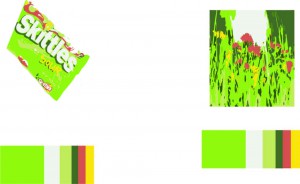
This final assignment, i believe it was difficult to do because i have to combined all of the saturation like prismatic, chromatic gray, and muted colors. The concept of this design, i have to illustrate of something that involves evolution. So designed a forrest that would transform into buildings or cities. I think that in the beginning of this assignment it was hard at first due to mixing a large variety of colors. what i learn from this so far is that i know what colors to mix in order to get a certain color or creation saturation. 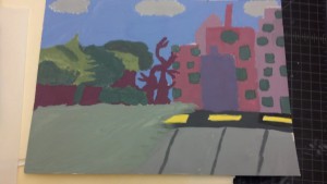
Prismatic Color- Assignment #4
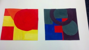
unlike the chromatic grays and muted colors, prismatic colors are much more easier since it doesn’t involve a lot of mixing with white or darker colors. All i did in this design, was painting orange and yellow, along with violet, green, red, and blue. After that i cutted the colors into shapes and mounted them on a 6×6.
Muted Color- Assignment #4
Color Triads- Assignment # 4
Chromatic Gray- Assignment #4
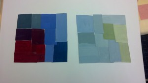
In This Assignment, i was experimenting on mixing gouache paints, by desaturating the colors. Creating a dark grayish color or also known as chromatic gray. In this design, i was mixing and desaturating colors from violet to yellow, creating some sort of brown color and later mixing the color with white. I also mixed blue and yellow to make a green color, then i desaturated it with more blue, creating a dark green.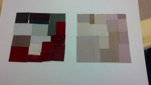
Shifting Hue- Assignment #5
In this part of the assignment, its similar to the color interaction design. In this assignment, we just have to change the hue of the color. Basically the same concept but different colors. Using illustrator and selecting different colors to see which fits. I think this is assignment was fun because there are a lot of varieties of colors to make this design. What i have learned so far is combining saturation and hue to create a design that can trick the critic’s eyes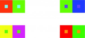
Color Interaction- Assignment #5
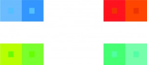 In this Assignment, i was assigned to design a color interaction that creates an illusion for the viewer’s eyes. I could paint it or design it digitally on the computer, i chose to design the color interaction digitally in illustrator. If i were to do the assignment in paint, i could only do two color interactions but i’m doing this digitally so i have to design four color interactions. The process of creating this design is really easy, At first i added guides in illustrator to measure and balance out my work. Then i used the rectangle tool to create my interactions from 2×2 to 1/2×1/2. After that, i used the swatch or color guide to choose different colors for my interactions.
Added Value- Assignment #3
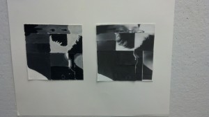
These two are my “Added Value” work, one work is painted and the other work is made in college. As for the college, i printed a portrait of myself and cut it into different pieces. Then i mixed the pieces up and placed them in different areas on a drawn 6×6 box in inches. For the painted work, i drew the images to match the collage and then i used black and white gouache paint. I Think this assignment was quite difficult for me to work on, because the color mixture to get the exact match from the collage. I wasn’t quite sure what was i doing a little bit. I’m too focused on putting between high-key and low-key.
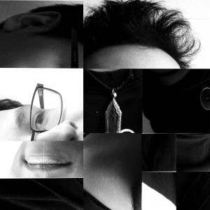
The second Added Value work is my digital composition worked on photoshop. The measurement is also 6×6 in inches. I believe this work is much easy because of my experience with designing work or projects on my computer. Although i think i could have put more effort into my work because it seems too easy to look at.
In the next project, i should try to put ore effort into my work and try to find extra time to make it happen.
High-key and Low-key- Assignment #3
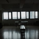
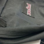
These two pictures, high-key and low-key. The image showing the dark corners and a bright window is best describe as a low-key because of the darkness surrounding the window and its the main focal point. As for the image of the book bag, it shows the High-key since there are barely dark areas showing and its mostly light.

