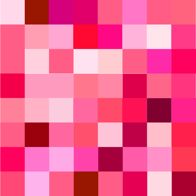
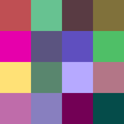

I had a great experience in this project. I learned how to use two different colors of the backgrounds to affect the value, hue, saturation and bezold effect. In the second part, I created bright composition by spring colors. As you can see the value over there. The saturation part created by more dark colors. The small little squares are from light pink to dark red to show the special depth. I found the craftsmanship is hard to do well in the little square composition.


Leave a Reply