Visual Quote Project
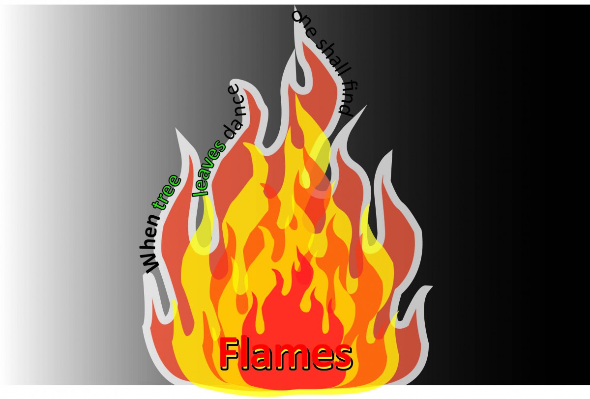
The flame was a vector drawing that was copied multiple times, and I added some different colors primarily red and yellow and changed the opacity in order to bring the flames to life. The words are following the flames and the weight of the characters change as you read from right to left.
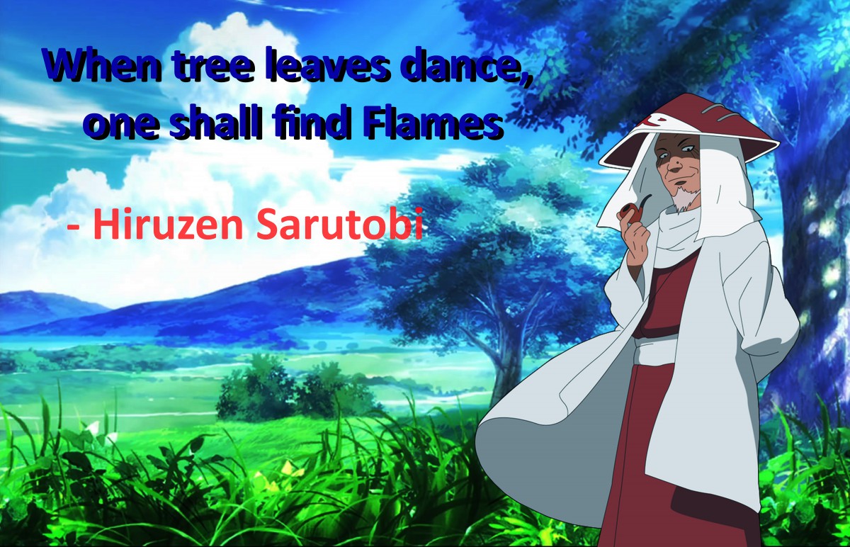
Images Provided by http://www.wallpapersis.com/wallpaper/ef-history-of-ring-tones-tree-clouds-grass-light-nature.html
and http://naruto.wikia.com/wiki/Hiruzen_Sarutobi
Fonts used were Complimentary blue Calibri Bold in order to make the quote pop, also a red Calibri Bold was used for the name of the person who said the quote with a change in the opacity.
Streets of Rage Remake


These two screen shots above are of the new streets of rage remix. Our kick starter creates a remix of an old classic side scrolling beat em up. We want to bring back the old 2d side scroller streets of rage into a new more modernized version. This brand new remix of the game comes with 20x more content and all new levels.
Kinect Security System Idea

My project consists of the Kinect being turned into a security camera that would track using its motion sensors and an infrared light to track the person as well.
Graphic Principles Best Works

Course Reflection
I took Graphic principles 1 for the first time. My skills in this major weren’t the best, I was a true novice. The first day in the class we were asked what do the graphic arts mean to us, my initial response was “The composition of logos and colors that work together”. Our professor told us that it was much more than that. It was about perfection and getting every project down to the last detail. Perfection is key when it comes to presenting in front of a client, but most important what matters is even if you are wrong, being able to identify your errors and presenting them with grace. To practice our presentation and vocabulary skills we were given two handouts, one that helped with vocabulary that was related to describing art and communicating amongst artist and the other was a small script for presenting your work.
Aside from the helping out our presentation skills our visual skills have improved as well, I couldn’t tell the difference between a 16th of an inch to a 32 of an inch. But all this changed with the first project, we were required to draw a square. The trick was to get the tension right, the square couldn’t be too big or too small, so on my first try I was already off by a 32 of an inch. Not knowing what that was I began looking up videos on how to improve my measurements, and looking at the squares from really far away really helped improve my vision, at first I wasn’t able to see it. But soon learning from Professor Nicolaos constructive criticism really helped seeing what perfection looked like.

