My Short Film

In this short film, I documented my sister and her boyfriend on one of there dates. I also interviewed two of my classmates on their interpretation of love. I purposely didn’t interview my sister and her boyfriend because I wanted unbiased answers.

This Short Film was assigned to me by my professor for my Digital Media Foundations class (CDMG 1111)

Poster Idea

This poster I had originally developed for another class but I made two versions. This version is dominated by the overwhelming green colors it shows. The different shades of green are meant to represent the various stages plant life go through on our planet. The focal point of the poster is the yellow light bulb. It is accompanied by three leaves in the middle and a power symbol at the bottom. The leaves and power symbol inside of the light bulb are meant to represent the fading away of earth’s resources. The leaves represent what little life would be left on earth in the future if we don’t change our ways. The power symbol is shown to be fading away, losing it’s power and energy. This is meant to demonstrate our need to conserve energy and power for future generations. The gradient background itself is meant to show the discoloration of earth and what could happen if we don’t learn to protect our planet. This poster is meant to be a warning to more ecologically proficient about planet earth.What I’m trying to say is “If you don’t do your part, this could be us in the near future”.

About Me

My name is Jerry Pico. This is my first semester at City Tech. My major is Communication Design. My reasoning for choosing this major is because I’m interested in learning the basics of graphic design. Although City Tech doesn’t have a specific graphic design major in it’s curriculum, this communication design major focuses on certain aspects that I have found beneficial in taking the necessary steps towards becoming knowledgeable in the field study of graphic design. This is my first time taking this type of course at any school. I previously took a typing class in high school, but that’s about it for me in terms of taking computer-based classes. I took a few art classes in high school and college. In high school, I took Art I and Art II. those classes focused on drawing and painting. In BMCC, I took Art Studio I (I believe that’s what it was called). In that class, my professor caught us the basics of painting and how to use those techniques for our own use outside of class. As I stated in class a few weeks ago, I wanted to pursue a major in graphic design because I am fascinated by the process of making video games. I’ve been gaming all my life and am curious as to how one can start a career in the field of work. One of my all time favorite game series’, called God of War, has been a great influence to me, I feel. It’s story, the design of the characters, how incredibly thought out the overall world they created for this game makes me want to learn how to make such stories and bring them to life on a screen. I discovered this game from a magazine that’s all about gaming called Game Informer. I was subscribed to this magazine in the past, from 2011 until 2015. I unsubscribed from it because of money issues. This magazine showed all its readers the latest in gaming, such as the newest games, consoles, and PCs that this magazine wants its readers to discover so that we can buy them. This magazine also did an annual rundown of E3, the biggest event in gaming that happens every year around June. A few artists that influence me are Eminem, Big Pun, and Michael Jackson. I’ve listened to these artists all my life and the music they’ve made has influenced me greatly. My favorite Eminem song is “Lose Yourself”. It is arguably the best song he’s ever made. The beat me made, the lyricism he utilized, the emotion he invoked in those who listen to the song, all make this song utterly perfect. I find myself daydreaming of how I would seize the day and make a better life for myself whenever I hear this song. My favorite Big Pun song is “Beware”. I love this song because I feel like I can fight anyone and will always come out winning. His delivery of lyrics and how heart pounding the beats and melody from the song make it so poetic, but in a “hit me and I’ll hit back harder” type of way. My favorite Michael Jackson song is “Smooth Criminal”. Michael Jackson is hands done the greatest artist of all time. His music has changed how we think of music and he has been an influence to any artist that has come after him. The song itself is great but the music video is fantastic. The iconic outfit he’s wearing and the leaning dance move he does impacted me when i was younger and it still impresses me now whenever I look at the music video. Those are some things that have influenced me growing up and I am sure that I’ll find more things as influenced later on in life.

Logo Research – PlayStation Logo

 The PlayStation logo is synonymous for representing the home video game console of the same name. If you asked anyone under the age of 30, they would say the logo represents all the fun adventures they made growing up with the product that was first introduced in 1994. Almost everyone I know can say they had the best time growing up with PlayStation. The logo was designed by Manabu Sakamoto during the initial conception of the game console. The logo we know today to represent Sony’s branch of gaming was created along with other designs that were being looked at. The final logo utilizes a font that Sakamoto himself invented specifically for the logo. The logo has remained the same design for more than twenty years, but the color scheme has changed to become more modernized. Back when it was invented in 1994, the logo used four distinct colors to represent what Sony wanted the PlayStation to invoke into its consumers. The four colors are red, yellow, green, and blue and are said to have represented joy, passion, and excellence. The first PlayStation up until the first iteration of the PlayStation 3 used the PlayStation logo with the usual colors. In recent times however, the color scheme has changed from using the colors to using plain white on packaging of its games and consoles. The white colored logo has also been featured on commercials for PlayStation products, such as an updated version of the PlayStation 3, PS Vita handheld console, and PlayStation 4, the newest member of the PlayStation family. This decision to change the colors of the logo could stem from the idea of wanting to become more modernized for today’s consumers of the brand. 

The logo wasn’t found right away, however. It took up to 20 times for the brand to gets its proper identity. The designer had numerous designs to show the company executives. Ultimately, Sony and the designer decided to go with the logo that we are familiar with today. As stated before, the font in the lettering in the word PlayStation is of the designer’s own creation. The letter “a” the word PlayStation was altered when the logo and word got an update in 2009. 

In 2009, the PlayStation brand celebrated it’s 15th anniversary. With this celebration, came with it a logo that payed tribute to the many incarnations of the PlayStation brand. The special edition logo showed the many products that Sony made for the PlayStation brand. All these images made up the number 15, and in them you can see the PlayStation 1, the PlayStation 2 and its updated versions, and the PlayStation 3 and its updated versions. Along with those images are included the PSP (PlayStation portable) and the discs that ran with the system UMD (Universal Media Disc) and the PSP Go, its companion system. Also you can see a blu ray disc, the disc that ran on the PlayStation 3, a few controllers compatible with the systems called DualShock and other peripherals used in the PlayStation family. In 2014, PlayStation celebrated its 20th anniversary with another special edition logo. It incorporated the original four color PlayStation logo and the number “20th” next to it, as well as the word “anniversary” at the bottom. 


http://logos.wikia.com/wiki/PlayStation

http://www.famouslogos.us/playstation-logo/

http://www.famouslogos.net/playstation-logo/

http://vector.me/browse/36755/playstation  

https://en.wikipedia.org/wiki/PlayStation#/media/File:PlayStation_logo.svg  

http://logos.wikia.com/wiki/PlayStation

Graphic Design Principles I Course Reflection

This semester, I learned quite a lot in COMD 1100 from the instructor, the students and the class itself. When the class started, the impression that was brought into mind was this class was going to deal mainly with the usage of software programs. As the name of the class would suggest, Graphic Design Principles I, being introduced to color theory and other forms of handmade creations was not anticipated. The techniques were beneficial to the overall improvement on visual perception. This is true because before the class, I didn’t think about color theory or transparency. I didn’t think about how much an ad would cost in a magazine or how to look at things, essentially, outside of the box.

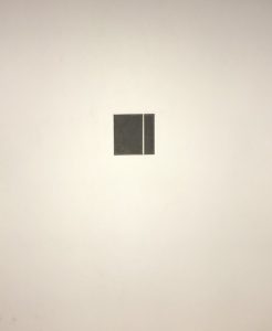
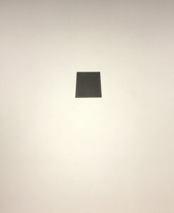
As the class went on, the class as a whole began to improve. This is evident in seeing the work of students and witnessing the overall design structure from them improve as our semester moved on. This improvement of overall quality in the students ushered in new ground for the students to display their talents on a much larger scale. We learned how to utilize markers and create perfect shapes. We learned how to make squares at the precise measurement. My first venture into the shape drawing process wasn’t what I wanted it to be. I was not successful with the placement of the square in the sheet of Bristol paper. After showing the class the project during critique, I learned a valuable lesson. When looking at a piece, the artist must display their best works and make sure the observer can read the piece. Our professor instructed the class that in the Western world, everything is read for left to right. My piece was reversed, thus making it not viewer friendly. This observation will remain with me for the remainder of my design career.

Along the way we also studied the structure of rectangles and curved shapes, such as circles and other curved shapes. Then we tackled the difficult assignment of using perspective for a project. We did this when we did the square from a three dimensional point of view. It was a daunting task to say the least. It proved to be beneficial because now I can use that skill to make three dimensional images by hand. I hope this skill will help me in making more abstract pieces using this basic structure in the future.

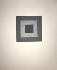
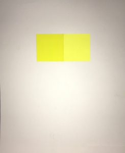
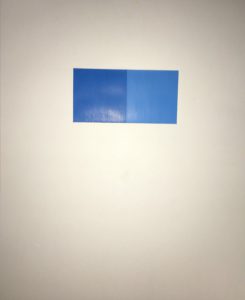
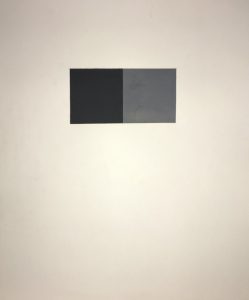
Soon after, we started to use our designer gouache to develop different tones of color. First we used achromatic colors, which means no color. Then we went to monochromatic colors, which means one color. With the monochromatic shapes we had to use the same color but incorporate different tones to create a well balanced harmony.

Afterwards we developed the full color project. I enjoyed doing these pieces front the start. The was feedback was positive. The best pieces were displayed in the Grace Gallery exhibition. Currently, we are beginning our Going Green final project. The students in the class have to brainstorm ideas and come up with a simple yet powerful message through the use of design. This project will let the students show a conscience and supportive mindset of the environment to support today’s needs.

The class itself was enjoyable. I learned a great deal of new and important information. I was expecting to work on the computers right away. I can say without a doubt this was a good launching pad into the world of design. Every time I get on the train or go out I see ads. I’ve seen ads before but now I see myself question how it’s made. I ask myself what process did the designers make to achieve a quality design? I’ve come to see everyday things in a new light.

Welcome!

This is the first post on your Learning Blog. Edit or delete it, then start blogging!

The ePortfolio is both a Learning Blog and an Academic Career Portfolio. Use the Learning Blog to document your learning experiences and class assignments each semester. As time goes by, add content to the Academics and Career sections to show your department, graduate institutions, or future employers how well prepared you are for your chosen career.

NOTE: Remember to add appropriate Categories and Tags to your posts. This will help your professors and other visitors find the content they are looking for. The Categories “Coursework” and “Field Trips” and the Tags “OpenLab” and “City Tech” have already been applied to this post. Feel free to make changes!