What I learned was that time is of the essence. I personally felt that my supervisors didn’t give me work quickly enough. I was questioning that all throughout my internship but towards the end I realized that it was enough work to be done. I just had to show my skills with what I was assigned to do. I also learned take constructive criticism. I learned a lot during my time at Giving Forward. In the beginning, teamwork was a vital component to my internship experience. After a while however, I reverted back to working on my own again. This wasn’t a problem, it was just reassuring that my supervisors trusted me enough to work on my own. For that I am grateful. The one thing I wish to take away with me is the fact that in the beginning I was worried about my performance during this semester. I was worried about everything from how I was going to perform during in class sessions, as well as how my work for Giving Forward was going to be considered. All in all, it was a great experience to intern for Giving Forward and to be apart of Prof. Nicolaou’s class. It was a full circle moment for me, as I started with her in Graphic Design Principles I and got the opportunity to finish with her now for COMD 4900.
Final Banner Update – #13
I received feedback from Oscar and Michael. They both agreed that my updates work very well. I was so relieved that they chose how I designed the banners in my way. I developed my own copy to use in the banners and changed up the font a bit, thus making effective working banners ready for uploading online. I have included the update versions here. This was the last assignment for me in this internship. I did let Oscar and Kevin know that my time with them as an intern is done, but I am still available if they need help in any design work. This week is also a great occasion, as I finished my minimum 120 hours of service for internship class. I have been keeping track of my hours and they sum up to 123 hours. I wanted to do more hours, but I wasn’t able to do so because of some communication issues in the beginning. It’s all good in the end. I learned a lot from everyone at Giving Forward, and I will use this information learned from my supervisors to take with and develop affecting design work wherever I go.


Work, Work, Work – #12
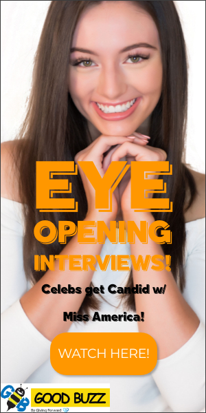
This is the Week 12 update. I have done my first draft of the banners for the Payton may interviews. I kept in constant communication with my supervisors via slack and zoom. We meet and discuss the approaches needed for the banner designs. I was given copy to include in the banners. The purpose of this copy was to entice any potential viewers into clicking the ad banners to send them to Goodbuzz.com. These ads are going to be displayed on social media sites such as Facebook, Instagram, Twitter, etc. Doing this generates ad revenue, and this enables Giving Forward the ability to donate 50% of the proceeds to nonprofits. I was also given examples of appropriate sizes needed for the various banners I need to make. Kevin, Oscar, Michael and I had discussions on how to approach the development of these banners. It was best to keep things clean and simple this time around. I learn from my previous assignments that less is definitely more. So I kept that in mind when making the banners. A clear and clean visible text was important as well. My experience so far at this internship has been favorable. One thing that has been on my mind is the idea of not getting enough work to do. I somehow feel like I’m behind my other classmates and thus am getting anxious due to the need for more work. It’s ok though, because the work I’m getting needs to be as well done as possible, and that focus is good enough. I sent Oscar my first draft files of the Payton May banners, he liked them, their structure, and the copy I used. Some adjustments needed to be made. I have them included here. The original typeface I used wasn’t very legible so I decided to use a different one. I sent Oscar my updated files and I’m now waiting for feedback. Aside from feeling like I don’t get enough work to do, this internship has been a positive experience. I have learned a lot from Oscar and Michael, and Kevin has been a great supervisor as well. I wait for next week to see what else needs to be done. I wait with excitement for what’s to come.


Adjustments and more Adjustments – Week 11
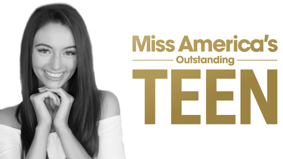
Week 11 has come and gone. I have since completed 90 hours in my internship. I know that after 100 hours are completed, we must send our evaluation sheet to our supervisors. I plan on doing this next week, when I for sure have accumulated more than 100 hours. So far, it’s been a great experience. Working with Giving Forward has been very beneficial to me. It was very unstructured in the beginning, but later in the semester it got more balanced as we were given more work to do. Also, the weekly meetings we attended gave us much needed support. So far, I’ve met with Kevin, Oscar, Michael and others on a weekly basis. Sometimes we even meet twice a week to further discuss design approaches. This week, I got feedback on my header designs. Oscar and Michael liked my designs, but adjustments needed to be made. We decided to flip the design over, meaning the copy, which was originally on the right, now had to go on the left. The image of Payton May had to go from the left to the right as well. They also wanted to go forward with the black and white image, as it worked best with the type of design they wanted. I then showed them the updates. They liked them and decided to use the updates on Goodbuzz. I made different versions of the headers but they decided to use this one. This was a relief to say the least. It was a simple design but it took a couple of weeks to get the look just right, and up to their standards. That task is done. I now have to work on the next task, which is creating the banners for the Payton May interviews for GoodBuzz. I look forward to that assignment. We move on upward and onward.
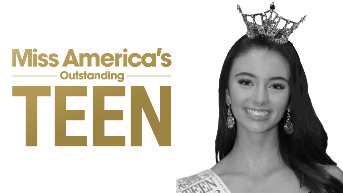
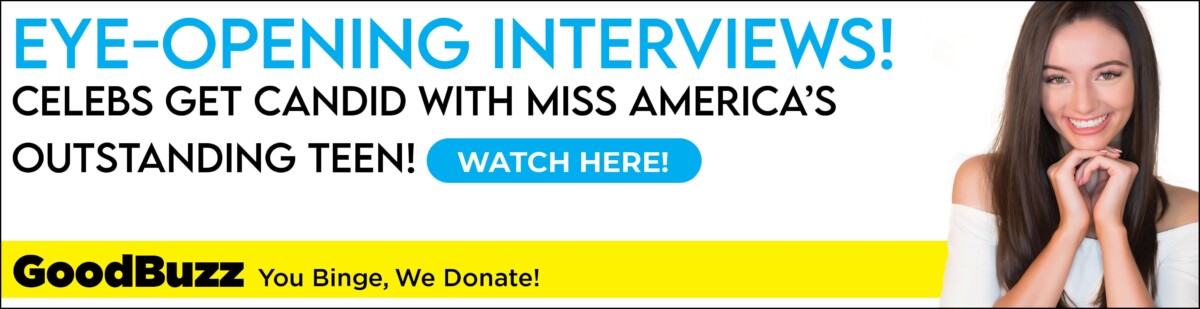
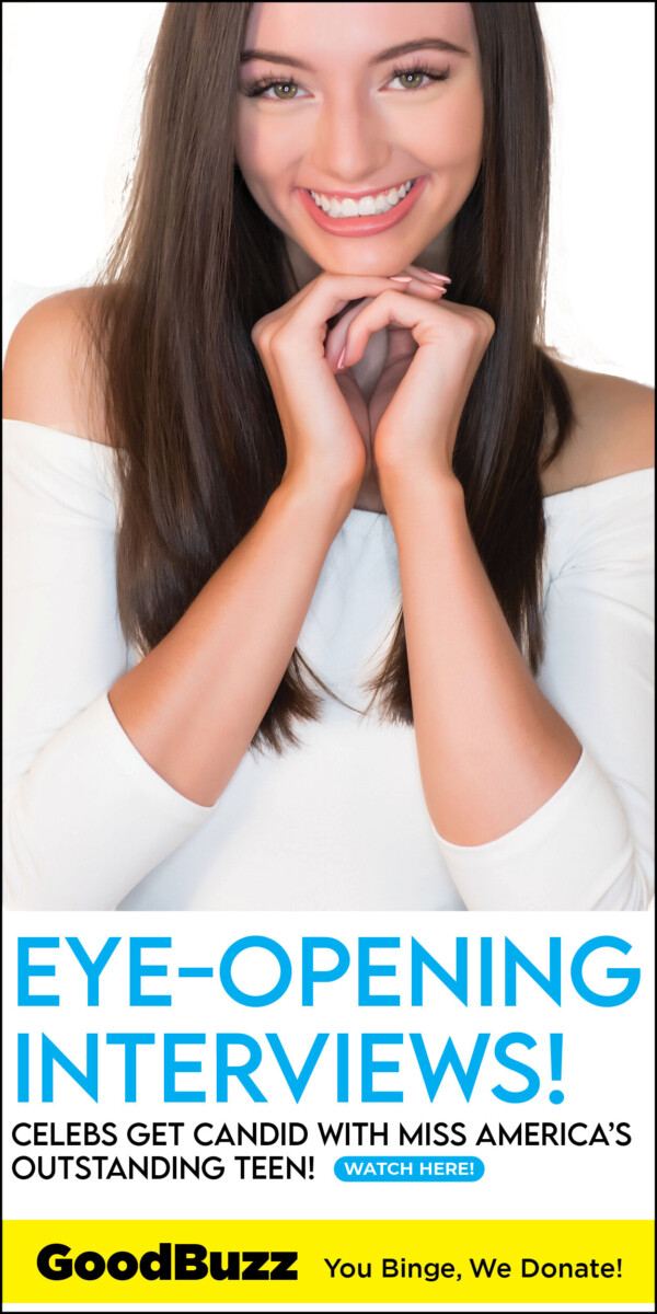
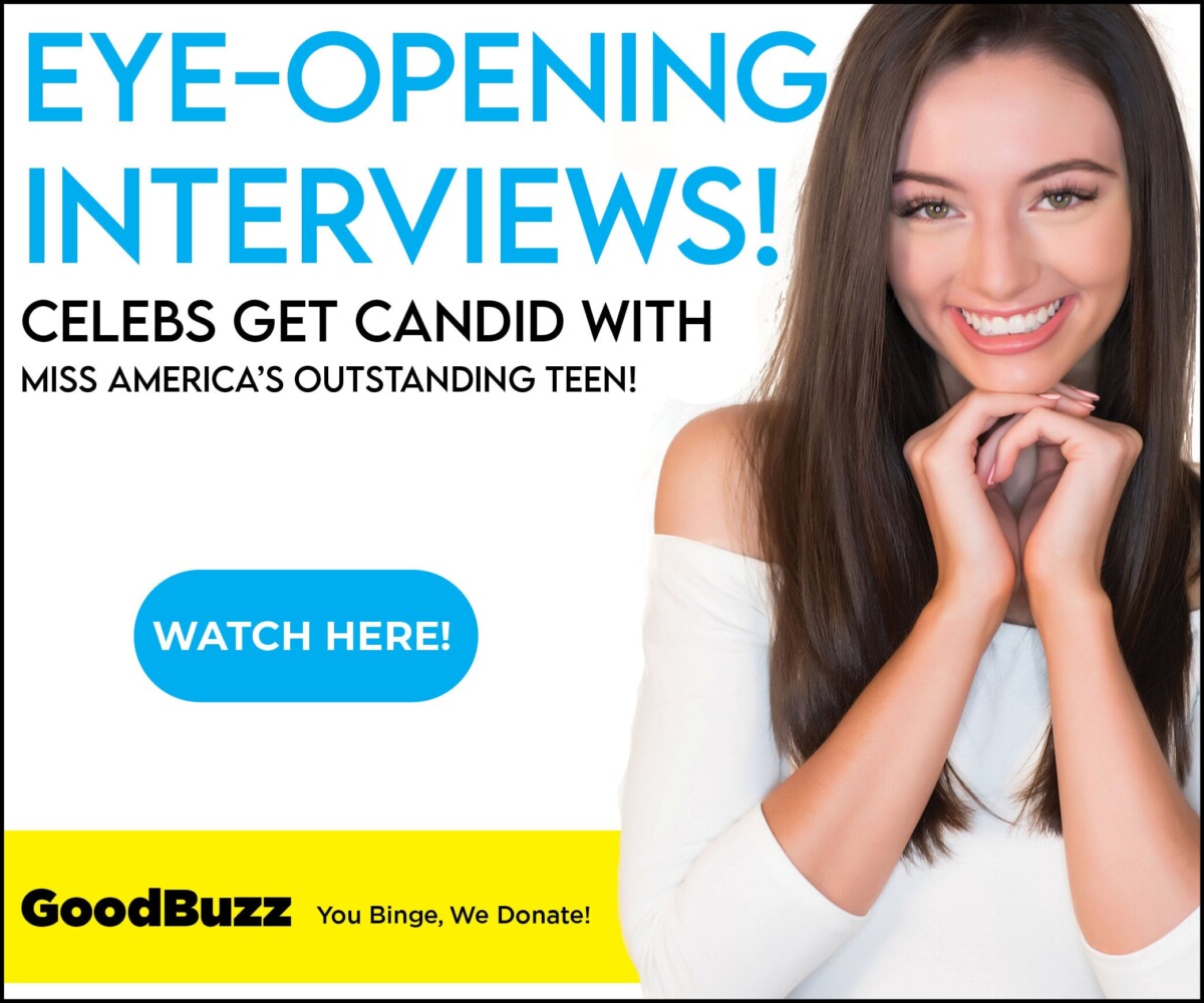
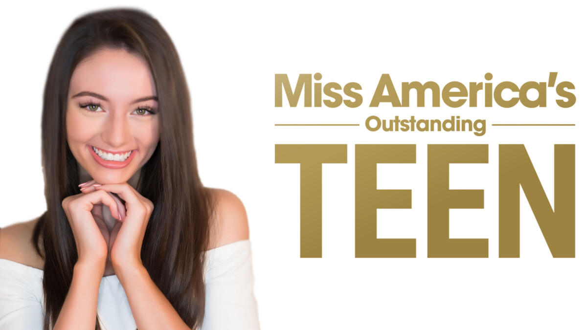
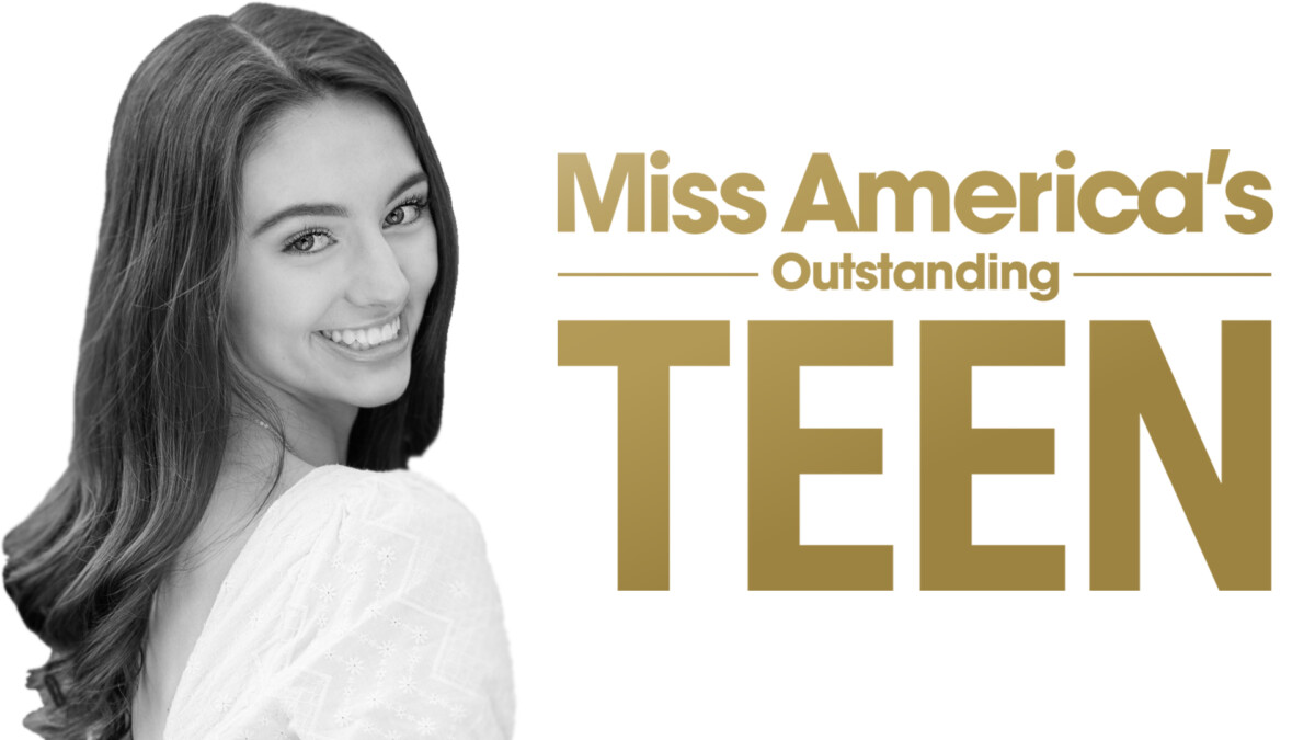
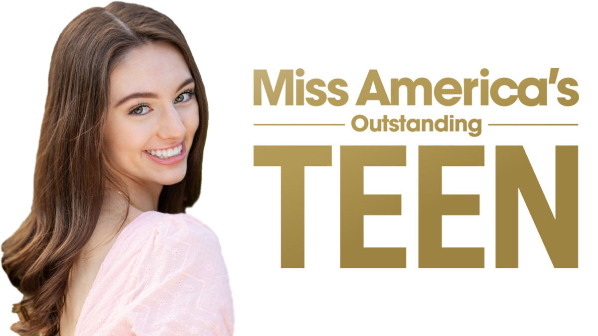
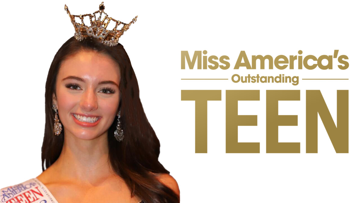
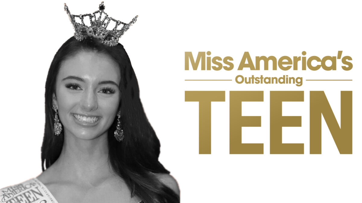
New Assignments! – Week 10
I completed another week in my Giving Forward internship. The total hours of work comes to 75 hours. It’s still not as enough as I wanted to accomplish at this point, but it’s still hours completed nonetheless. Every little bit counts. This week my teammates and I got our new assignments. First was one assignment pertaining to video editing. The job was to edit a zoom interview that’s going to be featured on GoodBuzz. The other assignment was to create headers and banners for interviews conducted by Miss America’s Outstanding Teen 2020, Payton May. Giving Forward and Payton May are collaborating to conduct interviews with celebrities. These interviews are conducted for the sake of generated revenue towards Giving Forward and its operations and donating to nonprofits. For these series of interviews Kevin Lee, my supervisor, and his assistants assigned me to do the headers and banners. I was all aboard for this assignment, as Luis and Gabriel were assigned to edit the video. All this work assigned to us was to be used for the GoodBuzz website. I got to work right away in creating these headers and banners. Kevin Lee had assigned us with two of his assistants in creating content for the GoodBuzz website. Oscar Stadthagen and Michael Dwyer have been overseeing our work, giving us insight and using their expertise in what works in creating content for the GoodBuzz website. This week, I did the first draft of the headers. I was supplied with the photos being used and the copy being used as well. I kept Kevin, Oscar, and Michael up to date with my progress on a daily basis via slack. They wanted me to duplicate a header that was made for a series of interviews they did before with another Miss America. I used this header example as a template on how to approach the work needed to be done. I don’t have the header template they told me to use but I have the versions I did, of which I will included here. I then sent them what I did and I am waiting for their feedback. I wait anxiously for their responses.
The Waiting Game – Week 9
As of this week, I have accumulated 60 hours in the field for Giving Forward. I was hoping to have more hours completed, but we started a bit late in the internship. Even with that circumstance, I believe I’m in a good position to complete the 120 hours needed for the class. As previously mentioned in the last posting, A new member was added to our team. Michael Dwyer is an experienced designer who was called upon to add more experience to our team. This was a great acquisition for Luis, Gabriel, and I, as we can now learn and absorb his knowledge, thus granting us the abilities to achieve greater work. This week was a slow week to say the least. We have our weekly meeting on Mondays, and in the meeting, Kevin, Oscar, and Michael were preparing us with some new work. It was in the earlier stages of presenting, some work ranging from video editing to banner producing. That was all that was mentioned in that meeting. A great majority of the weekly meetings are dedicated to the other side of Giving Forward, such as other interns and volunteers giving updates on their work and other activities being conducted. One of their focuses being to generate web traffic on their site, GoodBuzz. The more people who visit and interact with their GoodBuzz site, the more funds are generated. Those funds are then split 50/50, half of which goes to non profits. More information pertaining to our next assignments will be presented to us in the next meeting, hopefully.
Designers Assemble! – Week #8
As stated in last week’s update, Mr. Lee and his assistants chose Luis’s banner design for the comedy zoom event. They didn’t choose my design. I’m ok with their choice, as his design was very good and really set the tone for the special event. I took this as a learning experience and to see what works and doesn’t work in terms of banner designs. Work-wise, this week we weren’t assigned any new projects to do. This is a pet peeve of mine, as I feel like if I’m not constantly doing work, then I feel behind. I’ll give them the benefit of the doubt however, as they’re constantly trying to put together events that generate revenue for nonprofits. Another observation I made was even in the weekly meetings any and all design talk is very brief, as everything else needs to be addressed first, such as garnering more traffic to their website in order to generate funds to help out nonprofits. With all that talk on how Giving Forward is trying to help as much as they can, there was time for us to do some design talk. This week, Mr. Lee and his assistants introduced another member to the design team. A gentleman by the name of Michael Dwyer. Michael has a great amount of experience in the design field, so i’m relieved he has joined us. Mr. Lee and his assistants decided to do this because they wanted to add more experience to our design team. I think this is going to be a great learning experience for all of us, especially me. I have no doubt we will learn a great deal of expert knowledge with Michael on board. I look forward to the next assignments being given to us.
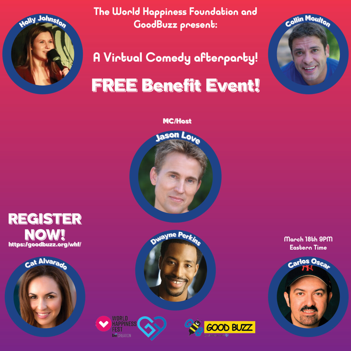
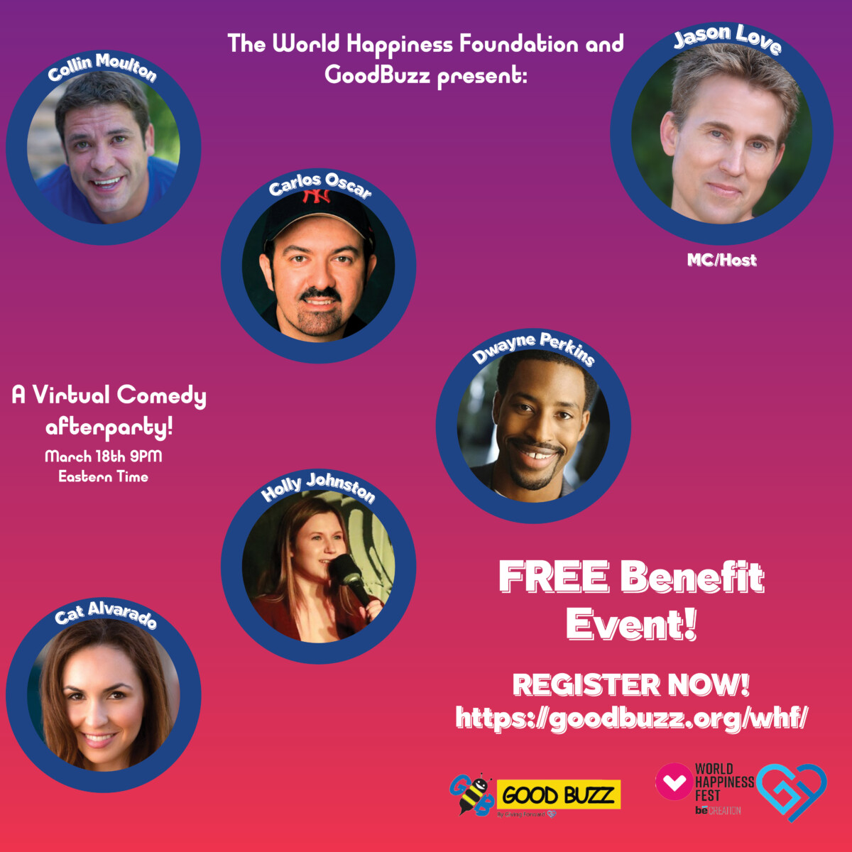
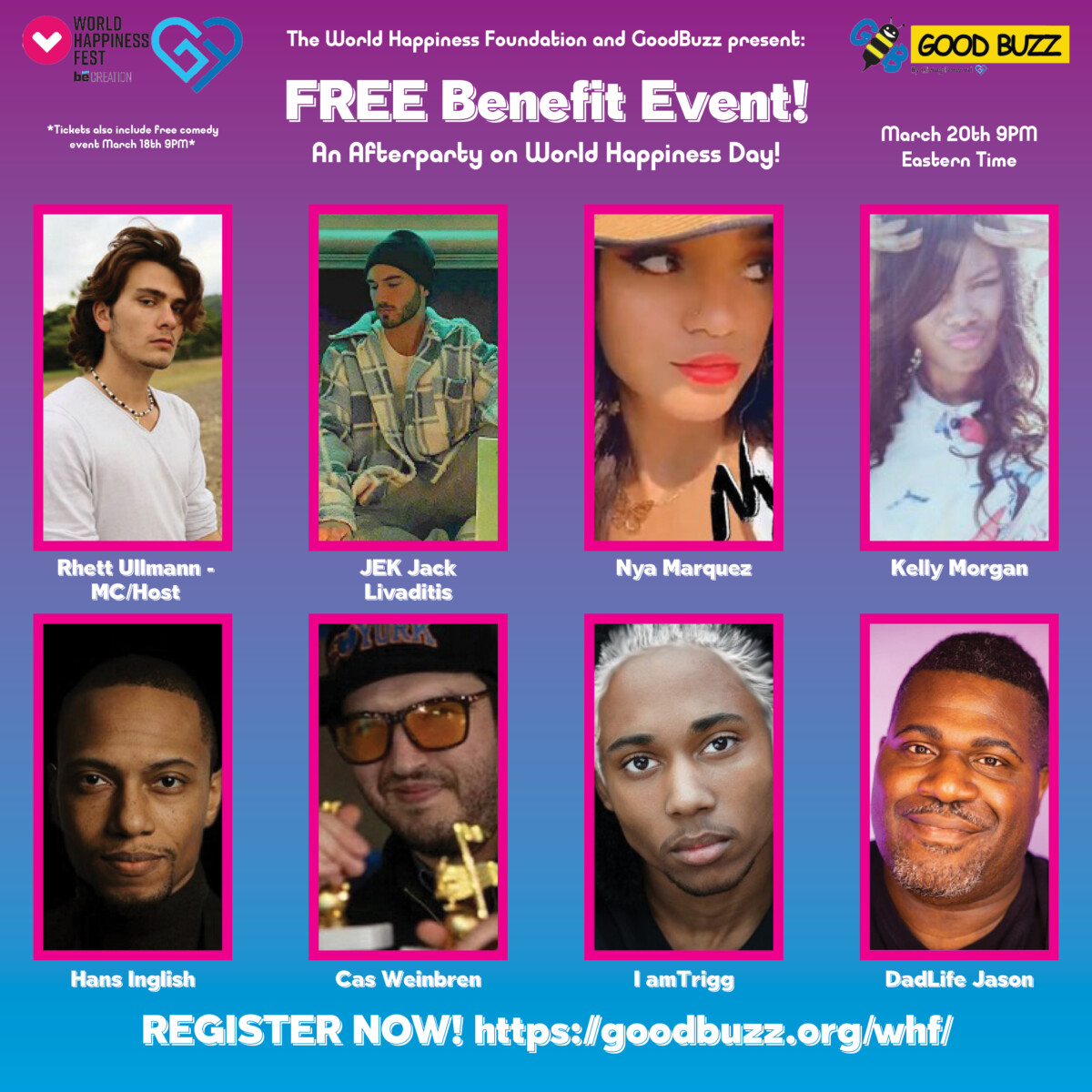
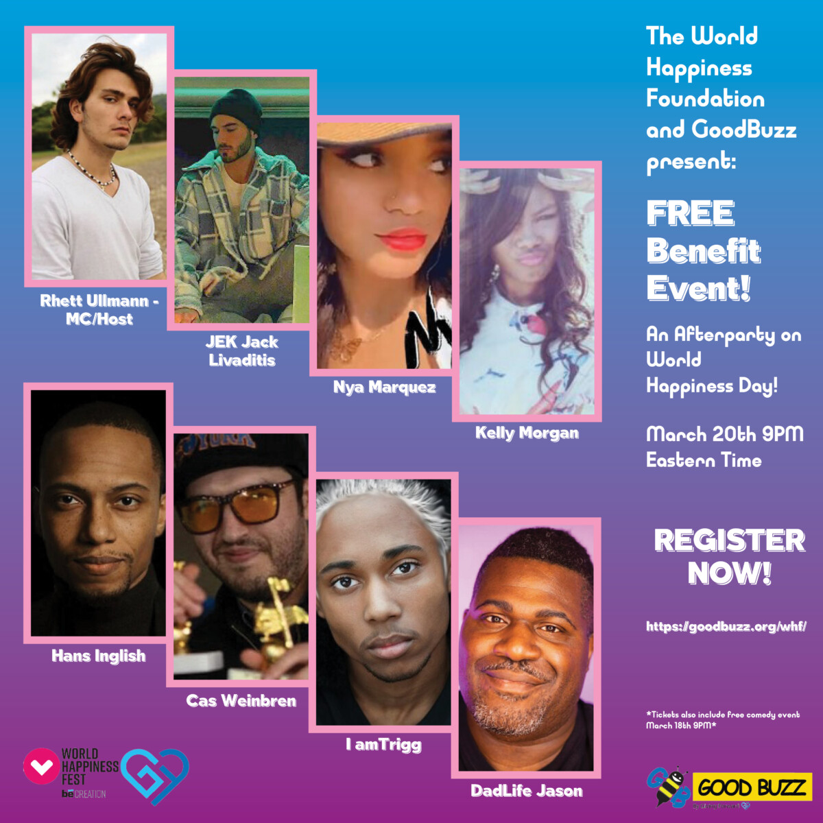
Let’s Get To Work – #7
We are now in week 7. My teammates and I are now in constant communication with Mr. Lee and his assistants. We have started attending weekly meetings held on Monday evenings. These meetings are held as means of discussing upcoming events and assignments for said events. It’s convenient for me to attend these meetings, as I get more insight on the going ons at Giving Forward and the time these meetings occur help too. This week, we have been assigned to work on making social media banners for online zoom comedy and music events. The music event was taking place on friday march 19th, with the comedy event taking place the day before. Giving Forward has a history of hosting events in order to generate funds for charities. This event was to commemorate World Happiness Day, which was March 20th. Mr. Lee and his assistants spoke to us about making our own banners and from there they would select the one that best fits the look they want. They offered us to use a software called Bannersnack. Bannersnack let its users make IAB banners for online use. With Bannersnack, you can make multiple banners at a time. I wasn’t very familiar with Bannersnack at the time, so I opted to use Indesign when making my banners.
GoodBuzz comedy event 1
GoodBuzz comedy event 2
GoodBuzz music event 1
GoodBuzz music event 2
I was happy with the way my banners came out, for I used a gradient for the background to give it a sense of levity that this show was to be based on. I sent my files to Mr. Lee and his assistants on the 18th, via slack. They gave us this assignment rather late in the week, so I had to work hastily to get those out to them ASAP. We found out the results that same night on the 18th. Ultimately, they decided to go with Luis’ design, letting us know via Slack. They did make a good choice, as his banner was well done and really set the tone for the event’s lively nature. I was happy for him as well, as I saw his file posted on eventbrite and thus reinforced the notion of “if one of us wins, we all win”. This was a great learning experience for me, as I saw what works and doesn’t work, in terms of banner making. Less is more is the lesson learned here. I will keep that in mind for the next assignment. Also, I must familiarize myself with bannersnack. I very much enjoyed doing this project. On to the next one we go.
Gordon Parks Assignment
I am in the same boat as the rest of my classmates. This is the first time I am learning about Gordon Parks and his work. However, upon further research, I am glad this is my first time learning about this man and his work. His work sheds light on the African American struggle. It also encapsulates the beauty of the African American spirit and resiliency. What I’d like to focus on is the article that was about how the HBO show, “Lovecraft Country”, made references to Gordon Parks’ work. Since the show is set in the 1950s and Gordon Parks was there to capture the feel of what African Americans had to deal with on a daily basis because of Jim Crow laws. Specific photographs, that where part of his “Segregation Series”, where used to recreate certain scenes in the show, such as a woman and her niece coming out of a theater. That particular scene was captured by Parks and was used in the show to pay homage to his work. This was a fascinating and exciting find for me due to the fact that I watched this show and, since I didn’t know about Gordon Parks and his work beforehand, it had given me a whole new perspective on the show. I will rewatch the season again in the coming days to find the scene again. I am also hopeful that the show runners will include more scenes that pay tribute to Parks’ work again in later seasons.
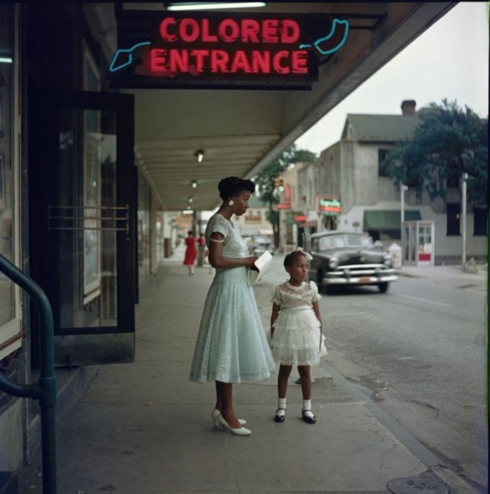
Department Store in Mobile, Alabama. (Gordon Parks, courtesy The Gordon Parks Foundation) bn
https://www.newsweek.com/lovecraft-country-gordon-parks-photos-1525235
Ethics Assignment – 2a and 2b
2a. In the past, I would find inspiration for designing from things I enjoy. The first thing that comes to mind was when I designed a poster for the marvel movie, Venom, which came out in 2018. I chose to make this poster because of an assignment I had for typography 2 class, back in the spring 2018 semester. Prof. Garrastegui assigned for us to make movie posters with typography being a focal point. When doing research for this project, I looked at other poster designs involving somewhat of a similar layout to my initial design. A lot designs for this character had usage of typography but none of them featured any playing around with the venom name itself, so I decided to do that. The designed work I submitted for grading wasn’t very strong, in my opinion. I also remember Prof. Garrastegui gave a certain number of type required for the project. I submitted it for grading and that was that. After a few months passed, I was setting up a portfolio website. I wanted to include this poster but felt it needed revising, so that’s what I did. The first design had more typography all around and the eye’s weren’t as organic feeling. The revised version I used for my website shows that making a few tweaks can go along way. I removed the extra type and drew the eyes on Illustrator. I also used the correct logos associated with the venom character, such as using the Marvel logo, and other corresponding logos associated with the film, such as including the Sony logo and Columbia Pictures logo, among others. I strongly feel the revised version is the better of the two. When doing this poster, I didn’t think about giving credit from who I drew inspiration from. I had the idea in mind that, since this only for classwork, I don’t have to worry about giving credit and I should be fine. I never had the idea of putting this particular design for sale or thought about making a profit from it. It was simply for classwork. However, upon reading the various readings assigned to us for this ethics assignment, I learn the importance of taking inspiration from other works of art and doing your own spin on it, but also giving credit where credit is due. I decided to remove my poster from my portfolio site. When I get the proper rights, then and only then, will I post it again on my site.
Here is where I drew inspiration from when making my posters. The link is below.
https://creativesfeed.com/venom-poster-designs/
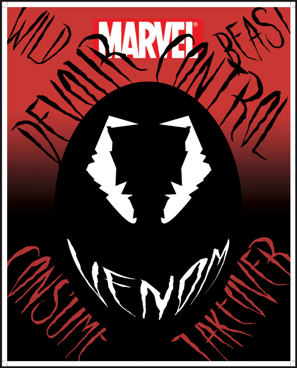
The version I submitted for class.
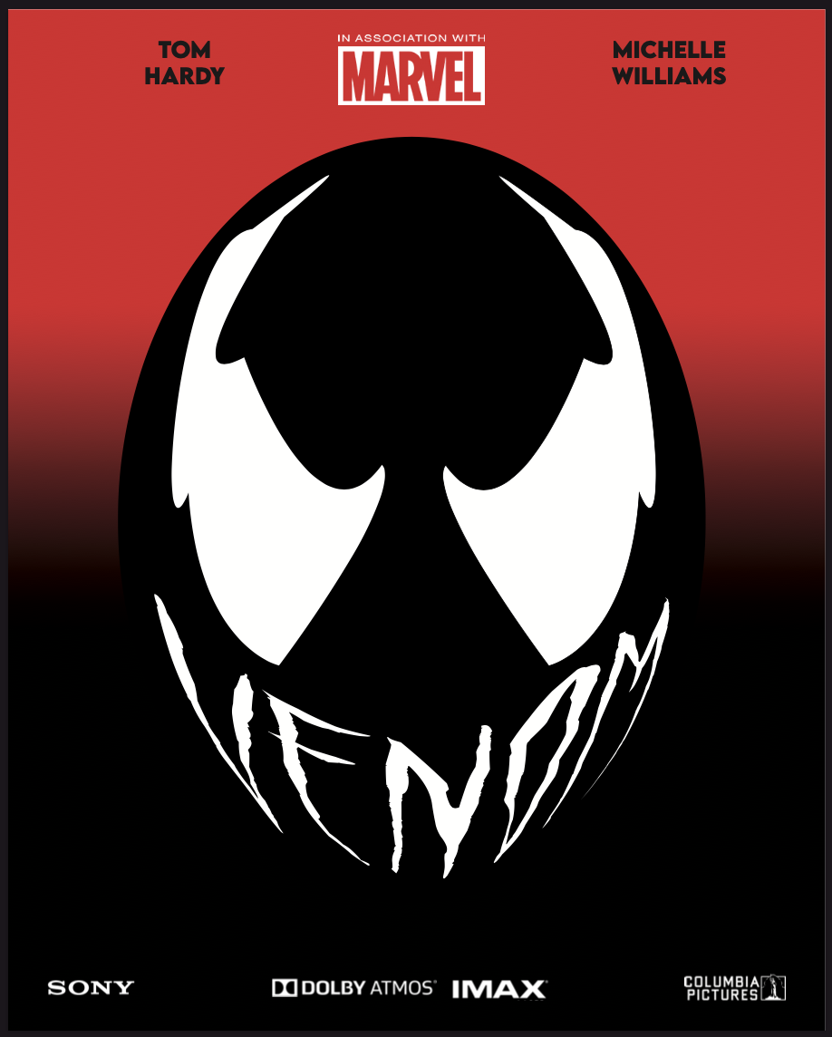
The revised version I had in my portfolio site.
2b. Upon reading the article of the Fairey Copyright case, I’ve come the conclusion Fairey should have been more cautious of his artistic endeavors. I see that he was inspired by Obama’s win and wanted to commemorate his legacy in this way, but he should’ve went through the proper channels first. Getting the licensing for usage of the image was the first step he needed to take. If he did that in the initials stages of his HOPE poster design, then he wouldn’t have gotten in trouble. He made it out alive in the long run, since after this incident he went on to work with the Associated Press in any future design work. Everyone won in the long run, it just seemed super unnecessary for him not to get the proper licensing from the beginning. However, since he went this route, he wouldn’t have gotten the opportunity at working with the AP had he chose a different image for his HOPE poster.

