My life in a day video was created by mind mapping! I thought of the idea that I use creativity every day of my life. Then I used a mind map to express what I thought meant to be creative. I used my sewing skills as a way to express my creativity by customizing a pair of pants. This idea then became an action and was recorded with an iPad mini. Recording and editing the video was fun because it was a new experience. My life in a day video is based on the word creativity.
Category Archives: Coursework
Hot Wheels Logo Research Project
Hot Wheels is one of the most effective and popular toy cars ever known. As soon as the company launched in 1968, it was a complete success. Kids fell in love with the racing metal cars from the start. From designing 16 cars to producing thousands, the company has done a tremendous job at keeping up with real world cars and designing its own. The founder of Hot Wheels, Elliet Handler, thought of producing his own toy cars for kids due to the lack of satisfaction from his previous job.
Elliet Handler came up with the name âHot Wheelsâ because his partner, Harry Bradley, had a classic car that caught Ellietâs attention. Elliet greeted his colleague saying âMan, those are some Hot Wheels!â so the name originated from a compliment. After the title, the logo was designed with âHot Wheelsâ in flames and Ellietâs signature at the bottom right (Mattel). âThe flame edges of the logo represent the speed of the toy cars.â (Logopedia). Over a period of time, the brand name was modified. Reducing in size, shape and text. Overall, the brand name is still similar to its original legacy.
Some organizations (The Hot Rod Hobbies and The Bowling Green Hot Rods baseball league) both display similar flame-like emblems. The Hot Rod Hobbies is an organization (originated in the 1990sâ) used to compete with participants using small RC cars. Their logo is similar to the Hot Wheels brand name in which they both use flames. The Bowling Green Hot Rod baseball leagueâs emblem (Originated in 2009) shows a âHot Rodâ car with a flaming muffler. Similar to Ellietâs compliment to Harry Bradleyâs âHot Rod,â the teamâs emblem has the same characteristics the Hot Wheelâs brand name originated from. The Hot Rod Hobbies club claimed, âto have their emblem designed by someone elseâ (Employee at Hot Rod Hobbies), with a different intention. The Bowling Green Hot Rods also use baseball stitching to present itself as a baseball team. In conclusion, there are no facts indicating that these logos were influenced by the Hot Wheelsâ brand name.
Furthermore, The Hot Wheelsâ title was designed close to a relating typeface called âHeavy Heap.â The flames of the W of the Hot Wheels title signify the designer used this typeface in the development. Elliet Handler designed the original logo but various designers modified it over time (including Michael Endreola). The typeface and flames were edified to target a clear brand name. The color and flame edges of the logo were modified continuously. The redevelopment of the logo was used to make the brand name look more faster every time.
Being the major toy car production in history, Hot Wheels has revolutionized from selling metal cars to having its own tv shows, movies and much more. This company is a complete success and to this day is working its way up to a future like no other. Hot Wheelsâ owns a unique emblem with its flaming red logo and unique text. The companyâs logo is very similar to what the company representsâtoy cars with hot wheels.
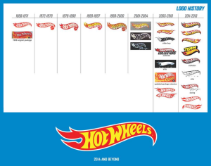
JHidalgo-D305 Logo Research FINAL
How my logo came about
My logo was created in my Graphic Design Principles II course. My professor assigned me to make a logo out of basic shapes like squares and triangles. I chose triangles because angular shapes signify masculinity. There is a purpose for every triangle in my logo. The three white outlined triangles inside the black triangle represent my belief in God the father (top), Jesus Christ the son (left) and the Holy Spirit (right). The black triangle unifies them together and my initials are in the middle triangle as the focal point. My logo is simple and unified.
Visual Quote Concept
I intended this post to be playful because it catches the attention of the viewer immediately. The colors I used are rainbow-like because there is a variety of different hues. I also resized the type to fit proportionally on the page. Fun is a way of using a variety of colors to be playful because that’s what fun is all about.
I used a sky diving picture to enhance this visual quote because skydiving is an interesting sport. The type I used is Bebas Neue and I kerned the quote along with some leading. Also, I used a blue fill to match the color of the sky and added an outer glow to make the visual quote pop. The sky is the limit but not if you can walk on it!
Walt Disneyâs characters from the movie âThe Incrediblesâ inspired this visual quote. Using the Incredibles, I designed the type to be aligned with the Violet (right) and Mr. Incredible (left).
Going Green Project
Principles of Graphic Design
Bottle Drawing
This is a one point perspective drawing of a bottle shape
The most challenging part of this drawing was the ellipse(s) because I had to make sure they were around the same shape to make the bottle look more realistic. I enjoyed drawing this bottle because it was an exciting experience drawing the bottle itself and the paper that wraps around it as well.
3D City Drawing
These drawings are one and two point perspectives on what a city looks like with its vanishing points. The most challenging part of this assignment was drawing the “invisible lines” because they were dotted and I had to carefully follow the guidelines. I enjoyed drawing these cities because it was my first time drawing a landscape.
Paraline Drawing
This project helped me visualize 3-D perspective because it showed me how following parallel lines on graph paper works. Due to the 911 tragedy, I thought of drawing the Twin Towers and the Brooklyn bridge behind it. The hardest part about this project was making sure that each lines aligned perfectly with one another. I’m very proud of my work because I drew out the Twin Towers with nice proportion.
Welcome!
This is my e-portfolio, welcome!