Research Project: Milton Glaser


Milton Glaser is one of the most famous graphic designers of all time. I found out about Milton Glaser in my first semester at City Tech. I also found out that he was the one who created the I Love New York logo. As an aspiring artist from New York City, Milton Glaser’s famous “I Love NY” logo inspired me to learn about him and his artwork. Milton Glaser is known all around the world and is considered one of the best Graphic Designers of all time.


Milton Glaser’s interest in design started at a very young age. He was born in New York City in 1929 and he went to the high school of Music and Art. Later, he went on to study at the Cooper Union School of Art and graduated from there. According to Milton Glaser’s website, Cooper Union is “one of the best schools in the world to study design.” After he graduated from Cooper Union, he earned a scholarship to study at the Academy of fine art in Bologna, Italy. Glaser’s compelling artistic skills exposed him to the world of design at a very young age.


Milton Glaser is considered the father of Graphic Design. His compelling artwork has been published in museums like the Museum of Modern Art and Centre Georges Pompidou in Paris. He is the first graphic designer to have one-man shows at both museums. Tourists from all around the world come to the MoMA to view his art. One of Milton Glaser’s famous art work is the famous I Love NY logo. Milton Glaser created the logo in the 1970’s and it is still used today. This symbol is seen everywhere in New York City because it is a famous design. Milton Glaser’s greatest accomplishments are the reasons why he is considered as the father of graphic design.


Milton Glaser started his own company in 1974 and works in several fields of design. Milton Glaser named the company after himself and is still designing to this day. Some branches of design he works with are corporate identities, environmental and interior design, and packaging. Milton Glaser designs logos and brochures for corporate identities. Another subject his company works with is restaurant and supermarket interior design. The last field of design is packaging, which includes food and beverage design. To conclude, Milton Glaser’s company worked with famous clients like the Brooklyn Brewery, Target, and Citibank.


To conclude, Milton Glaser is a famed twentieth century graphic designer. He is an encouraging icon for graphic designers and his artwork has been seen all around the world. The graphic artist also created a global icon for New York City and is still working today. Milton Glaser has his own company and has worked with several clients in the past. Milton Glaser is one of the greatest graphic designers of all time.

iloveny

Works Cited

“Milton Glaser History.” Milton Glaser History. n.p. n.d. Web. 5 May 2016.

<http://www.miltonglaser.com/milton/c:history/#11>

“Milton Glaser Biography, Designs and Facts” Famous Graphic Designers, n.p n.d. ­Web. 5 May

2016.

<http://www.famousgraphicdesigners.org/milton-glaser>


Field Trip to the United Federation of Teachers (UFT)


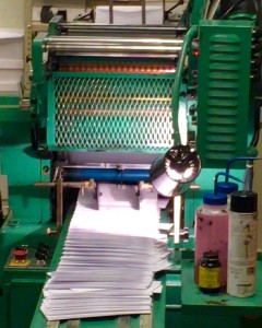
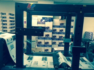
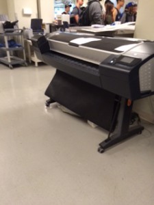
The field trip to the United Federation of Teachers was a field trip to remember. This trip was for educational purposes. Our tour conductor Oscar, is the chief of the printing lab at UFT. He was very kind and gave us information on the machines the company used daily. Some of the machines we saw were the ESPON 9800,  the mail machine and the inserter. The EPSON 9800 is an ink jet printer that can print large posters about 44 inches in width and 74 inches in length. This machine is used for high quality print like pictures and posters. The second machine we saw was used for printing envelope cards. This machine could easily print about 140,000 envelopes a day.  The third machine we saw was called the inserter. The inserter has it’s name from inserting papers into an envelope. The inserter simply folds the paper, inserts it into the envelope and seals it. This machine can do about 50,000 envelopes in a day.

The tour guide Oscar is the chief of the staff in the printing lab. Oscar gave us a tour around the lab showing us all different kinds of machines. He was also generous enough to show us how some of the machines work like the Prism, which can cut about 50 sheets of paper in one slice. Oscar told us that he has done plenty of jobs for all kinds of companies but he specializes in posters. He also gave us advice on the types of printers we should use if any us are planning to work in the printing field. Oscar concluded that he has made many mistakes in the past but those mistakes gave him the opportunity to grow and be a better leader.


File_000
 Envelope printerField Trip Picture 2 Brochure printer

Field Trip Picture Poster and picture printer (EPSON 9800)


My Life in a Day Video

IMG_3039

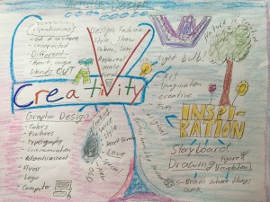
My life in a day video was created by mind mapping! I thought of the idea that I use creativity every day of my life. Then I used a mind map to express what I thought meant to be creative. I used my sewing skills as a way to express my creativity by customizing a pair of pants. This idea then became an action and was recorded with an iPad mini. Recording and editing the video was fun because it was a new experience. My life in a day video is based on the word creativity.

Hot Wheels Logo Research Project


Hot Wheels is one of the most effective and popular toy cars ever known. As soon as the company launched in 1968, it was a complete success. Kids fell in love with the racing metal cars from the start. From designing 16 cars to producing thousands, the company has done a tremendous job at keeping up with real world cars and designing its own. The founder of Hot Wheels, Elliet Handler, thought of producing his own toy cars for kids due to the lack of satisfaction from his previous job.

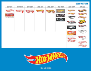
Elliet Handler came up with the name “Hot Wheels” because his partner, Harry Bradley, had a classic car that caught Elliet’s attention. Elliet greeted his colleague saying “Man, those are some Hot Wheels!” so the name originated from a compliment. After the title, the logo was designed with “Hot Wheels” in flames and Elliet’s signature at the bottom right (Mattel). “The flame edges of the logo represent the speed of the toy cars.” (Logopedia). Over a period of time, the brand name was modified. Reducing in size, shape and text. Overall, the brand name is still similar to its original legacy.

Some organizations (The Hot Rod Hobbies and The Bowling Green Hot Rods baseball league) both display similar flame-like emblems. The Hot Rod Hobbies is an organization (originated in the 1990s’) used to compete with participants using small RC cars. Their logo is similar to the Hot Wheels brand name in which they both use flames. The Bowling Green Hot Rod baseball league’s emblem (Originated in 2009) shows a “Hot Rod” car with a flaming muffler. Similar to Elliet’s compliment to Harry Bradley’s “Hot Rod,” the team’s emblem has the same characteristics the Hot Wheel’s brand name originated from.  The Hot Rod Hobbies club claimed, “to have their emblem designed by someone else” (Employee at Hot Rod Hobbies), with a different intention. The Bowling Green Hot Rods also use baseball stitching to present itself as a baseball team. In conclusion, there are no facts indicating that these logos were influenced by the Hot Wheels’ brand name.

Furthermore, The Hot Wheels’ title was designed close to a relating typeface called “Heavy Heap.” The flames of the W of the Hot Wheels title signify the designer used this typeface in the development. Elliet Handler designed the original logo but various designers modified it over time (including Michael Endreola). The typeface and flames were edified to target a clear brand name. The color and flame edges of the logo were modified continuously. The redevelopment of the logo was used to make the brand name look more faster every time.

Being the major toy car production in history, Hot Wheels has revolutionized from selling metal cars to having its own tv shows, movies and much more. This company is a complete success and to this day is working its way up to a future like no other. Hot Wheels’ owns a unique emblem with its flaming red logo and unique text. The company’s logo is very similar to what the company represents—toy cars with hot wheels.hot wheels

JHidalgo-D305 Logo Research FINAL


How my logo came about

THE LAND OF TRIANGLES JORDIEL HIDLAGO new logo

My logo was created in my Graphic Design Principles II course. My professor assigned me to make a logo out of basic shapes like squares and triangles. I chose triangles because angular shapes signify masculinity. There is a purpose for every triangle in my logo. The three white outlined triangles inside the black triangle represent my belief in God the father (top), Jesus Christ the son (left) and the Holy Spirit (right). The black triangle unifies them together and my initials are in the middle triangle as the focal point. My logo is simple and unified.

Visual Quote Concept

Visual Quote Concepts3

I intended this post to be playful because it catches the attention of the viewer immediately. The colors I used are rainbow-like because there is a variety of different hues. I also resized the type to fit proportionally on the page. Fun is a way of using a variety of colors to be playful because that’s what fun is all about.

Visual Quote Concepts RGB2

I used a sky diving picture to enhance this visual quote because skydiving is an interesting sport. The type I used is Bebas Neue and I kerned the quote along with some leading. Also, I used a blue fill to match the color of the sky and added an outer glow to make the visual quote pop. The sky is the limit but not if you can walk on it!

Visual Quote Concepts

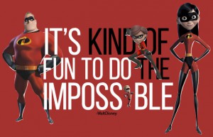
Walt Disney’s characters from the movie “The Incredibles” inspired this visual quote. Using the Incredibles, I designed the type to be aligned with the Violet (right) and Mr. Incredible (left).

The Analysis of the Experience of Visual Perception in Graphic Design Principles I


I did not expect much of my graphic design principles class I’m enrolled in now. The most I expected was to draw circles and squares because I heard about my professor from a student who had previously taken her course. I went to this course with a clear mind. In the beginning I found the class a bit challenging but after two sessions, I was confident in myself and very motivated to work my best.

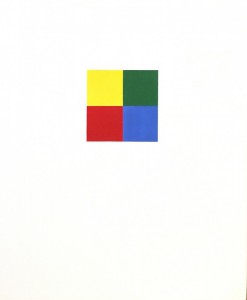
This graphic design course was very useful because I learned about the focal point. I didn’t notice on how fickle the human eye truly is until now. I learned that the focal point is one of the keys to unlock the consumer’s undivided attention. The focal point of an image is the first thing (object) the consumer sees. Then comes perspective, an illusion of depth from size of objects headed into the vanishing point.

With perspective the shape shown for can go from 2-D to 3-D dimensions. This technique will be very useful in design production.

To conclude, I made friends with a few students in the class that were either one step ahead or needed improvement. As a class, we contributed to one another, teaching and learning the guidelines that work for one another. Working with markers and fine point pens improved my vision in critics. Now I use this technique everywhere I go.

The gouache project has been a tough project to improve on but practice makes perfect. However, I realized that the lesson to take home from this course is (o understand perspective and it’s dimensions, to know whether an image proportion is off by a 16th or a 32. Now I know the elements that can invite the viewer into the page.

Bottle Drawing

Bottle Drawing (2)Bottle 2

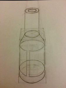
This is a one point perspective drawing of a bottle shape

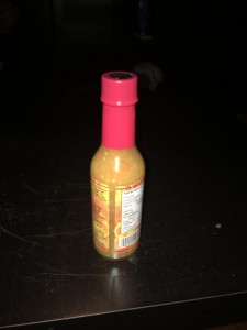
The most challenging part of this drawing was the ellipse(s) because I had to make sure they were around the same shape to make the bottle look more realistic. I enjoyed drawing this bottle because it was an exciting experience drawing the bottle itself and the paper that wraps around it as well.