Do it for the gram!

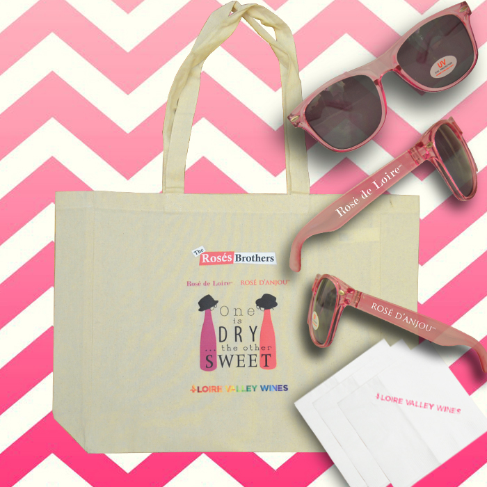
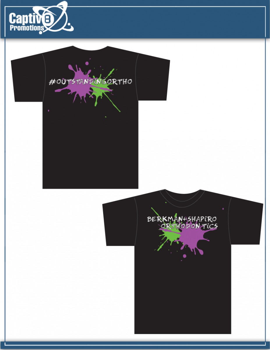
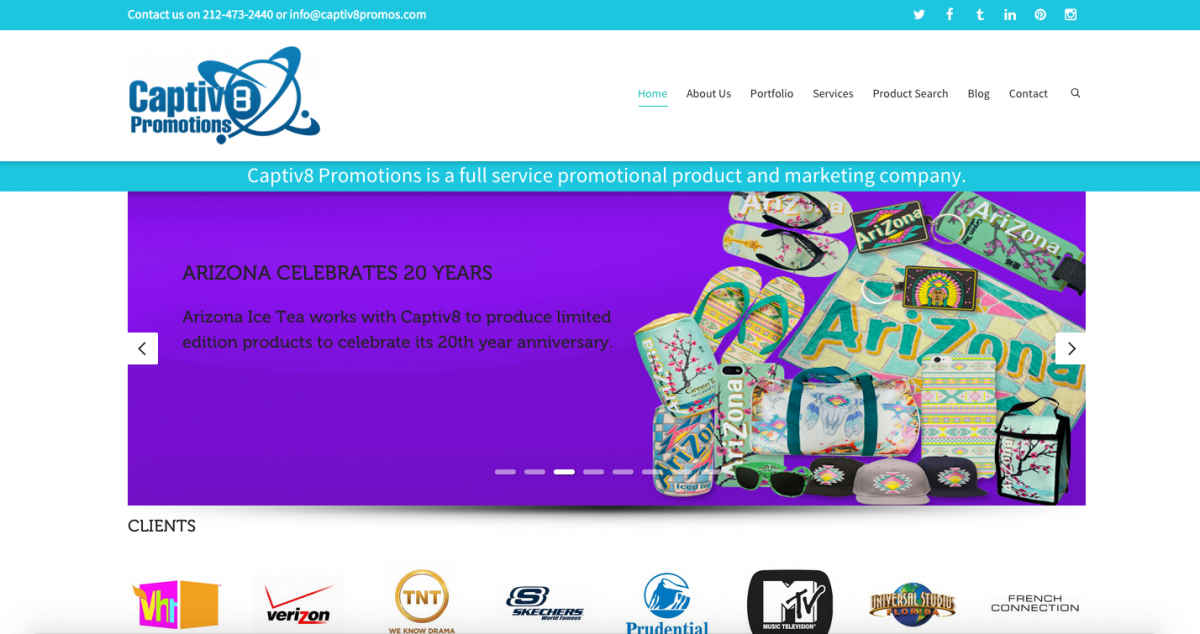
The best way to get the word out about a product or message is social media. In my weeks in my internship had to create layout designs for products the company wanted to display for their Instagram account. One of the three products I had to display was for a company called Loire Valley Wine. I was given the following product to display: tot bag, napkins and sunglasses. I had to get multiple angles of the glasses. I took the camera and took the photos. After I did that, I went to Photoshop to cut them out. Then the designer part comes in, in which I had to figure a layout. I had to do a few different layouts but I had to do ore editing. Juan’s advice was to change the colors to look more lively and together. I agreed because the pictures stock came out darken then the actually product. I learned how to replace color in Photoshop, which made a world of different.


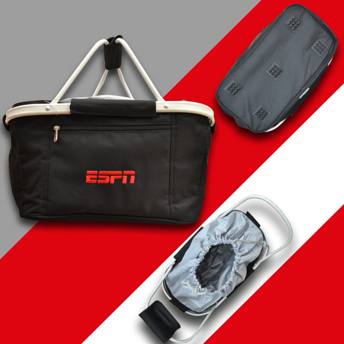
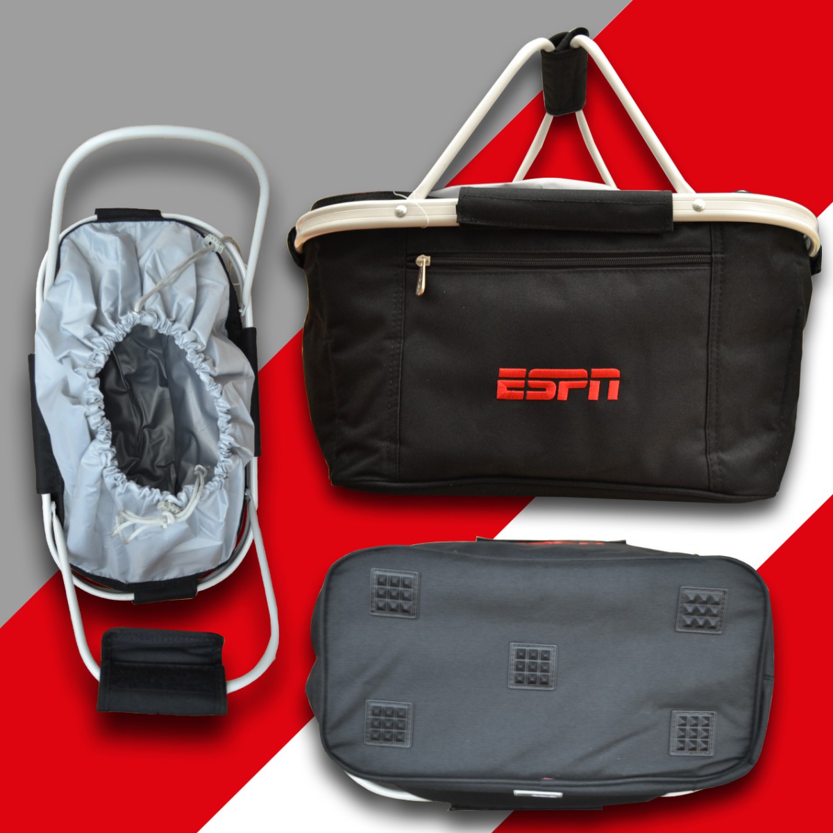
My second display I had to layout was for an ESPN basket. ESPN is the worldwide leader in sports programing. I am a big fan of ESPN as that is the channel I watch most often since I was fifteen. My familiarity of the brand made it easy for me to figure out a design layout for the basket. I had three images to work with. I had the front of the bag, which display the logo. The bottom, which display bottom grip. I also had a bird eye view of the too. This was to display the interior and pull straps. I did multiple design layouts. I incorporated ESPN’S colors and used a design similar to what they use for one of their shows on Sports Center. The design is simple it a slide that uses shapes. I figure that would be the best background. I like the end layout design I came up with for this product.


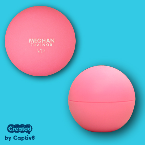
My last product I had to display was a lip balm for music superstar Meghan Trainor. You probably will know Meghan Trainor for her music hit “ All about that bass”. This was a simple layout in which I had to take a photo the top of the lip balm. I also had to take a photo of the side of it as well. After that, I had to quickly layout a design and choose a background that show good contrast. Finally I top it off with a Captiv8 logo. I have to say the instagram layout designs are simple but on social media an image need to quickly grab your attention. Without words, a person won’t know what it is. The image must not only speak to it audience but ultimately want the product because it look appealing.


loire-valley-wine-layout espn-basket3 espn-basket7 meghan-trainor-lip-balm

Flyer!

One of my most favorite assignment and challenging , was flyers design. I say that because even though it gave me difficultly at time I found a way to get the job at the end. Placement is key, just said in a previous blog entry. One flyer I had to design was for a real estate and construction ad on the products Captiv8 can design for these companies. It was confusing for me at first to come with a design because I only could have saw the ad go either real estate or construction only. I had to find a balance that focuses on both concepts in an ad. I looked online to see some flyers to help me spark an idea for layout. After doing so, the ideas started coming to me. I was very proud to use all the skills from Photoshop that I’ve learn from my internship being applied on this flyer because I see it was much more easier it was to design flyer than before.

Another Flyer was for a custom duffle bag that Captiv8 designed. This was supposed to be my first flyer. I had to move on to another project because the layout design wasn’t coming to me. The main factor that made this flyer difficult was the fact that one of the photo I took, I had cut of part of the bag. I later came to this project because I wanted to get it done and I’m glad Juan gave me another oppuruninity to do so. Like I did be before I looked online for reference. I quickly had a great idea that would help create a nice design. I showed Juan and he liked it. I was happy that I finally got this weight off my shoulder. I’m proud of myself for taking on the challenge and succeeding


new-layout2real-estate-and-construction-flyer

Learn something new everyday

One week, a client emailed me a design to do for them. I got information on how they wanted to design their product. A long with template and and pdf of the brand they promoting. However I never designed a phone wipe. Before I started my assignment I had to do some research on what this product is. I obviously knew by the name it was to clean your phone but I was surprise they’re many ways in custom designing one. The client wanted the logo to be one the cleaner that clean the phone. Simple. They also wanted the postcard, which hold the cleaner in the packaging designed. The client had two options. Option 1, the client ask to use various color and have the words “thank you for your gift on top. Also the client wanted the words “ proud history-vibrant future”, on the bottom. I did what they ask for and I also include a similar type font they use and how they played with the word from their pdf file. Option 2, the client wanted a photograph from the pdf on the postcard. Only challenge with that was the position of cleaner. Even though the client said the cleaner could have been placed anywhere. Juan and I agreed its best to place it in the middle because we didn’t know how they cut the postcard in production. All of these steps I spoke about was all done in Illustrator. I just want to share this because I found this assignment interesting because it was something brand new for me to design.


all-wipesSLC_FSL_6584_Postcard-2

Create then Update & Update some more

So you’re done with one clients project. However they want to see something else done a current way. The client has new ideas and wants to see you created them. I had to do this often. It is part of the job. One of the clients I will remember is Berkman & Shapiro Orthdontics. Berkman & Shapiro Orthodontics is a Orthodontics service company in the Michigan area. They had lots of ideas for their t-shirt design. First they want only text on their t-shirts with their brand color. Then, with mix and match of colors. After I was done and a day later they had a new idea. Now they wanted the text in a chalk font with splatter paint with a hashtag they came up with.I did what they ask for and they were happy. Since I added colors they said it would be costly. So I took out the additions color and stayed with their brand colors. Which are purple and green. I thought that would be it but guess what? They had a new idea. Now they wanted to add teeth with braces on the shirt. Juan sent me a picture and I made a duplicated of that image. When I came back to office, Juan told me a did a good job with the shirt designs and that time of the project was done a t a great pace. That is why this project is one of my favorites because I kept on improving project. I also did it in a good time frame. Juan was happy with my progress that meant a lot to me.


t8 Berkman-smile-tshirt-2015-v2 t1 t2 t3 t4 t5 t7 t11 t12 t13 t14 t10

Recreate & Retouch

Along my journey through my internship I also had either recreated or retouch products. One company I had to recreate for was a company called LaMarsa. LaMarsa is a fine Italian cuisine restaurant. They asked if we can help recreate their logo by extending the bottom of the letter “L” to stretch to the letter “a” in Marsa. Which was fun because I like doing logo, but it took awhile because I had to get the right flow on the l shape. Second I had to help recreate a vector file for a print design for a project called Selassie Stand up. I had to outline and color the image by apply color with the shapes i created. I had to make sure it looks a like duplicate of the pdf file. I also had to do the same for a brand called Sport Task Force. Another project was to quickly edit a flyer for Captive Midnite Snax. I had to remove any information that was on the pdf file prior so the company can add new information later. I had to quickly learn how to remove text on a pdf in Photoshop. I have to say I was nervous cause I didn’t know what to do. I took a second and I looked online how to properly to do it. I found out quickly and go the project done in less then 2mins. I was proud of myself. I know that timing is everything along side putting out good work. Finally I had to quickly add Captiv8 logo, social media and contact information on a flyer  School Spirit. Even though it might be small tweak I found how important they are because it the very small details that allows a product to be release. Also it important to remember the small tweaks skill because if you don’t remember it can take project that take 5mins to 30mins. That’s not good.Even though I could forget at times, I practice so I could could do it in my sleep.


LaMarsa selassiestandup Back2School_posters_SchoolSpirit Midnite Snax - Summer 2015 _ 2 Midnite-Snax---Summer-2015-_-2 STF_Logo_YinYang

Madden!

I have been given a small but exciting project. I was going to design for one of the video games I have played since I was in my early teens. I was going to design for EA Sport Madden video game. I had to design a packaging that EA Sport will use for this year game. I had to recreate a football field with plays written out. Finally add the EA logo on the field. I used Illustrator and Photoshop to fulfill my task. Combine with the skills I have in illustrator and the skill I have learned with Photoshop, I was comfortable doing this project. I am just happy I designing something for a game I had played and knowing that it will maybe be used package deal with the game. I don’t know what EA Sports Idea is to use it for but I’m happy to design it anyway.


madden-field

Placement is key!

It’s been a couple weeks into my internship now. I have picked up he pace in my time now that I’m more comfortable in Photoshop. The first couple days within the week I have been doing the web slides for Captiv8 on their homepage. Just like I did for Clif Bars that spoke of in the last entry. I created web slides on the merchandise they had create for brand like Bravado, which is like music brand. Arizona which are known for their various flavor of ice tea drinks. In project I learned how placement is so important. Every item must be showcase so the audience can figure out what are the items. Once you come with a layout it becomes easier to place items properly.


Screen Shot 2015-07-18 at 11.57.27 AM Screen Shot 2015-07-18 at 11.57.45 AM

First day on the job!

Today is June 5, 2015 and I have my first day at my internship. Once I arrived at the address I was confused. You see the address is 57 East 11th street. Once I was on the block the only thing I saw with the number 57 was a furniture store. I know, so I quickly looked on my phone if I was at the right address. I was told myself “there is no way their be an office inside a f furniture store”. I entered the furniture store and ask the cashier if they could help me find Captiv8 Promotions. The gentleman behind the desk laugh and told me it was okay, that he gets people telling him that question a lot. He told it was between his business and the one next store. He also told how to use the intercom system. So I told him thank you and walked to the area he told me to go. No wonder I couldn’t find it. It was like a hole in the wall. What I mean but that is a business being run in a tight area sandwich in to business that represent the walls. Anyway, I pressed the buttons in the intercom system and was buzzed in. Located on the 5th floor is Captiv8 Promotions. I was still early even though I had the mishap. I walked in and spoke with the reception Nicole. I told her that I was here to see Juan, I’m the intern. She told that he was running and she pointed in the area I would be working. So I walk into my area and got myself settled. I took out my laptop and my bacon egg cheese bagel. I know, but understand prior to my summer class I am not use to waking up early. I was hungry and running to get to the office. While I was waiting I asked Nicole if there was a kitchen and she told me there was one. She pointed to the direction of kitchen and I walked towards that direction. The kitchen is tight and small, and staying room only. I started eating and one of the workers by the name of Mary Ann walked into the office and introduce herself to me. She told me I could eat at my desk. I went back to my desk to finish eating my bagel. That was when another worker by the name of Ana came to me and introduce herself to me and all of other staff. I have to say everyone was inviting after meeting them. The atmosphere is very friendly and since it was a small office everyone knows each other. It after meeting everyone I felt more comfortable.


Soon after I was introduced to everyone in the office, I met Juan again. He took a minute to get himself together and call me over to his desk to discuss what my first assignment. My assignment was to design a flyer for the brand Clif Bars. Clif Bars is an organic brand that specializes in health snack bars. I had to take photographs of the merchandise and the create a college. After I’m finish with the flyer I have to use the image and put it on a slide that will be featured on the captiv8 website. Now sound easy right, well for a person who doesn’t normally use Photoshop my skill was up there just yet. It took me a while to finish cut out the images after it was upload. After that I had to come up with a design for the flyer. I’m not going to lie I was second-guessing a lot because I was working mainly on Photoshop. I took a great photo however my flyer design wasn’t coming to me. I tried my best but I knew I could have done better. After doing the flyer, I did the web slide. He like it and that was my first day. Juan showed me what he would have done to the flyer. Even though my work came out good and I quickly learned two things. Time is everything. There is no time to waste. Second I got to pick up my skill in Photoshop.clif-showcase Screen Shot 2015-07-18 at 11.14.14 AM

Lets get started!

Today you will come with me on my internship journey as I blog about it. I will share with you my progress, work and more. What better time to start then right now. I will be interning at Captiv8 Promotions located in Manhattan New York. So what is Captiv8 Promotions? Captiv8 Promotions is company that are leaders in designing merchandise for their clients and then promotion it to the public to purchase or client use only. Before I say anything else I will like to specially thank Professor Stella Nicolaou, she helped me find my internship in the clutch. She told me that Juan Felix of Captiv8 promotions, and that he will be a great guy to work with. After she gave me the contact information I quickly sent him my resume, portfolio and cover letter. Now I didn’t hear anything that day because it was Sunday. I quickly called him first thing Monday morning. We spoke and he was impressed. He asked what day I was free for an interview. I told him I was free on Wednesday. I had my interview that Wednesday after my internship class. I met Juan for the first time and his partner Mike. We spoke in their conference room, which then had a ton of merchandise that they have designed over the years. We spoke for about half an hour about the business and what I will be doing there. Meeting went well and my first day will be 2 days from now. I will keep you updated, so until next time. Peace.


Welcome!

This is the first post on your Learning Blog. Edit or delete it, then start blogging!

The ePortfolio is both a Learning Blog and an Academic Career Portfolio. Use the Learning Blog to document your learning experiences and class assignments each semester. As time goes by, add content to the Academics and Career sections to show your department, graduate institutions, or future employers how well prepared you are for your chosen career.

NOTE: Remember to add appropriate Categories and Tags to your posts. This will help your professors and other visitors find the content they are looking for. The Categories “Coursework” and “Field Trips” and the Tags “OpenLab” and “City Tech” have already been applied to this post. Feel free to make changes!