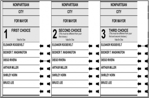
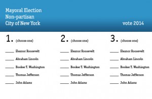
Here is the voting ballot I chose to redesign. The original seems to confusing and the type is too pinched and squeezed to fit in the boxes. The check mark area seems strange as well. I decided to use the existing layout to the best of my ability while cleaning up the design and adding some clarity for voters.


