I chose the quote, “The only impossible journey is the one you never begin” because I like how the quote is interpreted to tell people that nothing is fully impossible. It is only impossible if you never try it out and don’t give something a chance. I also see it as to how you have to push your own limits and test yourself to do the impossible and make it possible.
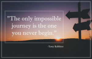
For thi s first visual, I chose this background because I liked the lighting in the background. The picture seems mostly bordered by darker colors and then in the center, is bright with the sun on the horizon. The silhouette of the arrows also stands out since it’s closer to the point of view and clear to the eye. Therefore, I put the text in a slightly opaque border to keep it simple so that it didn’t distract from the background image. I put the originator’s name outside the box so that the quote is the main focus of the visual.
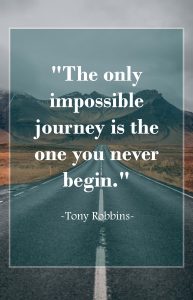
 For this second visual, I chose this background image because I liked the path of the highway showing that there is a road that can lead to anywhere, almost like a mysterious path to something new. I thought it related to the quote because the path of this road is like the journey in the quote. If you don’t try to go somewhere new then you should not say it’s impossible.
I added the opaque color of the bluish/teal color because the color scheme was similar to the original background image. It nicely blended out with the image and the light border gave it a little differentiation between the text box and the background picture.
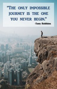
For the last visual, I chose this image because it looked really daring and scary from that angle of the photo. I thought of my experiences of going hiking and going on ledges that I would’ve never imagined on going but thanks to my br other, my declination was not an option. Although I definitely have not been in the situation of the person in that picture, that daring but I felt it was close enough to how I experienced my trips and with the quote, it really shows how nothing is impossible.
In this image, we can see I put the text in the top part so that we can analyze the image as well as the quote better since it seemed to better relate to each other in a way.


