Swiss-style Poster/ Thoughts on Project 4

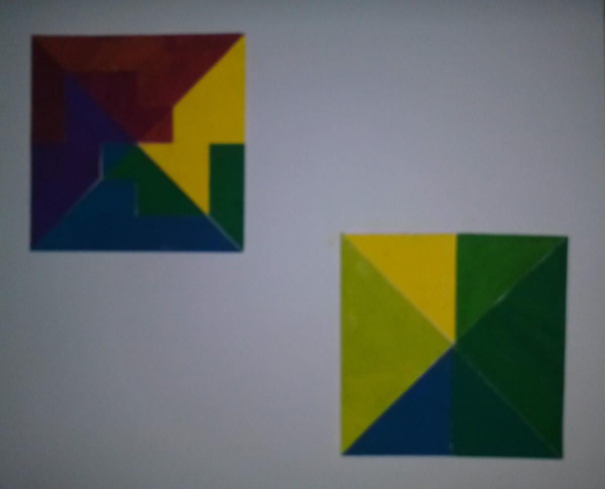
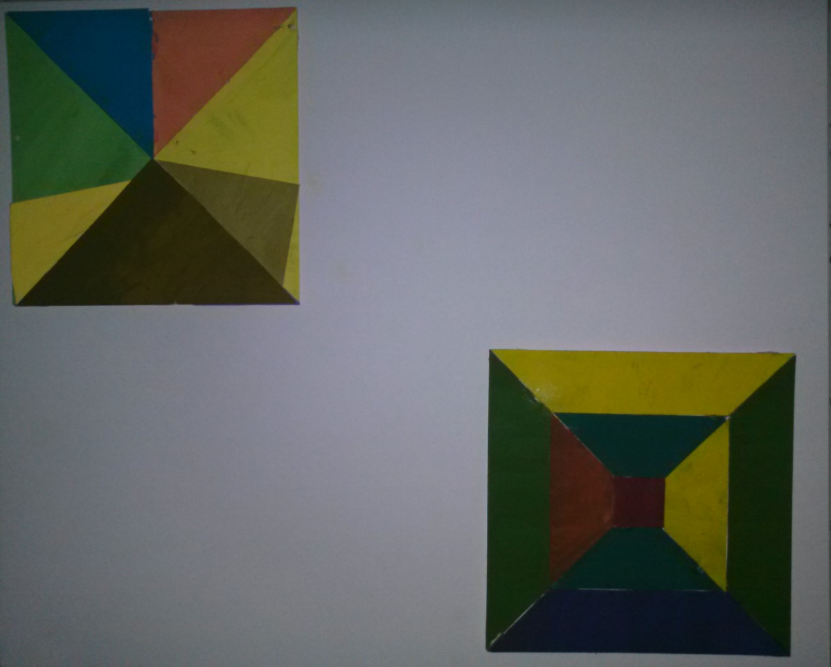
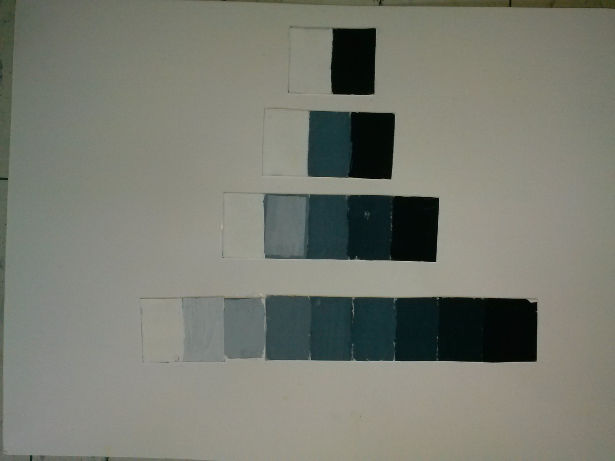
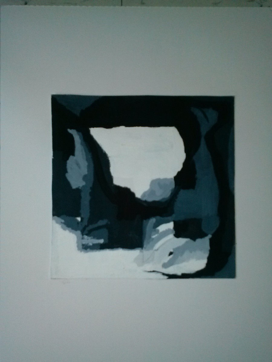
This project has been real interesting. It has taught me how to truly appreciate colors. Before we started, I thought that there was only one color, and I could rarely tell the difference between different levels of saturation. While painting the muted colors, I learned how even a little amount of white, or a little amount of a color’s compliment can drastically change the color’s hue. I feel that in this project that if I could have planned out the arrangement of the elements in the paintings, which would have helped the colors shine better. Planning would of also helped me ensure that I had enough of each color to paint everything I needed. All in all, I feel that this Swiss-style poster culminates the ideas and techniques we learned in this project.

Silent Rain

Silent Rain

Total Work Hours: 10-12 hours

2 Comments

Filed under Assignment 4, Coursework

Prismatic Color paintings

Getting the pure colors was the easiest of the three painting sets. I personally feel that the narrow range is the best of the two paintings. Although the broad range is very well organized and compliment each other really well.

2014-04-07 12.08.09

Leave a Comment

Filed under Assignment 4, Coursework

Muted color paintings

I wasted a lot of paint trying to get the mixtures right for this collage, but once I did it, I really love the way the colors complement each other. My broad range feels like the best of the two paintings

2014-04-07 12.05.58

Leave a Comment

Filed under Assignment 4, Coursework

Greyscale

This was a relatively simple endeavor in which we used the paints for the first time. I had difficulty mixing the paints, but once I figured the ratios for the middle gray, it became much easier to mix them.

2014-04-09 12.11.49

Leave a Comment

Filed under Assignment 3, Coursework

Digital Collage recreation/ Thoughts on Project 3

This was the easiest of the collages to make, since it was based off of my narrow range collage. We used Photoshop to recreate it the image digitally, and I was very pleased with the end result.

I had trouble on two parts of this project. The first difficulty I had was arranging the pieces of the cut-out pictures into a collage. It took several attempts, but in the end I was able to get a flow that works, and although I could improve the detail of the paintings, I feel that it was very successful. This digital collage helps us see how the value of each piece matters, since even the slightest change in color can have a great affect on how the colors shift and blend. Overall this project helped me to see the importance of a pieces value. Adding even the smallest amount of white to a piece can through the entire composition into disarray. This is why it is important to establish a hierarchy and a sense of motion so that the white can make sense in the black, or vice-a-verse.

igarcia_Value_added

Total Work Hours: 12-15 hours

Leave a Comment

Filed under Assignment 3, Coursework

Collage Painting

I pick my broad collage to paint. This would allow me to have more fun with the paints. I feel this was the most successful, although I would like to add more detail to it in the future

2014-04-09 12.13.14

Leave a Comment

Filed under Assignment 3, Coursework

Collages

After printing out 5 pages with our faces on them, we set out to work on making collages based off of them. Due to the quality of my collage, I used a low key template in my collages. This also made the Broad range collage very difficult to create

Narrow Range

Narrow Range

Broad Range

Broad Range

Leave a Comment

Filed under Assignment 3, Coursework

Museum Trip choice- Italian Futurism

This exhibit catches my attention do to it’s relation to both this course, and to my major classes. Although no actual buildings came form it, the conceptual designs have fueled architecture, and art for many many years. As we go through the exhibit, we will be able to see how these pioneers helped shape the later part of the century, such as Gaudi, and Filippo Marinetti. To discover it’s origins and foundations, help add to the beauty of this exhibit. The Guggenheim Museum’s architecture lends itself to the display of this multidisciplinary idiom. Taking its cue from the Futurists’ concept of the “total work of art” (an ensemble that surrounds the viewer in a completely Futurist environment) and their aim to achieve a “reconstruction of the universe,” the presentation integrates works in multiple mediums on all levels of the rotunda. This unique features all contribute to the enhancement of this exhibit.

Leave a Comment

Filed under Uncategorized

Animated GIF

Animated GIF

Animated GIF

It’s a Wonderful World – Louis Armstrong
Take Me Out – Franz Ferdinand

1 Comment

Filed under Uncategorized

High Key/ Low Key

IMG_20140310_124325

In this picture, the overall tones are low key. The shadows seem to try to overtake the light (seen at the top) and envelop the subject hidden in the darkness. The darker areas are clear because of this.

2014-03-10 12.39.00

Due to the back being very bright, the mullions of the curtain wall stand out. This make the focus go to the the mullions (due to the stark and sudden contrast between the darker and lighter tones) against the more high key background. This also is just a great few out onto DUMBO, and Brooklyn Heights

Leave a Comment

Filed under Assignment 3, Coursework