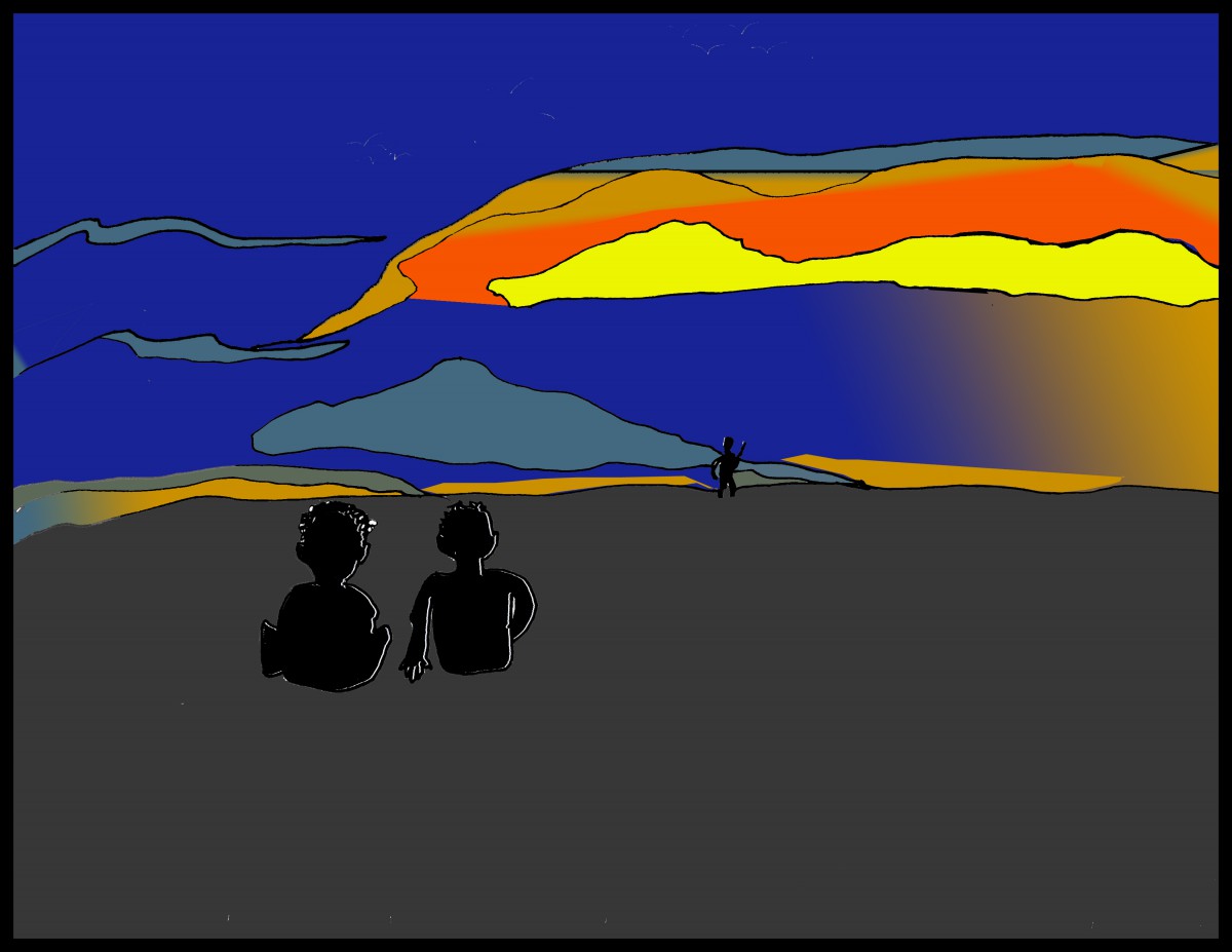
Memory of a sunset in Nicaragua
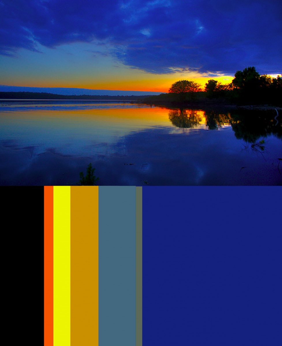
For the final part of the assignment, we had to pick an image, and do a color inventory of an image. We then needed to take this image and use it to illustrate a harmonious moment in our lives. I picked a peaceful moment of one time I was visiting Nicaragua. There, me and my cousins had been playing on the beach all day. As the day slowly turned into the night we just sat down into the sand, and looked at the horizon. It was such a peaceful, yet harmonious moment for me, seeing how the sun set over the beach which had only until moments ago held so much heat energy and life. It was a great memory, from a great day.
Hours Worked: 10 hours