https://drive.google.com/file/d/1X4srWj3G5c_bWiOZR1bMw0q__xJyfO8T/view?usp=sharing
Author: Henry (Page 1 of 2)
The third thing that I learned from my internship is to always have patience with your supervisors. When I was finished with my 120 hours and I had to fill out my time sheet. After I was done I message my supervisor Jennifer on the Rock app. I told her I completed my hours and that here was my form. I told whatever you have time can she sign the form and sent the form back to me, please. Two weeks later she still hasn’t sent me the form but every time I sent her the form. She would rely right away upon saying “got it and thank you.” I assumed she would send it to me a couple of days later but she did not. Later I found out that she was waiting for me to send her my final evaluation form so we could have a one-on-one. Everything works out for the best because of Crystal’s message to me with more changes to the Bollywood X Mas post. So I add more hours to my timesheet which by now over 120 hours. The lesson for me is don’t always assume the worst, and always check with your supervisor before you make an assumption.
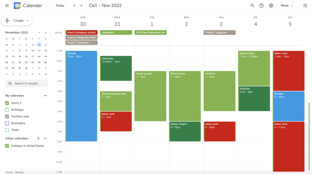
If you have a Gmail account you have probably heard and know about Google Calendar. Google Calendar is one of many google apps that comes when you sign up for a google account or a Gmail account. The amazing thing about all of this is that it’s completely free. All you have to do is sign up for an account. I haven’t used google calendar that often until I got into CUNY City Tech college.
When I was taking the Design Studio class last semester my professor made us use it. At first, I hated it because I don’t like scheduling things in general. I usually have a good sense of when stuff is the due mentality in my mind up until Design Studio class. I was taking four classes last semester including Design Studio. I have never taken Design Studio before and after I did I never had a class like that. It was a tremendous amount of self-research, homework, assignments, and projects in a single class. There wasn’t anything we were designing until after midterm. I thought I could handle and manage it all without some form of scheduling or planning app. Toward the midterm, I was in full panic mode because I had so much more work than I expected. I thought I had enough time to complete all my work before the midterm deadline. Not until I decided to take my design studio professor’s advice and finally use the google calendar app. I first put in my course hours which were 4 of them. Are hours I can’t change because they are classes? Then I put in the Google Calendar all the major assignments and projects due. I would then look at all the free slots in my weekly calendar and put in available time works to do my assignments and project. Google Calendar was useful for physically seeing the due date on a calendar and how much available time I actually have instead of mentally in my mind.
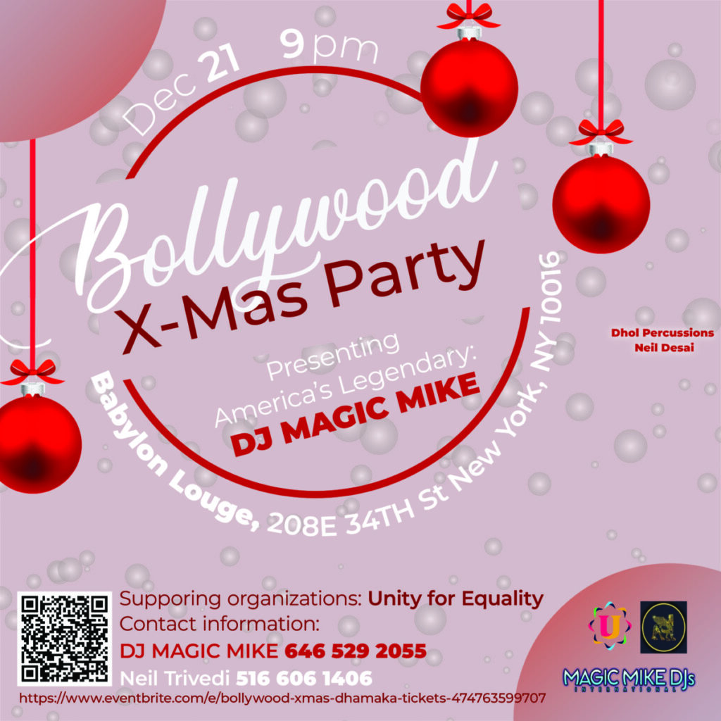
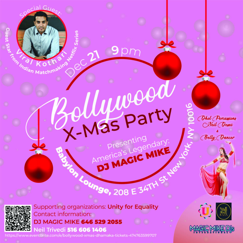
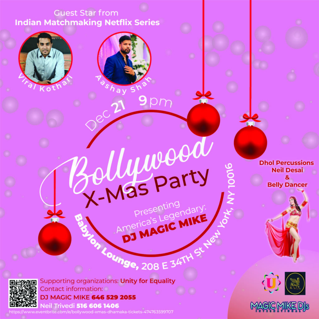
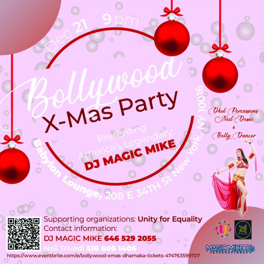
The second thing I learned from my internship at Unity For Equality was that when designing for a client is not about your design but about the client. You are not designing for yourself but for the client. At the end of the day, your client is the one paying you like a job. Even if you disagreed with the design choices of the client, you sometimes have to look beyond that. See the whole thing as part of your learning process and gain experiences. Until you found the one job you are looking for. When I was working on the Bollywood X Mas post I disagreed with my supervisor’s design request to keep on changing my original design. The Instagram post is only 1080 pixels by 1080 pixels and that doesn’t leave enough room for the amount of stuff they wanted me to add to a single post. It was frustrating but in the end, I’m just an intern learning and gaining real-life experiences. It’s funny to think I took on this project because I wanted something for my portfolio but in the end, it wasn’t as good as I thought. The lesson learned from my end is that later when the same situation occurs just do it for the experience until you wait for the next opportunity to come.
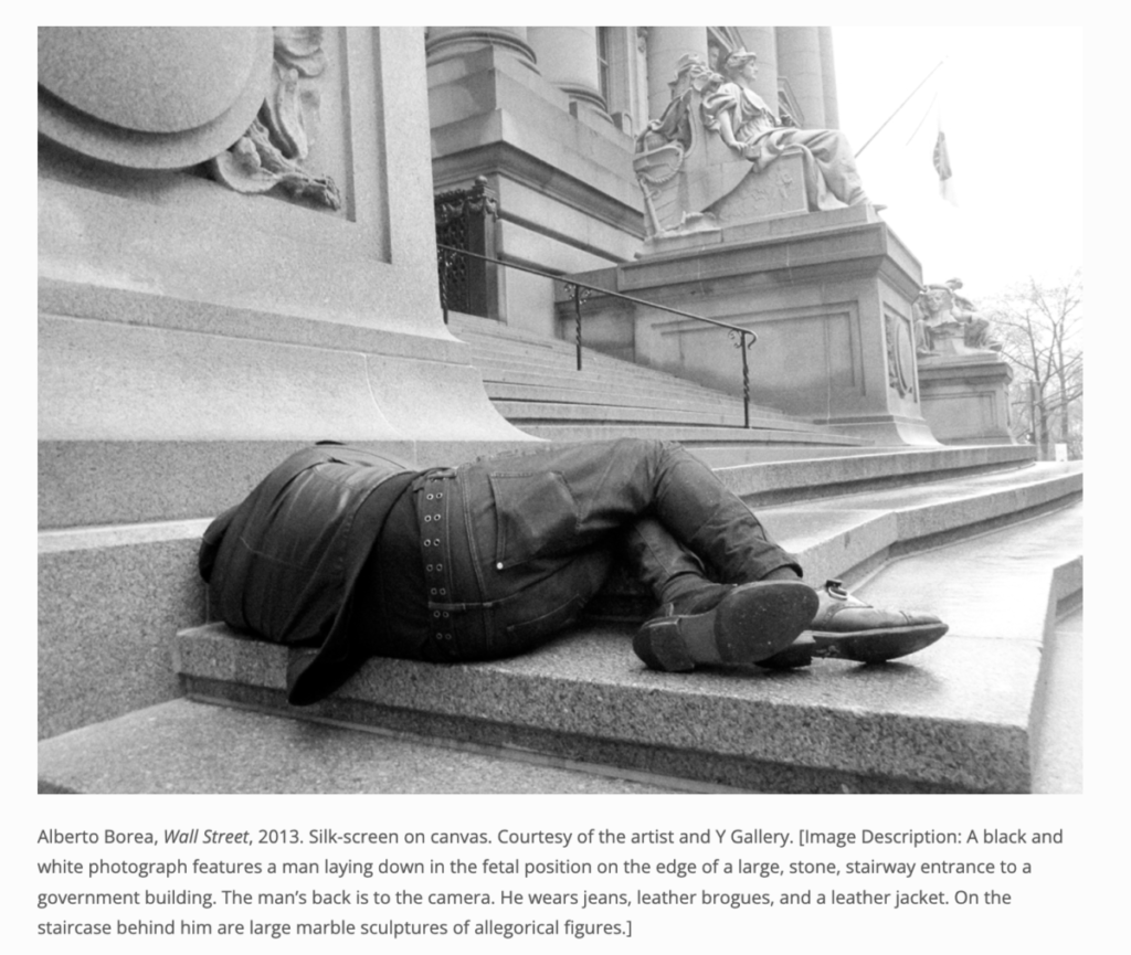
The virtual exhibit I visited was THE 8TH FLOOR and they are an independent exhibition that was established by Shelley and Donald Rublin in 2010. They are more of a modern exhibition showing “artistic” and “cultural initiatives.” The first artwork I choose is by Alberto Borea called Wall Street, 2013. The image is a Silk-screen on canvas. The photograph is in black and white of a man lying on the ground on a grand stone stairway to a government building. He wearing black boots, a leather jacket, and black jeans. The canvas is supposed to represent all the free public museums and activities that are given free access to all the citizens living in NYC. Looking at the diversity in NYC and all the different types of people living here. Everybody with their own culture and traditions. When I start looking at the black-and-white picture I thought it was a homeless person sleeping in front of a government building. Until I look up close and saw that he was wearing a nice black jacket and good-condition boots.
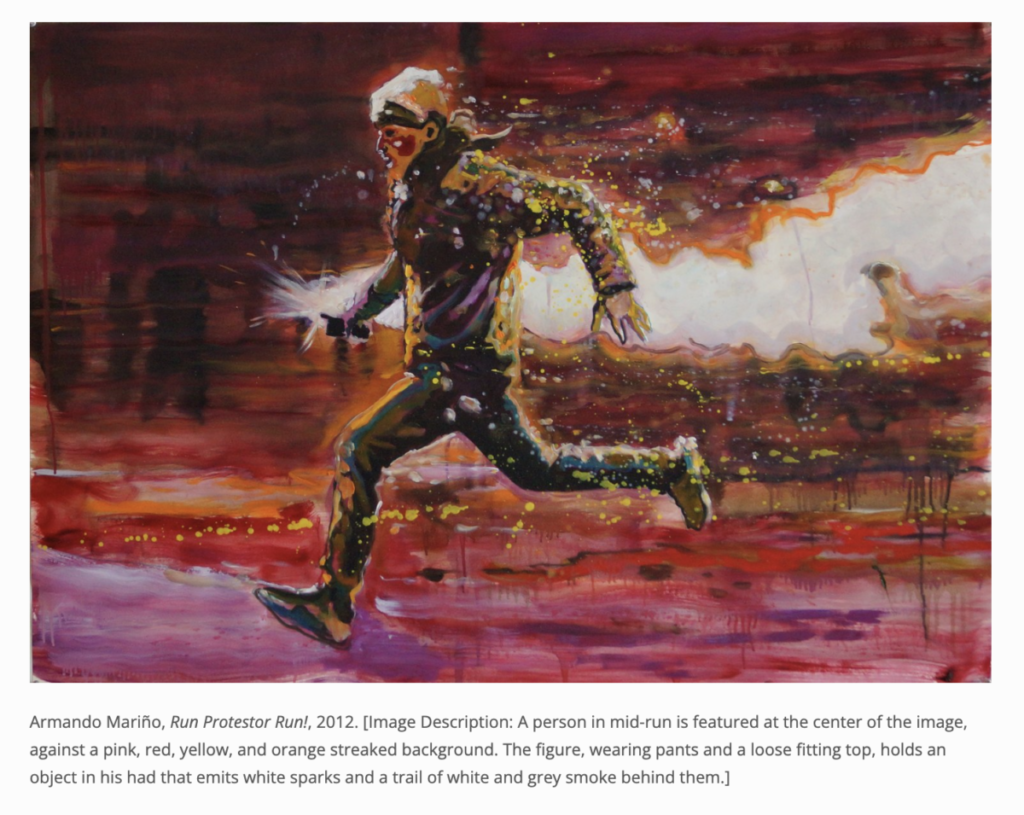
The second artwork is a painting by Armando Marino called Run Protestor Run, 2021 in the 8th Floor Exhibition. The painting is a person running with an object in his left hand that appears to be a white flare. The whole painting has an amazing range of colors of pink, red, yellow, and orange glare on the background. The painting has so many emotions and tensity that you can almost feel the adrenaline of the man in the painting. This is a large-scale painting that includes a “13-foot diptych.” Marino’s canvases are painting of people in mass protests and show his painting how violent it can become from a peaceful protest to a violent one.
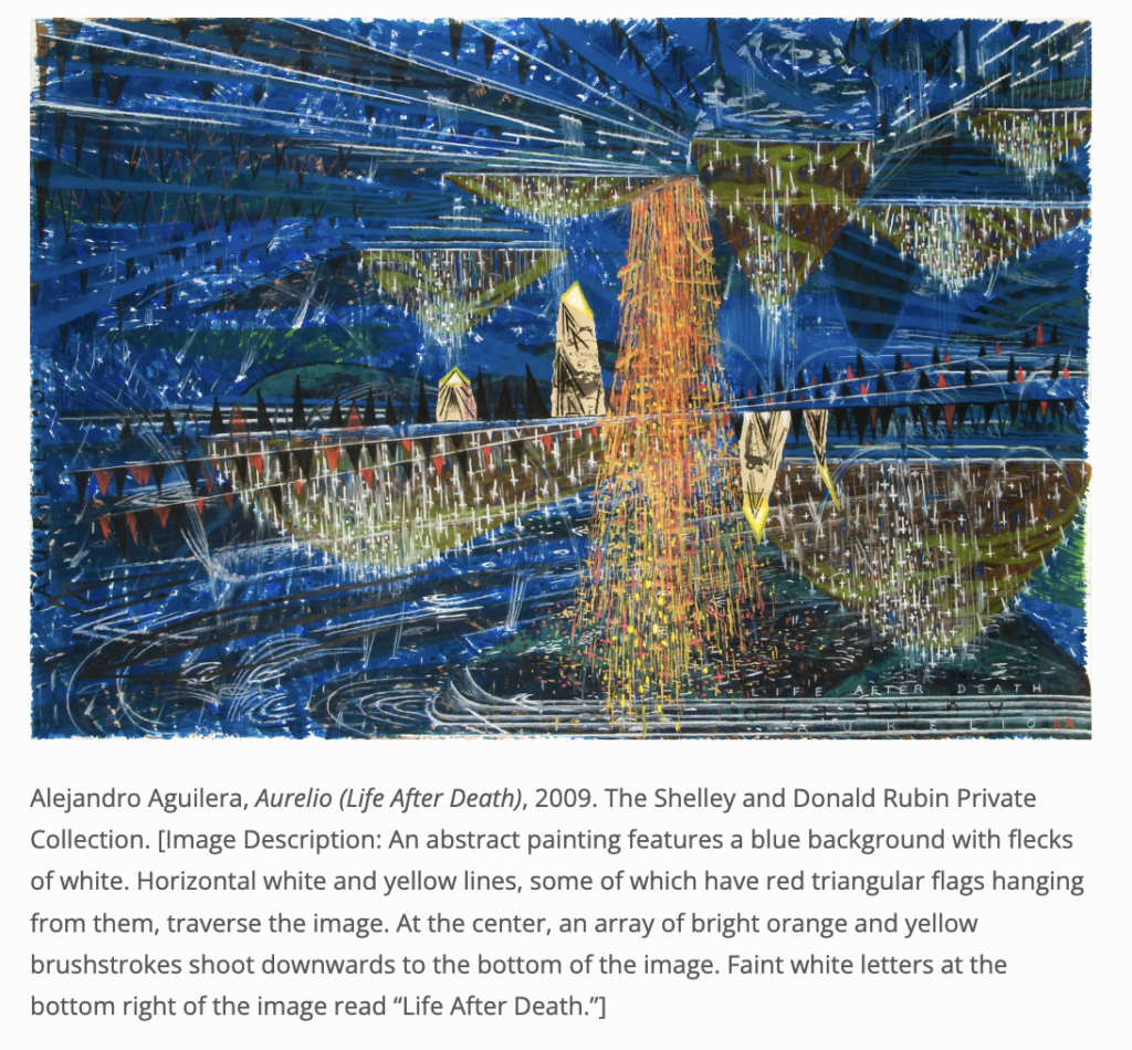
The third artwork is by Alejandro Aguilera, Aurelio called Life After Death, 2009 in The 8th Floor Exhibition. The artwork is 1 of 400 contemporary works of abstract painting with a background of little sparking white paint. The background of the painting is the majority of different shades of darker blue color paint. The center is a ray of orange and yellow brushstroke that appears to be hanging on the ceiling like a chandelier. According to the artist his painting is inspired by “sacred and isolated places around the world.” To me, the painting looks like a huge opera theater with many levels of seating. The orange and yellow brushstroke looks like a huge chandelier hanging from the ceiling of the theater. I love the contrast of the blue background compared to the orange and yellow brushstrokes.
I have been using Pinterest since my freshman year of high school. It is my go-to app for inspiration and mood board ideas. I used it socially and educationally. Socially part I would send funny pictures I find on Pinterest to my friends and family. Every time you search for something on Pinterest it gives you a great selection of what you are looking for. It gives a color palette, other designs, examples, etc. I definitely would agree that Pinterest is better than google when searching for ideas and mood boards. Google search engines sometimes give you the most random things that you did not even search for. Sometimes it can be overbearing. Pinterest is free and all you have to do is sign up for an account. I always use my Gmail account to sign up for apps because then all of them would have the same password. I would just easily remember the password and not forget it. When you create an account you can save each image to your own mood board. It will be forever saved in your account as long as you don’t delete it.
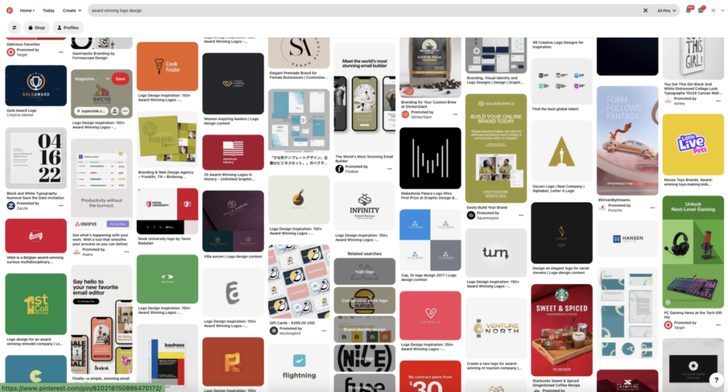
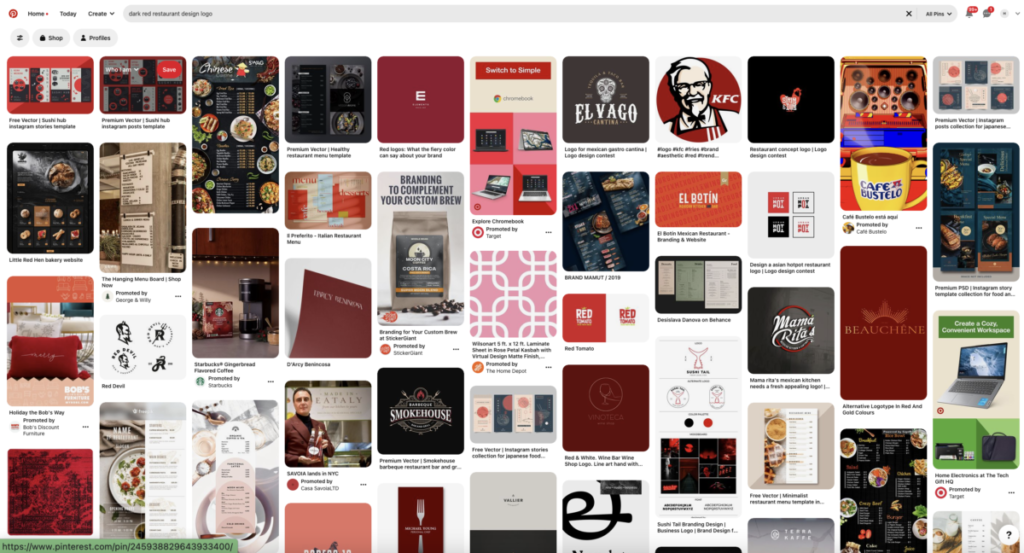
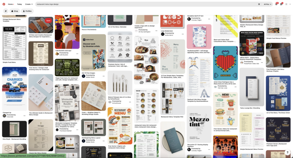
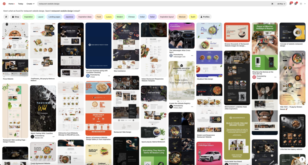
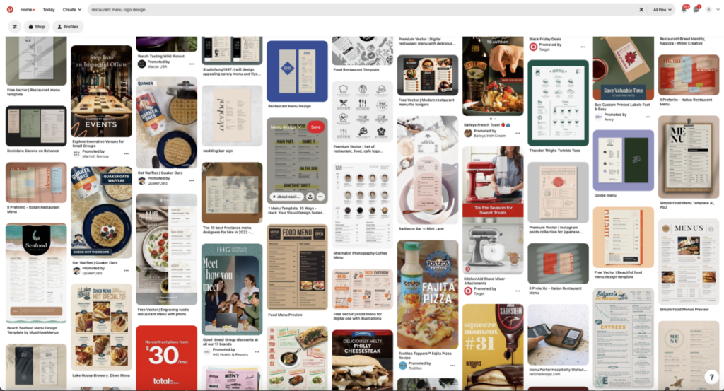
I just finished my senior project this semester and for my research in my process book, I used Pinterest. I would search and search every time for inspiration for logos, mock-ups, menus, ads, and color palettes. The platform is very resourceful and for personal experiences, I always love it for ideas. I haven’t had a bad encounter with the app so far and it has just been so useful to me during my senior project.
The images below are some of the mood board searches I used for my senior project this year.

For this internship at Unity for Equality, I did not have to perform any clerical duties. The reason I believed that I did not have to perform clerical duties because everybody is meeting remotely on Zoom. It might have been different if this was an in-person internship where maybe be a front desk and a clerk upfront. I would think the supervisor may ask one of the interns to manage help the desk or something similar to it. A typical day for my internship is pretty much the same as my college work since we were meeting on zoom. Instead of emailing a professor, I would message my supervisor using the Rock app which is very similar to the Slack app. I would do the work using adobe cloud programs on my computer just like I would for school projects.
I learned that you always have to be respectful and professional when talking or messaging your supervisor just like you would to your professors. You want to give them your respect as they are someone with more experience than you. Every time I message one of my supervisors I always put Mrs or Mr in front of their name and write “Hi” instead of “Hey” to be more respectful. I learned from my professor when I took Design Theory class that writing “Hey” is too casual and “Hi” is more professional. I always want to make a good impression when talking or messaging everybody in the profession. Just in case, later on, you need a recommendation for education or job purposes.
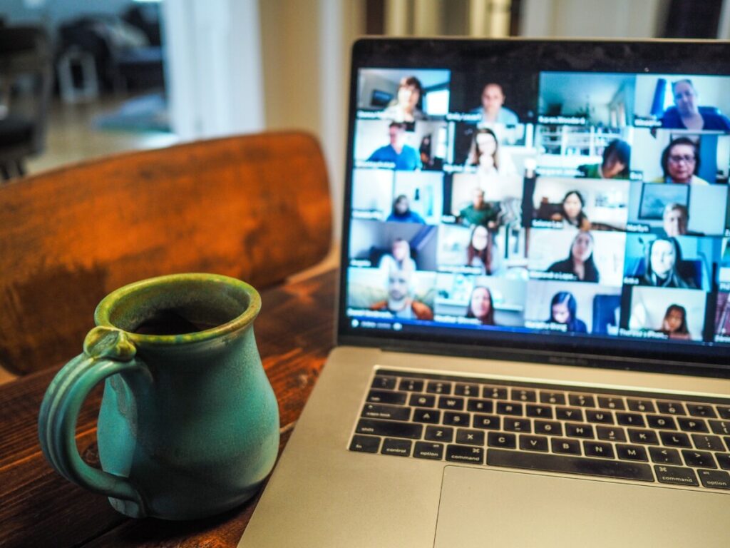
I attended one of the team meetings they have at the beginning of every month. The meeting was hosted on zoom and they would send out the link through their messenger app The Rock. Three full-time members were hosting the meeting, and only one other intern and I were there. The founder is Neil Trivil, Crystal Global Brand Ambassador, and Jennifer my supervisor who is the head of the Strategic Engagement Department. The meeting was awkward because at first, it was just me and I thought all the other interns would attend. First, everybody introduce themselves and how they found the organization. They talk about the organizations and all the events coming up for the holiday. They said that Fall and Winter is their busiest time of the year.
After I realized that everybody in Unity for Equality was a volunteer and they are not getting paid as well as me. I had a huge respect for everything that is a member of the organization. I thought that at least some of the members of the organization were getting paid but that was not the case. I think that since they are all volunteers, they must have a full-time job somewhere to make a living. They are all making time to help the organization out of their day to help people that are less fortunate than them. Crystal was a huge role model for me because she was the first person I work someone besides a professor that apply to my major which was graphic design. She was the first real-world experience I had that felt like working for a client on some kind of graphic design project. I know that not everybody is going to be as nice and understanding as Crystal was to me.
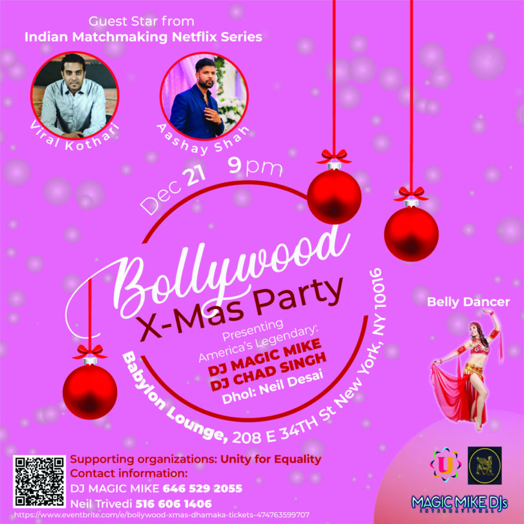
Here link to the event
https://www.eventbrite.com/e/bollywood-xmas-dhamaka-tickets-474763599707?aff=erelexpmlt
During my internship, I didn’t receive a collaborative project. However, I did work on a project that required a lot of communication back and forth with one of my supervisors. The project was a lot of work and I have finished 120 hours already. Two weeks afterward I completed the project I was still making changes to the project. I was a little irritated because my senior project was due soon and I had a lot more deliverables I needed to do for my senior project. Furthermore, I was also working on my portfolio in portfolio class. If this was a paid internship I would have felt different, but this was an unpaid internship. I didn’t want to complain, so I told my supervisor I could only work on the post at night around 8 pm to like 11 pm. I had to prioritize my schoolwork first over my internship work since this was my last year before I graduate and I was finished with my hours. Good thing my supervisor was very understanding and she was fine with me working late at night on the project.
The project was an event that the Unity for Equality is supporting and the event was called the BOLLYWOOD XMAS DHAMAKA on Dec 21 at 9 am at this hookah bar/restaurant. Crystal the Global Branding Ambassador asked if I had time to do this project and I replied saying I did. I just didn’t foresee that there were going be so many changes and alterations to the post after I have completed the project already. Overall, I did think the post I created for them is a success because it was exactly what they wanted and I did exactly how they wanted. That doesn’t mean that I agreed with the design choice Crystal had me change. In my opinion, they were trying to put a lot of information into a single Instagram post which is only 1080 pixels by 1080 pixels. That is not a lot of space for the number of texts and images they wanted me to add to the Bollywood X Mas post.

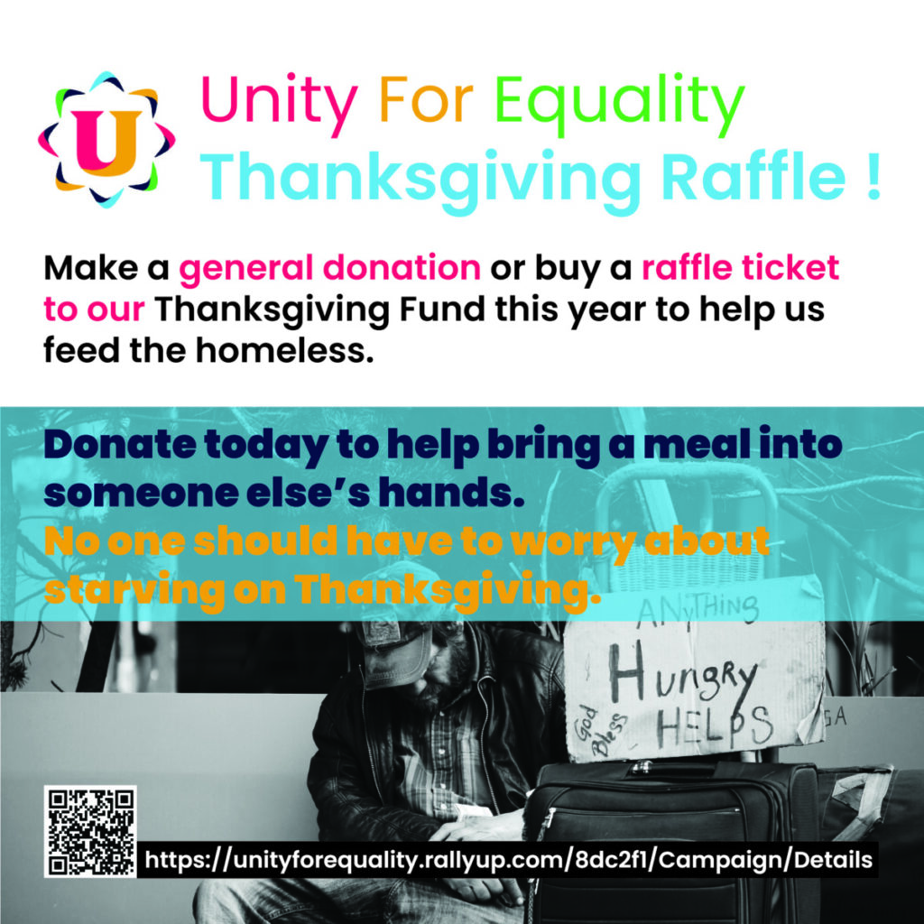
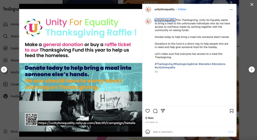
I was asked by Crystal who is the Global Branding Ambassador for the organization to do an Instagram post on their official Instagram for their Thanksgiving Raffle this year. Unity for Equality is doing a Thanksgiving Fundraiser to help feed the homeless and people who do not have “access to subsistence food at all” this Thanksgiving Year. They have created a website explaining where people can donate or purchase raffle tickets. When purchasing a raffle ticket, people have a chance to win prizes like iPhone 14 pro, a Unity for an Equality Lifetime membership, and an Apple Airpod pro.
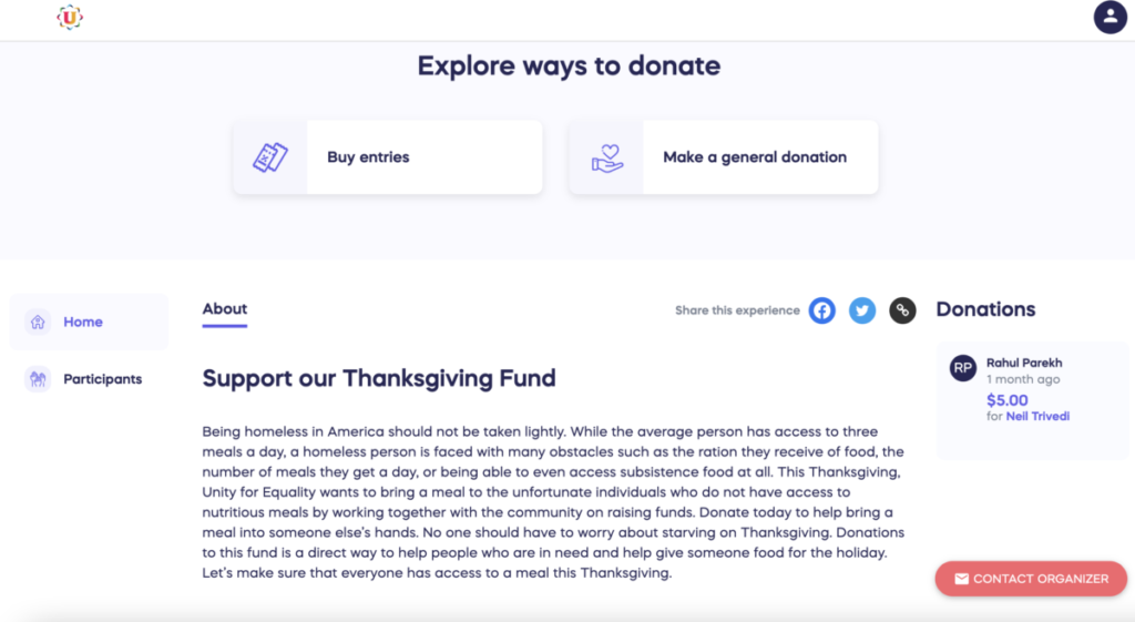
I think overall I did a good job on this assignment because there was a lot of communication back and forth between Crystal and me. When I finished the post I send it directly to her email and she would give me feedback right away. I would first send her a message using the organization message app Rock. Then I would send a pdf and a jpeg file using the website Wetranser. Before I started working on the post I first did my research on other design posts on their Instagram page probably done by other interns. When I was doing my research I realized that majority of their post had some form of image and great color contrast of texts. Then I went back to the website and read all the information again and pull out the most important message from the website. I used Adobe Indesign to create this post because it is easier to use the image frame and grids in Indesign compare to Illustrator. When designing anything for this organization, they want us to make sure we follow the company brand guidelines which I did. Only using their company color palette and typeface.
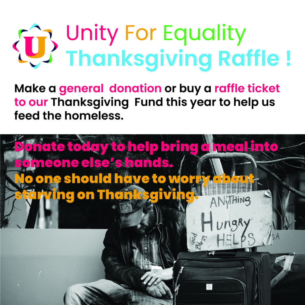
This was the first draft of the Thanksgiving Raffle Instagram post I sent her. She replied back that she love the color, the message, and the image I have chosen. Afterward, she did mention that the text that I placed on the homeless man image was difficult to read. Probably because of the color choice I made. I did have a feeling that it was going to be a little hard to read from the color. I think the reason because both of the colors were super bright neon which created some form of illusion that made it difficult to read. To fix the problem I created the backdrop over the texts over the image which made the text easier to read. Crystal agreed and the last thing she want me to add to the post was the URL to the Thanksgiving Raffie website and a QR code that links to the website as well. This was the final result after I made the changes to the texts and add the extra bit of context from Crystal.
