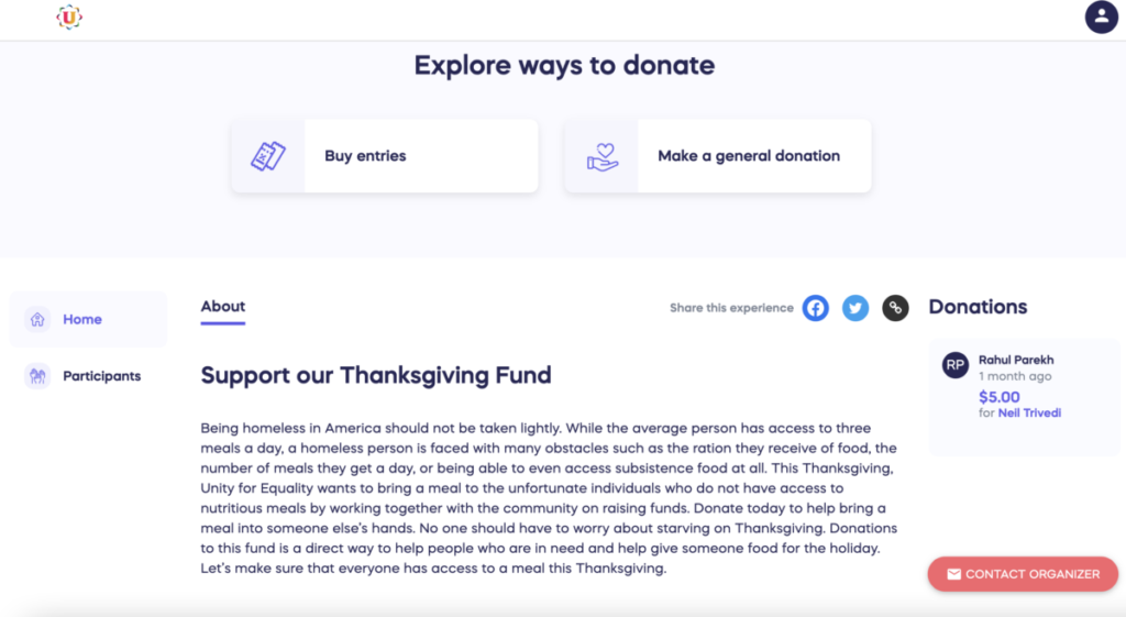
I was asked by Crystal who is the Global Branding Ambassador for the organization to do an Instagram post on their official Instagram for their Thanksgiving Raffle this year. Unity for Equality is doing a Thanksgiving Fundraiser to help feed the homeless and people who do not have “access to subsistence food at all” this Thanksgiving Year. They have created a website explaining where people can donate or purchase raffle tickets. When purchasing a raffle ticket, people have a chance to win prizes like iPhone 14 pro, a Unity for an Equality Lifetime membership, and an Apple Airpod pro.
I think overall I did a good job on this assignment because there was a lot of communication back and forth between Crystal and me. When I finished the post I send it directly to her email and she would give me feedback right away. I would first send her a message using the organization message app Rock. Then I would send a pdf and a jpeg file using the website Wetranser. Before I started working on the post I first did my research on other design posts on their Instagram page probably done by other interns. When I was doing my research I realized that majority of their post had some form of image and great color contrast of texts. Then I went back to the website and read all the information again and pull out the most important message from the website. I used Adobe Indesign to create this post because it is easier to use the image frame and grids in Indesign compare to Illustrator. When designing anything for this organization, they want us to make sure we follow the company brand guidelines which I did. Only using their company color palette and typeface.
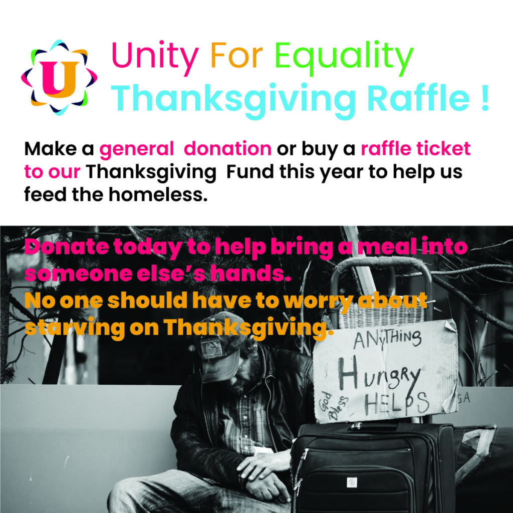
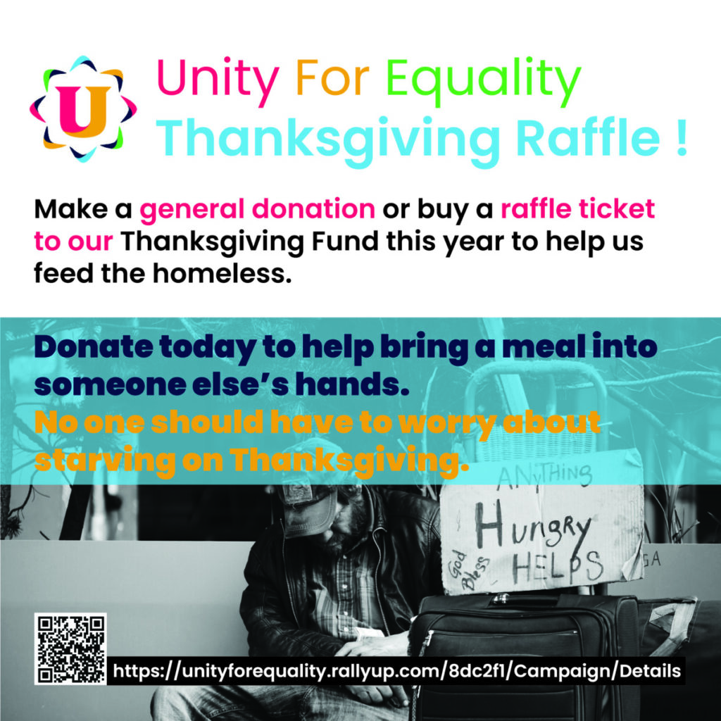
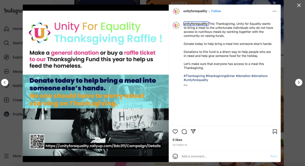
This was the first draft of the Thanksgiving Raffle Instagram post I sent her. She replied back that she love the color, the message, and the image I have chosen. Afterward, she did mention that the text that I placed on the homeless man image was difficult to read. Probably because of the color choice I made. I did have a feeling that it was going to be a little hard to read from the color. I think the reason because both of the colors were super bright neon which created some form of illusion that made it difficult to read. To fix the problem I created the backdrop over the texts over the image which made the text easier to read. Crystal agreed and the last thing she want me to add to the post was the URL to the Thanksgiving Raffie website and a QR code that links to the website as well. This was the final result after I made the changes to the texts and add the extra bit of context from Crystal.


Leave a Reply