So, all of these are essentially visually enhance quotes of “We Are One” Let’s take a look at these to start the class. I want you to notice the following:
• positioning of the type relative to other elements on the page
• alignment of all on the page to each other
• contrast–is the design high contrast? and, if so, what elements generate the contrast
• is there any use of repetition of elements in the design
• any visual cliches in use from last week’s handout?
• what attracts your eye first?
• Do you think the design is effective or ineffective? Provide a reason for you answer
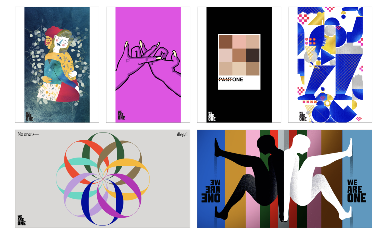
Pick three of the designs that you like, post them on your Openlab site under the heading We Are One response and write about one of them responding/answering the elements that I listed above.


Leave a Reply