Our Broken Economy, in One Simple Chart

Summary

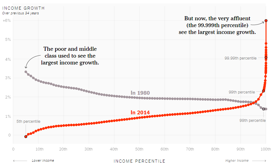
In this New York Times Article, “Our Broken Economy, in One simple Chart”, David Leonhardt explains how income growth is almost flat for the poor and middle class, but it seems to be skyrocketing for the top 1% of earners. The article is very interesting because Leonhardt not only exposes what is going on at the present moment, but also compares the current situation with the situation in 1980. The changes are shocking. In 1980, the poor and middle class used to see the largest income growth, but 34 years later, in 2014, the largest growth corresponds to the 99.99th percentile that happens to have a 6% income growth a year. At the moment, the 50th percentile has an income growth that is below 1%, which is not very promising.

The article is highly productive because it makes the reader reflect about why income distribution has changed drastically in the last four decades.

Graph

How the Graph was Used in this Article

The way the author used the graph in this article could not be better. The graph is a clear visual representation of the point that the author wants to make. By looking at the graph, it is easy to realize that income growth distribution changed drastically. The grey line represents income growth in 1980, and the red line represents income growth in 2014. It is easy to see how the grey line was decreasing, but the red line in increasing. Also, what catches the reader’s attention the most, it is how the red line skyrocketed in the 99.99th, which represent the very wealthy.

Link

https://www.nytimes.com/interactive/2017/08/07/opinion/leonhardt-income-inequality.html

How Statistics Relate to Computer Science

As a Computer Science student,  I have to admit that Statistics is highly important in my field. In such a way that some universities offer a joint major that combines both subjects.

In the first month of classes, I discovered that a huge part of the material that we are learning in our statistics class overlaps with the material of Computer Science classes such as Data Structures and Algorithms. As an example, the concept of Venn diagrams is a key concept in the class previously mentioned (Data Structures and Algorithms). In our class, Statistics, we went over it in order to understand the way values are distributed in a clear way. Other concepts, such as “and” or “or” operators, are also present in Computer Science.

My ambition after graduation is to get into the industry of video game programming. In that field, statistics and probability are key. One of the exercises that we are working on in this class is the probabilities of numbers when rolling two dice. I discovered that the probabilities of getting number 2 are six times less that the probability of getting number 7.In game programming, engineers work with random values, that can come from more than one set of values. Thanks to Statistics, I now know that if a random value is coming from two different set of values, as in the case of the two dice, the final results are not going to be equally distributed.

I think that having a strong foundation of Statistics is key in order to be a successful programmer.

Graph on Newspaper

Graph on Newspaper – The Economist – September 2nd, 2017; Volume 424; Number 9056; Page 19-20

Short summary

The article talks about:

  • how the climate on earth is changing and leading to more natural disasters such as storms, floods, extreme temperatures, droughts and forest fires
  • the models used to predict weather may need to be changed. Most are based on the assumption that the recent past is a good guide to the future. This assumption appears to fail now that we’re in the midst of the global warming. The article suggests that extrapolations from tail events have been too conservative. This is an important issue for civil engineers who are at risk at under-designing bridges, roads, dams and buildings.
  • The article raises questions about predicting the weather behavior in the future.
  • The article mention that in the moment there are more questions raised about how to predict the weather in the future than possible answers.

Reproduction

The Economist – Frequency modulation

‘The likelihood of floods is changing with the climate’

2nd post Stat w Prob – Pic

Description of the graph in the article

The graph #2 describes:

  • the number of global record-breaking precipitation events, compared to the 15-year moving average
  • the chart shows that the earth experienced many more record-breaking rain storms between 1990 and 2010 than each year. It did during 1950 – 1990
  • the article uses the graph to illustrate that climate warming is leading to an increase in the number of storms.

Link to the original article

https://www.economist.com/news/briefing/21727922-both-future-and-past-may-be-more-extreme-was-thought-likelihood-floods


How Statistics and Probability is related to Nursing

Statistics are a way of viewing and understanding data that provides information and insight as to how one event relates to another. In the nursing profession, the use of statistics directly affects patient care and advocacy efforts to advance the profession.

Nursing practice is increasingly based on empirical evidence that demonstrates the most effective protocols for patient care. Clinicians must have a basic understanding of statistics to be able to read, understand, and interpret the relevant literature. Armed with statistics, clinicians can determine if commonly used methods or protocols should be revised based on the relevant research. For instance, a hospital may change its policy to replace an IV line every 24 hours if a study shows that replacing the IV line every 20 hours reduces the risk of infection by 20 percent.

Systematically collecting, analyzing, interpreting, disseminating, and using health data is essential for understanding the health status of a population, for assessing progress, and for planning effective prevention programs.

Within public health, statistics and probability are seen as powerful ways to understand the relationship of geography to such issues as health outcomes, disease transmission, and access to health care.

Today’s nurses also need a working knowledge of nursing statistics for the profession to evolve and improve. That’s why students enrolled in nursing degree programs at Citytech must take a course in statistics. As the amount of clinical research published each year grows, nurses are expected to incorporate evidence-based practices in hospitals, clinics, nursing homes, physicians’ offices, and other settings.

Welcome to Statistics with Probability

In this course, you will learn about data. We will discuss how to collect data briefly, but the focus will be on analyzing and making inferences.

As a theme for the course, I chose sperm counts. The openlab icon for the course shows the how the chance for autism and schizophrenia changes with the age of the male. The data displayed in the graph were collected in Iceland. Here is a link to a summary of the Nature article from 2012 and a NYT article summarizing the findings.

The time-series displayed in the header of this site shows the trend of sperm counts and health from 1989 to 2005 in France. Here is the blog from which the graph comes with a longer discussion of the issue. This is quite alarming considering that the period studied is only 16 years long.

How do the 2 graphs differ? Are their any similarities? Can you write a paragraph which combines information from both graphs? What are some of the critical questions you might ask about these 2 studies?