In this course, you will learn about data. We will discuss how to collect data briefly, but the focus will be on analyzing and making inferences.
As a theme for the course, I chose sperm counts. The openlab icon for the course shows the how the chance for autism and schizophrenia changes with the age of the male. The data displayed in the graph were collected in Iceland. Here is a link to a summary of the Nature article from 2012 and a NYT article summarizing the findings.
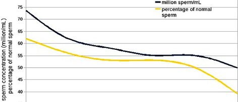
The time-series displayed in the header of this site shows the trend of sperm counts and health from 1989 to 2005 in France. Here is the blog from which the graph comes with a longer discussion of the issue. This is quite alarming considering that the period studied is only 16 years long.
How do the 2 graphs differ? Are their any similarities? Can you write a paragraph which combines information from both graphs? What are some of the critical questions you might ask about these 2 studies?

