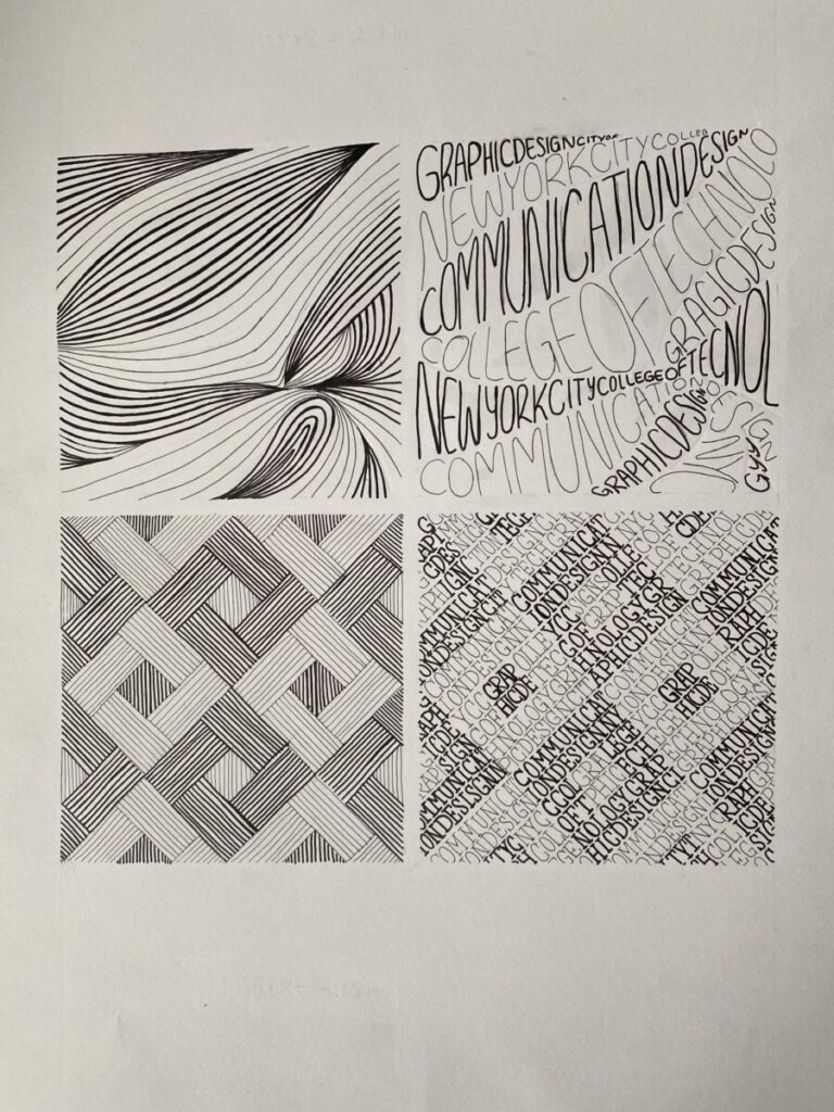
Step 1 Description: Pattern
This pattern reminds me of the tiles on a kitchen wall or bathroom wall. I would mostly associate it with a kitchen. Either way, the pattern is very geometric and solid. This pattern looks like the flatter kinds of tiles. Not the kind that they would have to paste down piece by piece. It would not be the kind that is shiny or reflects any light. I would say it is more dull and flat. Which does not make it boring, however it depends on one’s preference.
Step 1 Description: Texture
This is the kind of textured blanket you would receive at a hotel possibly. Perhaps it is thin and cold. It is not the thick kind that would keep you warm on a cold NYC morning, or the fluffy kind that you can feel a weight on top of you. That good kind of weight that feels like better quality. However, I’m sure it gets the job done. Overall, this blanket would be flexible and flows more than anything solid like a rock.
Final Thoughts:
Overall, I enjoyed the concept of this project. I think the final products look very graphic. I think I understand more about how to fill in shape with text or lines. This restriction to fill it in with only line/text forces the mind to find different and creative ways to do so. Once I created all of my sketches, I was able to compare and choose my favorite designs. The inking would have been the most tedious part of the project. I would like to have a much more steady hand to keep some lines cleaner than they came out. I am definitely a perfectionist, so I would’ve liked as much neatness as possible. Never the less, I enjoyed the learning process throughout this project. You can fill in shapes (and keep the shape) through text/lines rather than coloring in.


The tile description is very relatable and your type pattern drawing is really good…the flow is on point!