


Final Thoughts:
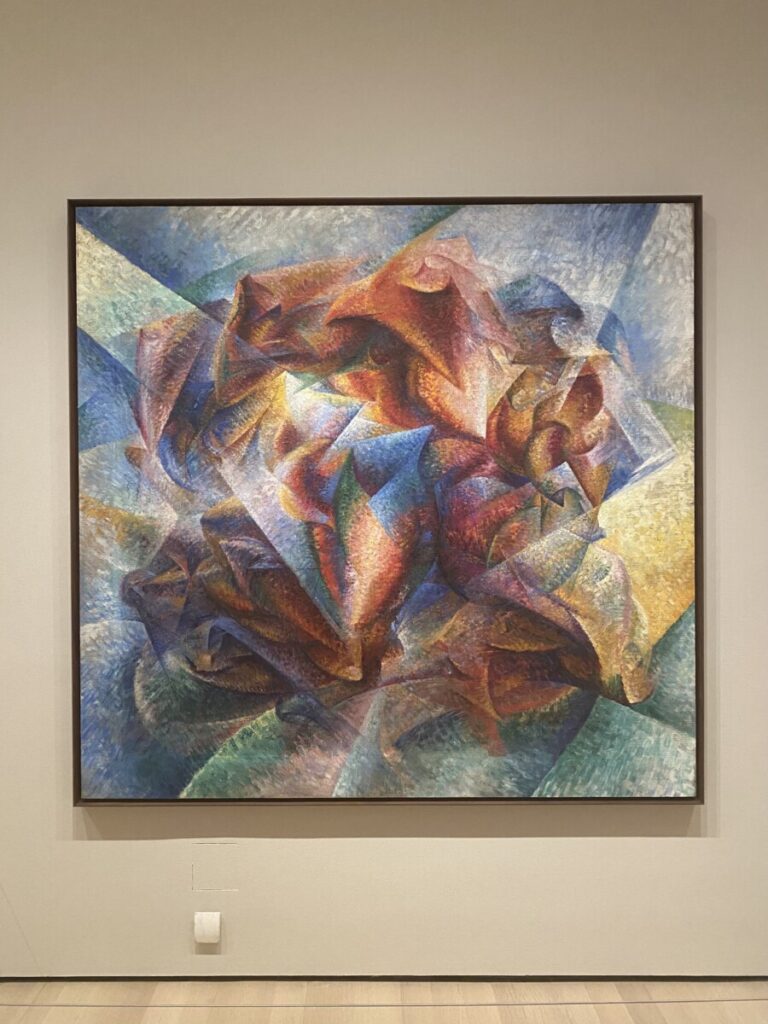
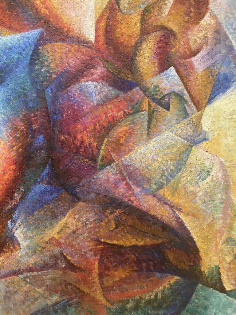
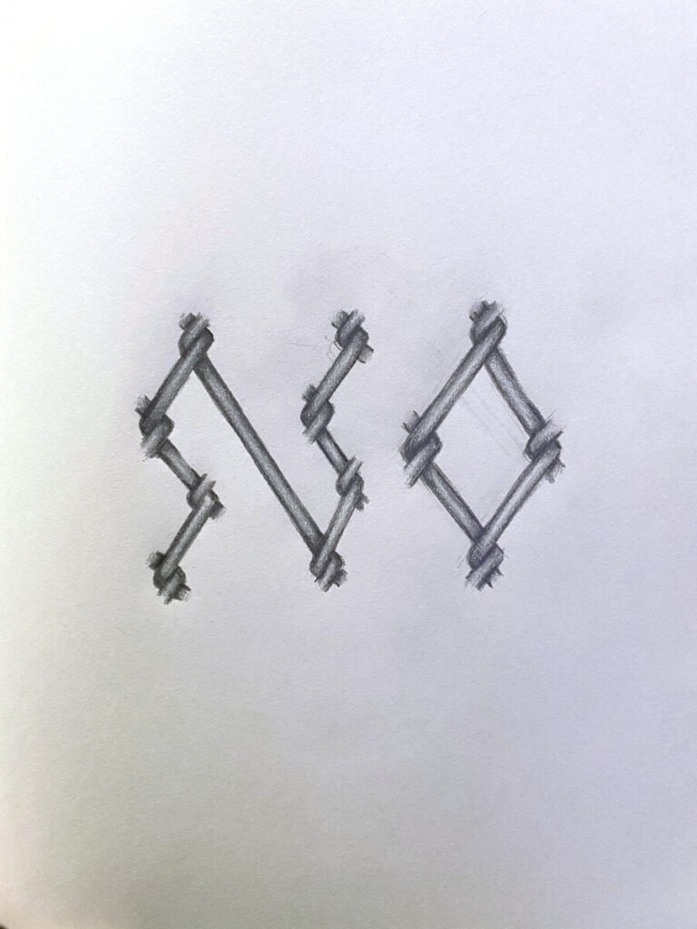
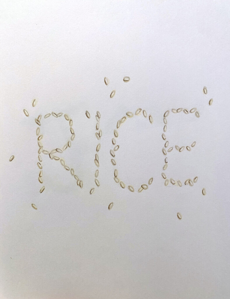
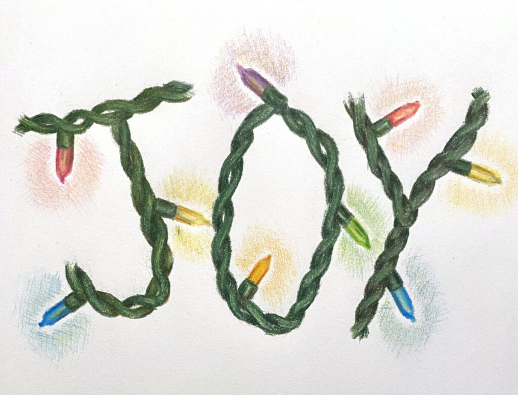
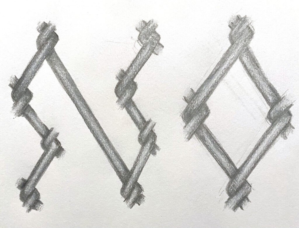
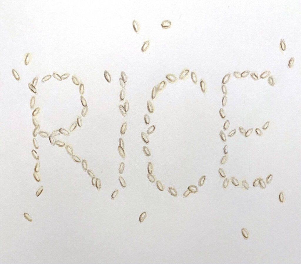
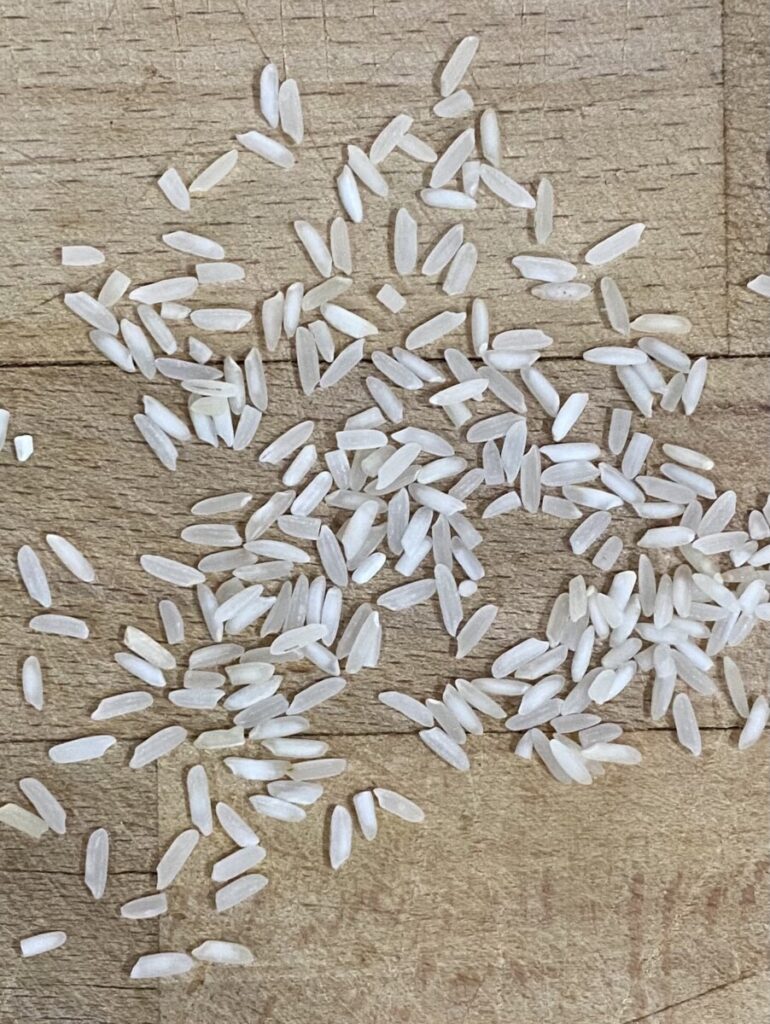
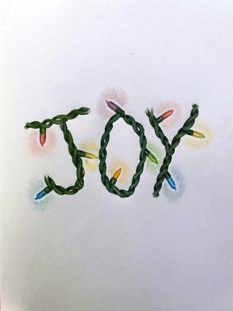
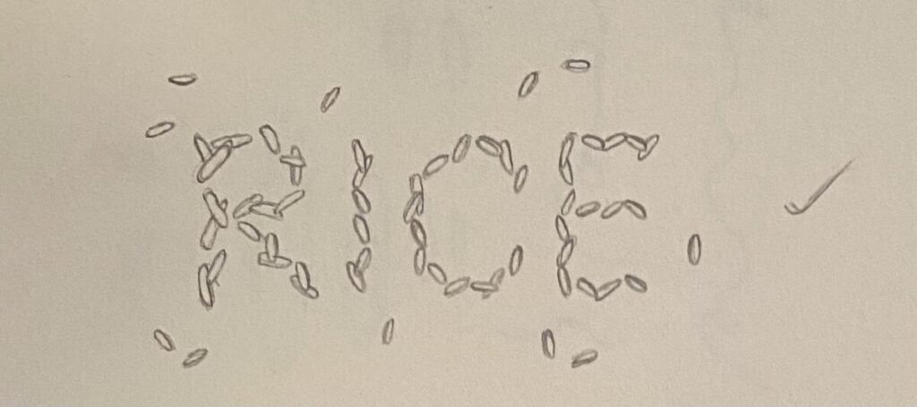
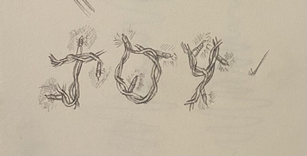
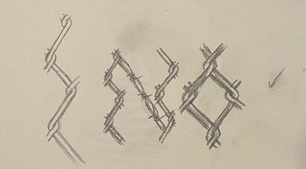
The themes from other projects seemed similar to this one on Imagination. For example, the text filling in a shape, (Project 2) and also, exploring color (which is what we did in Project 4). I enjoyed the freedom this project had to explore our imagination, by making a typeface out of our surroundings. The most difficult part for me was to look around for things I can use to make typefaces. However, once I found things and took my pictures, thats where the fun began to create it myself! I sketched out my ideas, from outlining a line drawing, to listing colors I’d use before beginning the final. In my designs above, I used Prisma Color Pencils to make the details as realistic as possible (like my photographs that are also above).
Overall, I never find myself to be a very creative person, so this project was definitely challenging for me. It forced me to look deeper into my surroundings for typefaces that I could possibly create. In addition to finding references in my surroundings, I needed to learn to use them to create typefaces that may not have been there. Once I took on these challenges of my own, being able to create my designs was the rewarding part for me. After all, usually the difficult work is what pays off the most, and I believe this project portrayed that in the best way. It was fun and creative, and overall rewarding!


FINAL THOUGHTS:
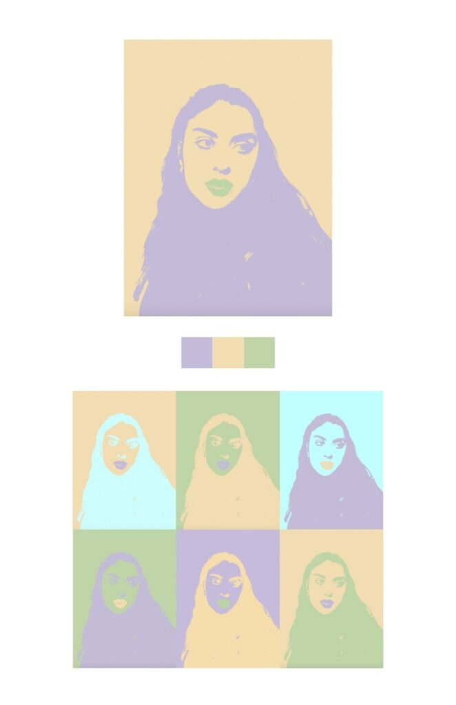
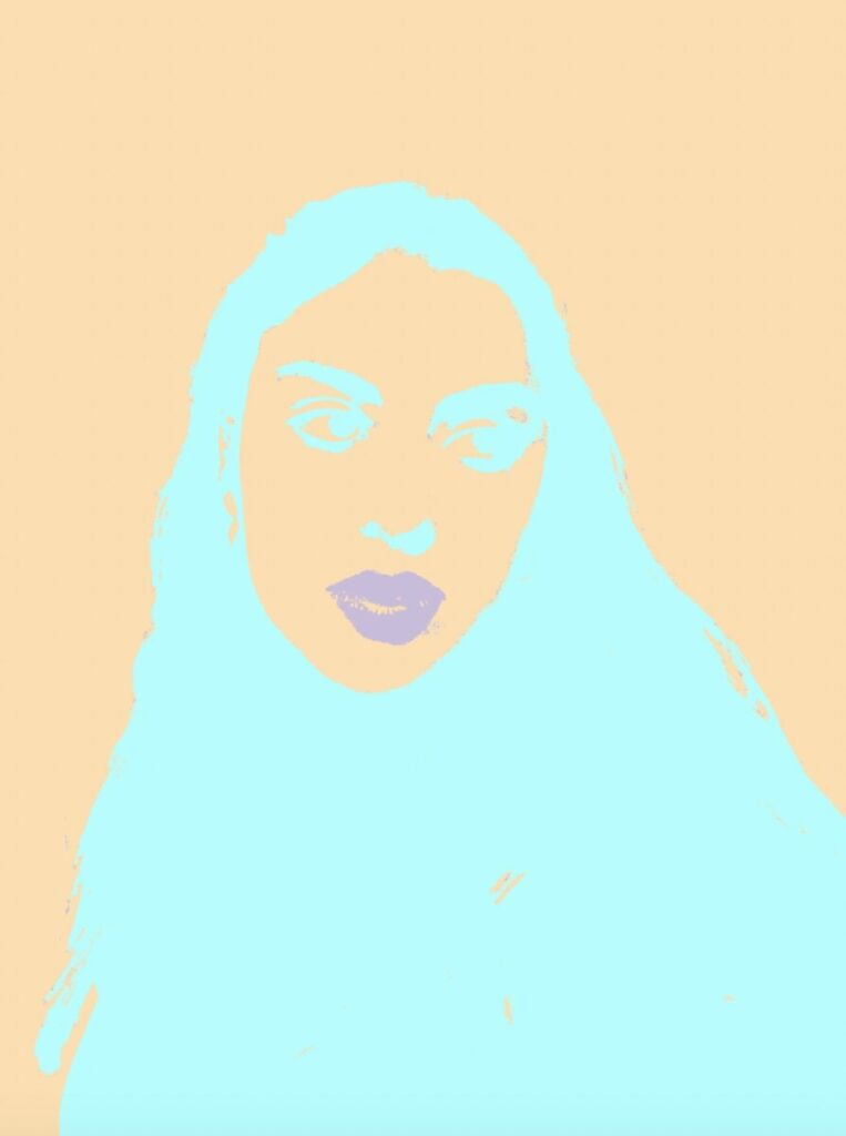
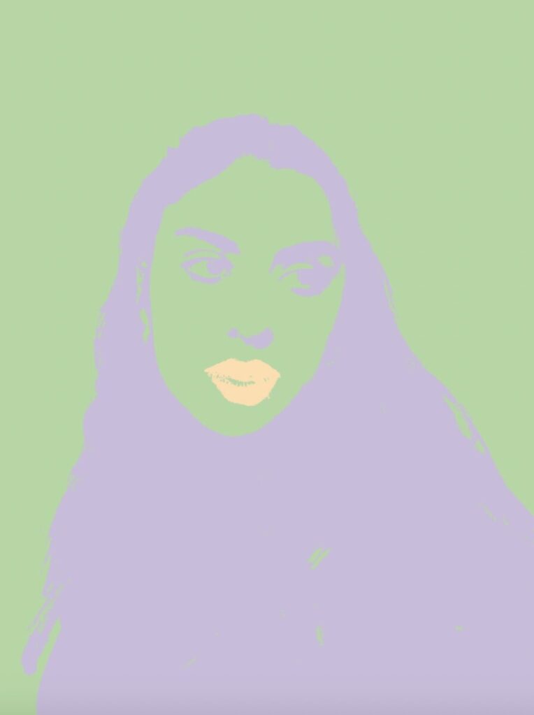
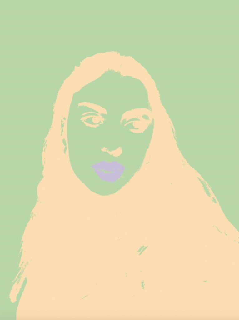
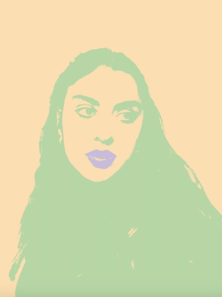
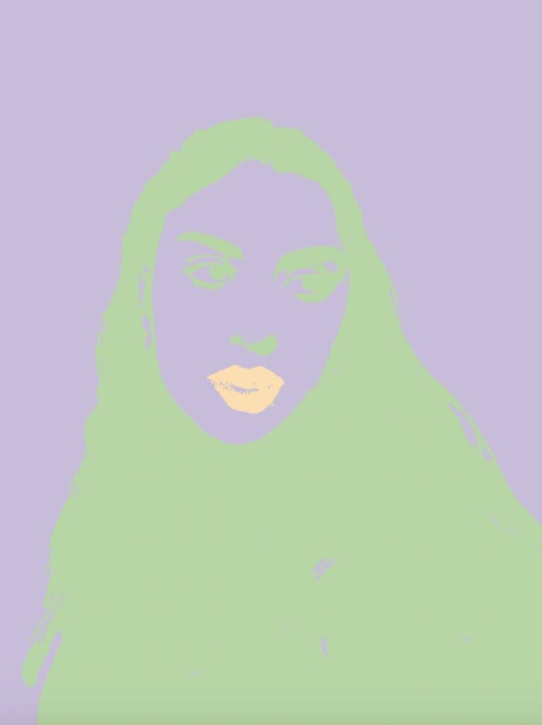
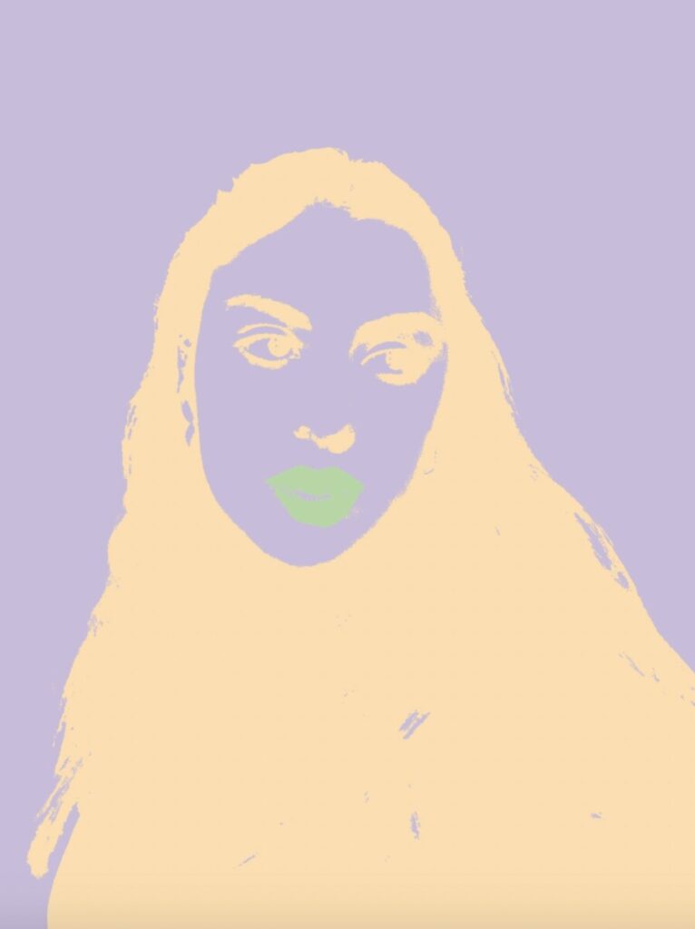
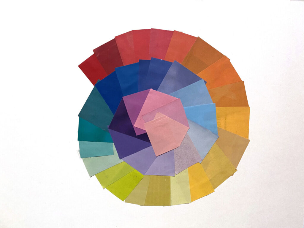
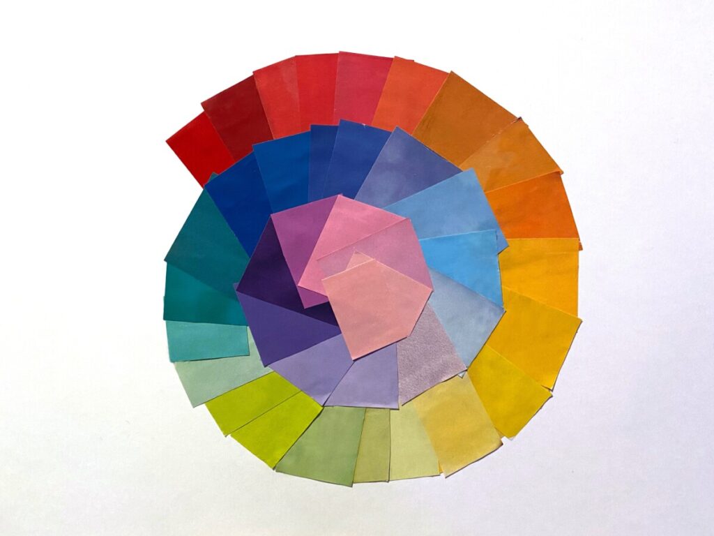
Overall, the projects steps helped run through the process smoothly. To begin with the color wheel and color study helped know more about the colors I chose for my final delivery. I began with the color wheel and correcting any colors that didn’t flow. From there, I chose to focus on Lavender as my favorite color for the template. I learned things I did not know before, like the meaning behind different shades of purple. This research helped me realize why I even like the color lavender to begin with. I never had a particular reason to like it, but once I looked into the social and cultural meaning behind it, it all began to add up. From there, I was able to experiment on creating my own pieces using the triad colors for Lavender. I also added a blue-green tint to two of them because that is my second favorite color. This process of experimenting and placing those images all together helped me see what colors contrast more or less than others. For example, some images look more fitting when the bright color is the background and the darker ones are the foreground. If I switched this, I noticed the image looks inverted.
Nevertheless, my eyes grew to understand and see more with color relationships when designing an image. Some look better together than others, and in graphic design, understanding color would be essential to achieve the best and strongest piece. If I could do a second version of this project, I would try darker colors rather than the pastel tones I chose this time around. It would expand my range of understanding which colors complement one another better than others. When designing, I will apply what I have learned with Triad colors and they’re contrasts, as well as design with complementary colors as it makes images look much stronger.

The OpenLab is an open-source, digital platform designed to support teaching and learning at City Tech (New York City College of Technology), and to promote student and faculty engagement in the intellectual and social life of the college community.

