

Process 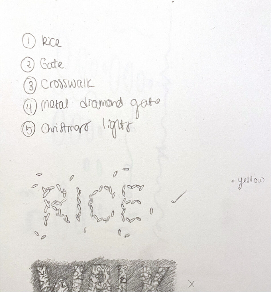
Process
Final Thoughts:
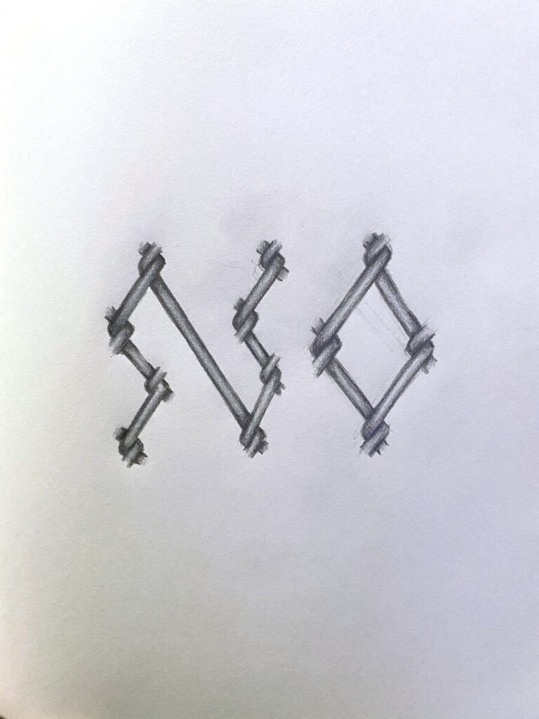
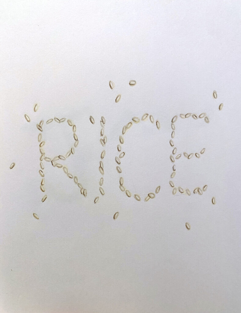
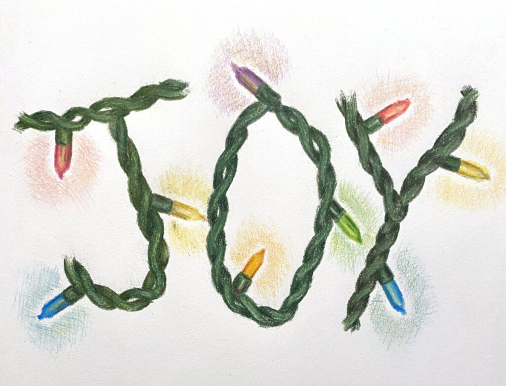
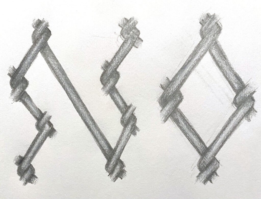
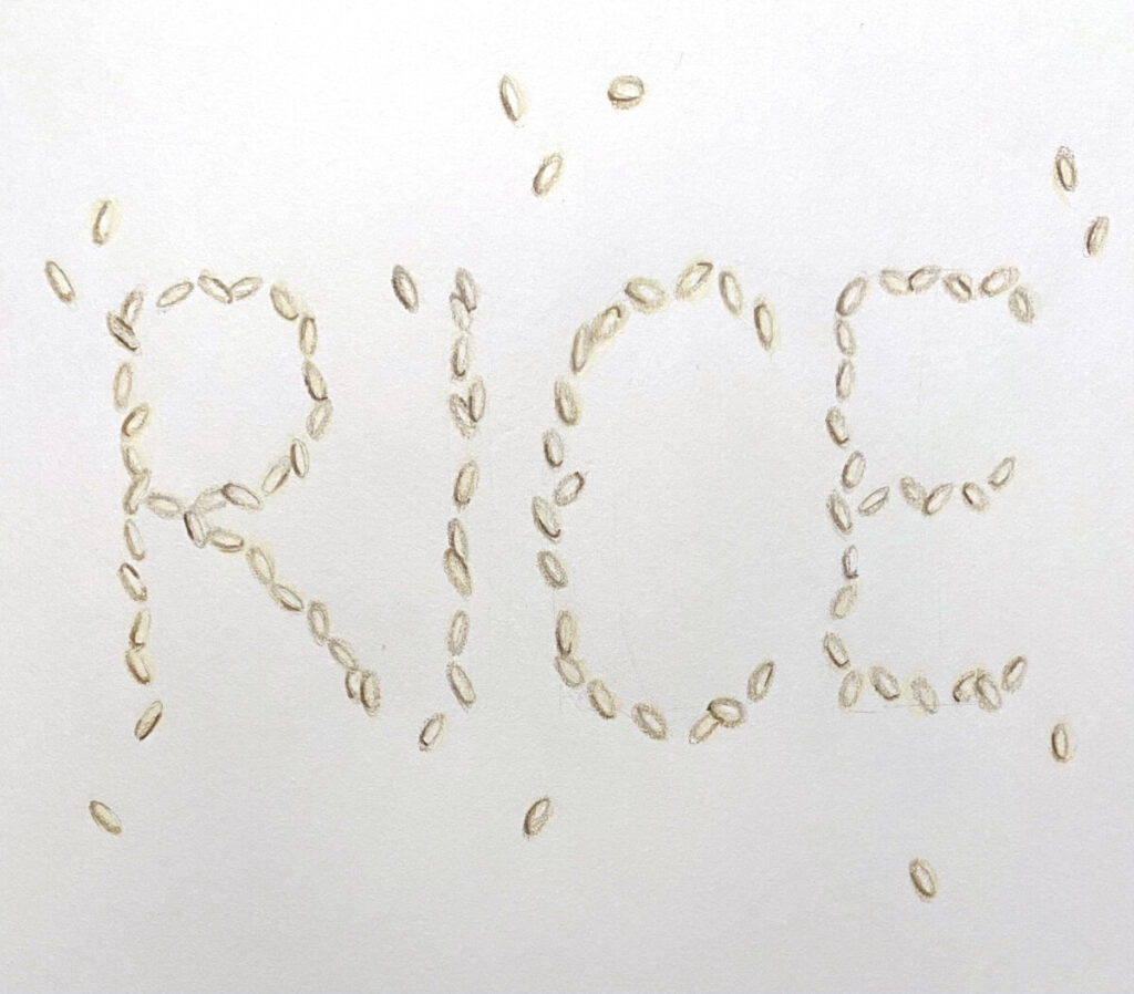
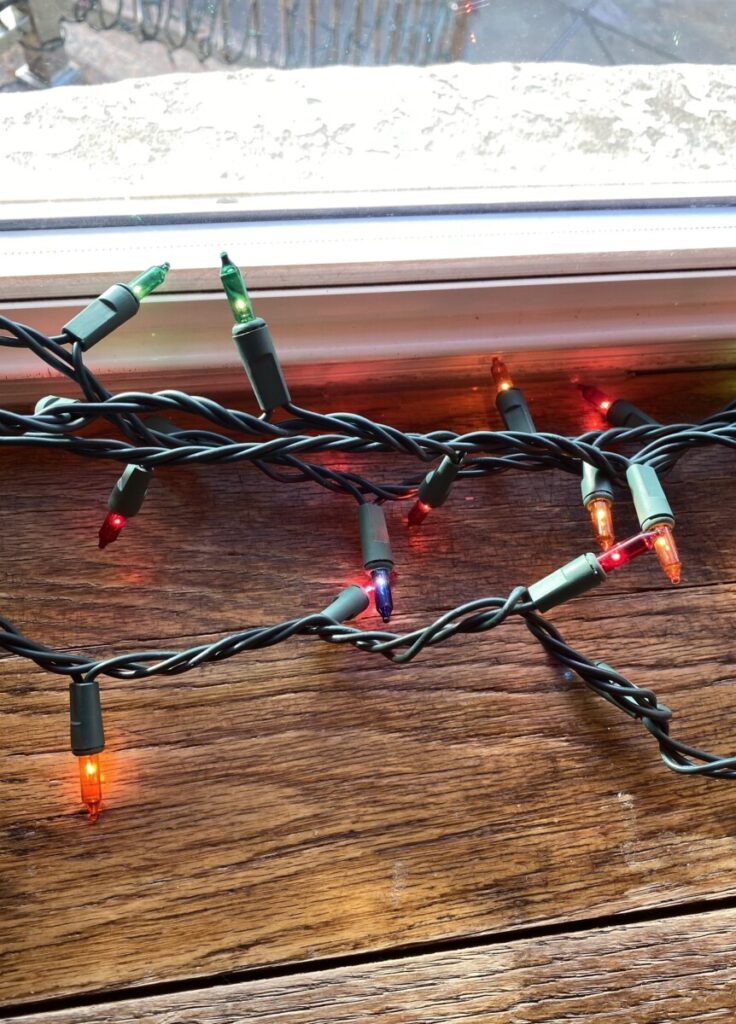
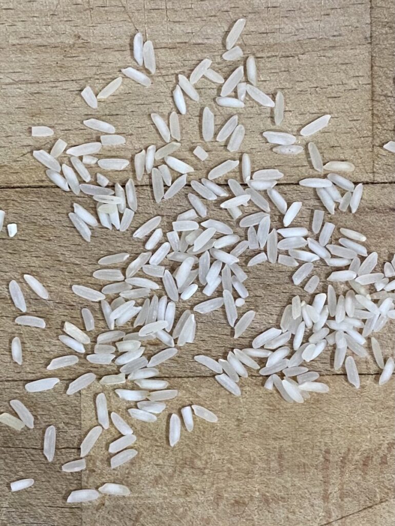
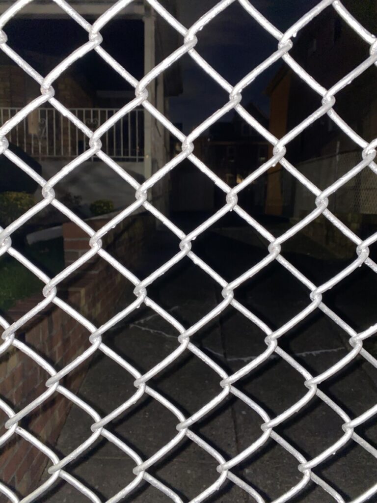
The themes from other projects seemed similar to this one on Imagination. For example, the text filling in a shape, (Project 2) and also, exploring color (which is what we did in Project 4). I enjoyed the freedom this project had to explore our imagination, by making a typeface out of our surroundings. The most difficult part for me was to look around for things I can use to make typefaces. However, once I found things and took my pictures, thats where the fun began to create it myself! I sketched out my ideas, from outlining a line drawing, to listing colors I’d use before beginning the final. In my designs above, I used Prisma Color Pencils to make the details as realistic as possible (like my photographs that are also above).
Overall, I never find myself to be a very creative person, so this project was definitely challenging for me. It forced me to look deeper into my surroundings for typefaces that I could possibly create. In addition to finding references in my surroundings, I needed to learn to use them to create typefaces that may not have been there. Once I took on these challenges of my own, being able to create my designs was the rewarding part for me. After all, usually the difficult work is what pays off the most, and I believe this project portrayed that in the best way. It was fun and creative, and overall rewarding!


i think you captured the spirit of the original imaged in your typeface perfectly. these are awesome.
All three are really great but the Christmas lights were my favorite. Like Klever said, you were able to capture the sense of every picture perfectly. Great job!