Monthly Archives: October 2020
Step 2 – Line
Step 1 – Image Descriptions
Pattern
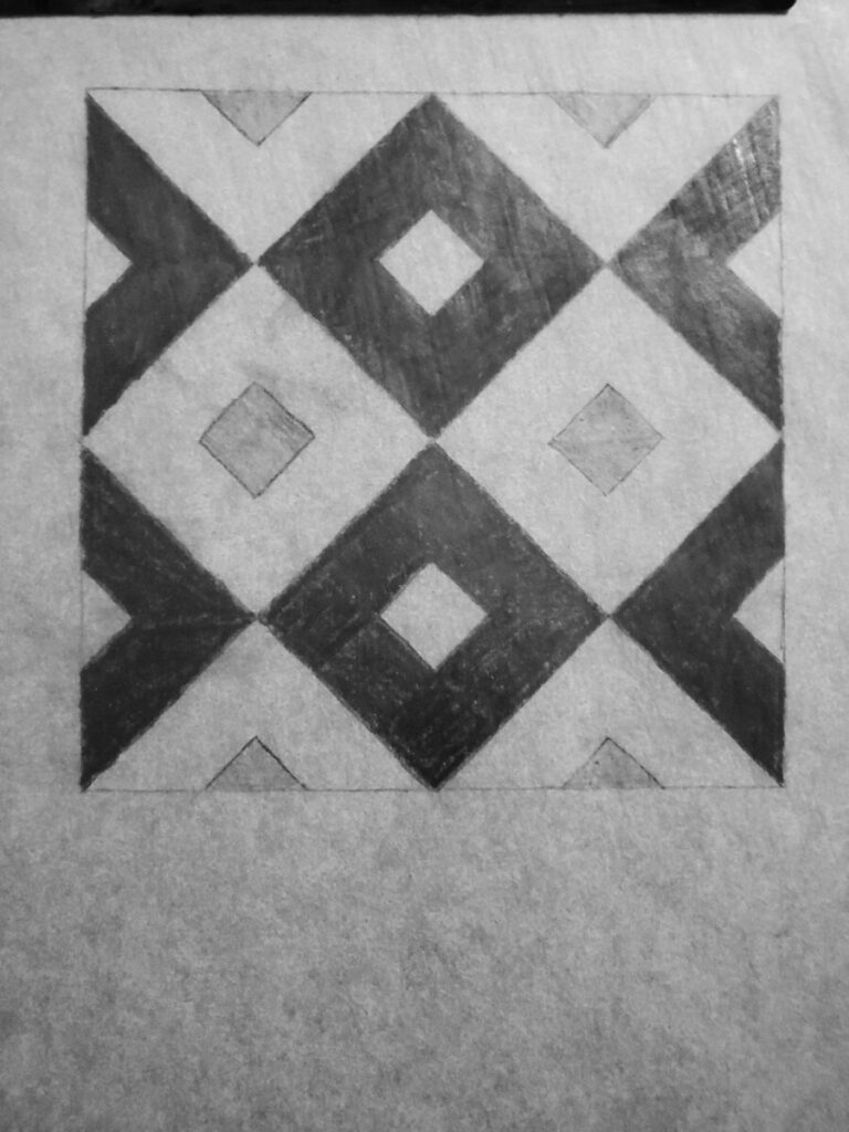
This image is reminiscent of tiles that you would find at a Mediterranean style home. This tile pattern is very structured. The image of the patterns is compact so it gives the feeling that these patterns are never-ending. There really isn’t much that separates this image from the rest, aside from its uniformity. The variety of greyscale colors detach the pattern from even more repetition, which helps with appealing any audience. This pattern can be seen anywhere, from the previously mentioned home to clothes to restaurants.
The flow of this pattern is stagnant. Besides the greys, there are no changes. It can look boring, but it seems very stable. What makes the image look really clean is the fact that there are no strokes. Strokes are the borders to a shape. If a stroke were added to this pattern, the image would seem heavy and repetitive, which is not appealing. Another good things about this image is the balance it creates. It’s stability creates balance for any design additions. Whether it would be color, lines, or letters, the pattern will remain noticeable.
Texture
The texture of this image reminds me of the cobblestone streets of SoHo, Manhattan. They look uniformed from a bird’s eye view but up close, they are chipped and scattered. The lack of pattern up close gives the image a more organic appearance. That’s what makes it fashionable. But the different sizes of shapes also gives a feeling of firm uncertainty. It reminds me of how careful I have to be when walking on these stones to avoid tripping. Organic and unorganized would be two words to describe this picture.
This image is so rigid that it seems like no flow even exists. However, the movement of the stones appear like they are going in the southeast direction. It looks like it’s leading me somewhere, but I’m unsure of where its taking me due to the lack of flow and rhythm. Like previously stated, the lack of pattern makes the stones look more organic, thanks to the contrasts.
Step5: Deliver
Step 1 Description: Pattern
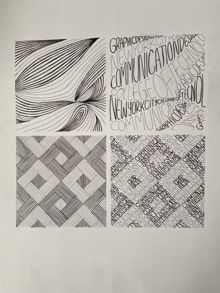
This pattern reminds me of the tiles on a kitchen wall or bathroom wall. I would mostly associate it with a kitchen. Either way, the pattern is very geometric and solid. This pattern looks like the flatter kinds of tiles. Not the kind that they would have to paste down piece by piece. It would not be the kind that is shiny or reflects any light. I would say it is more dull and flat. Which does not make it boring, however it depends on one’s preference.
Step 1 Description: Texture
This is the kind of textured blanket you would receive at a hotel possibly. Perhaps it is thin and cold. It is not the thick kind that would keep you warm on a cold NYC morning, or the fluffy kind that you can feel a weight on top of you. That good kind of weight that feels like better quality. However, I’m sure it gets the job done. Overall, this blanket would be flexible and flows more than anything solid like a rock.
Final Thoughts:
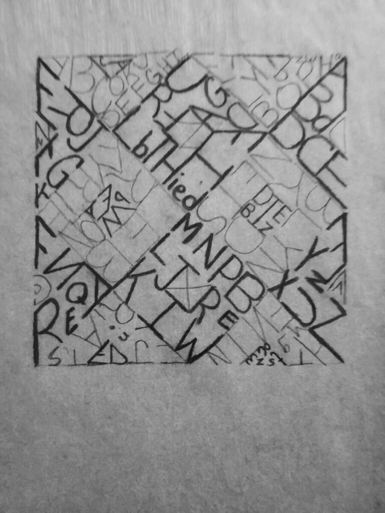
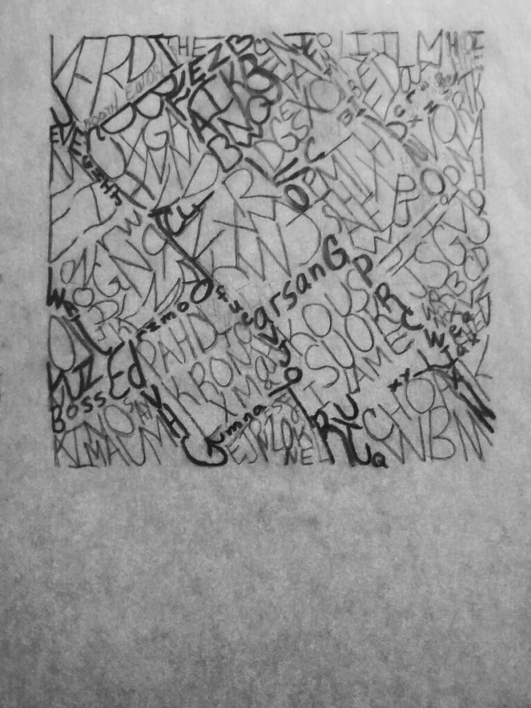
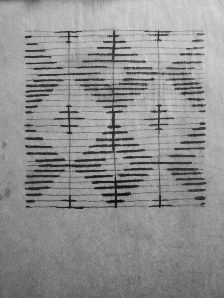
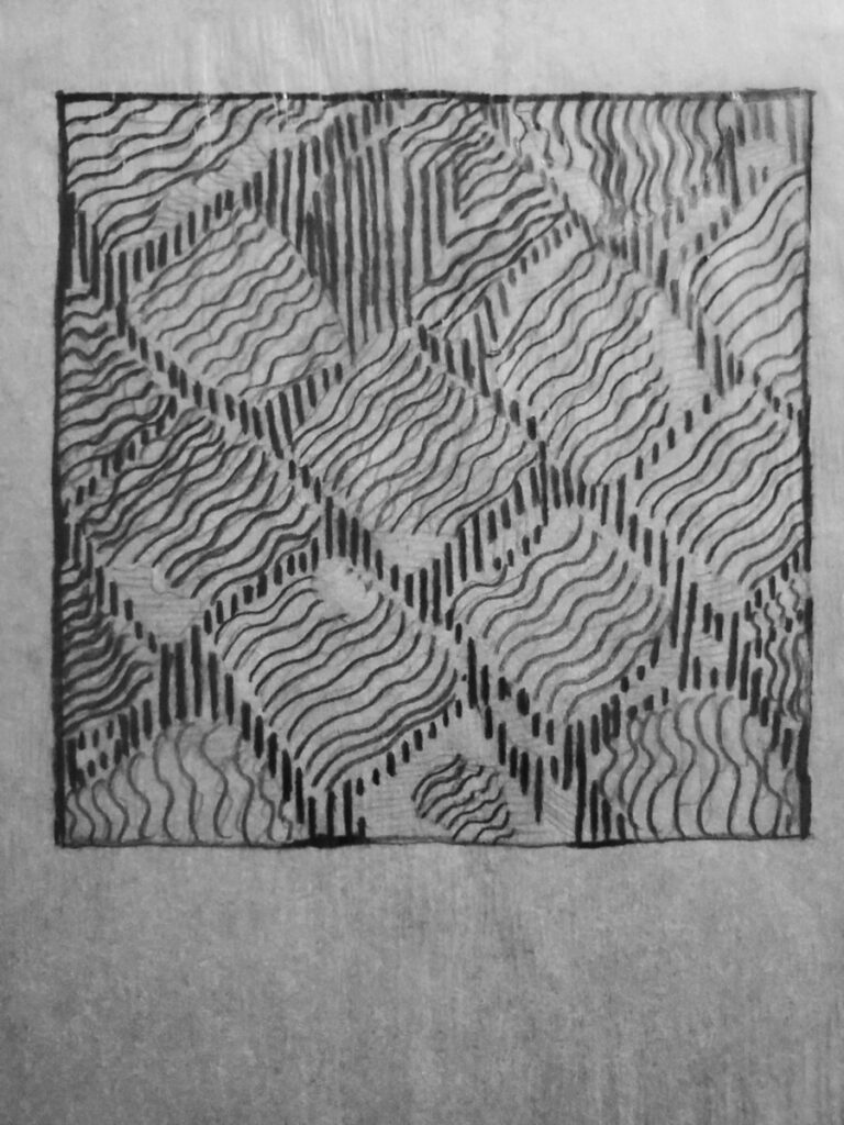
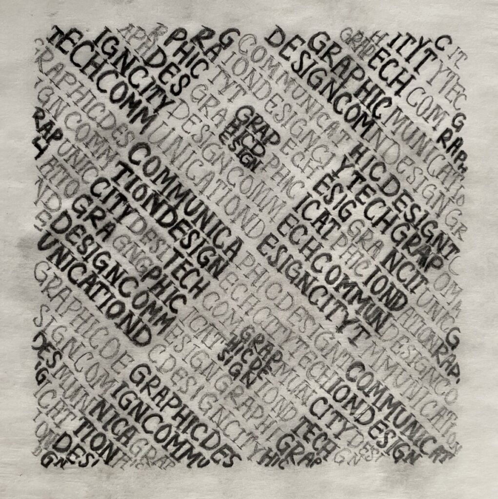
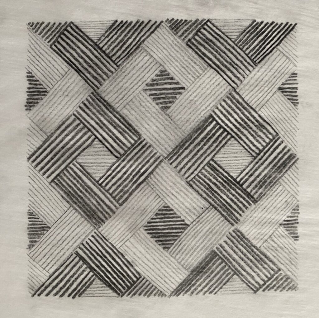
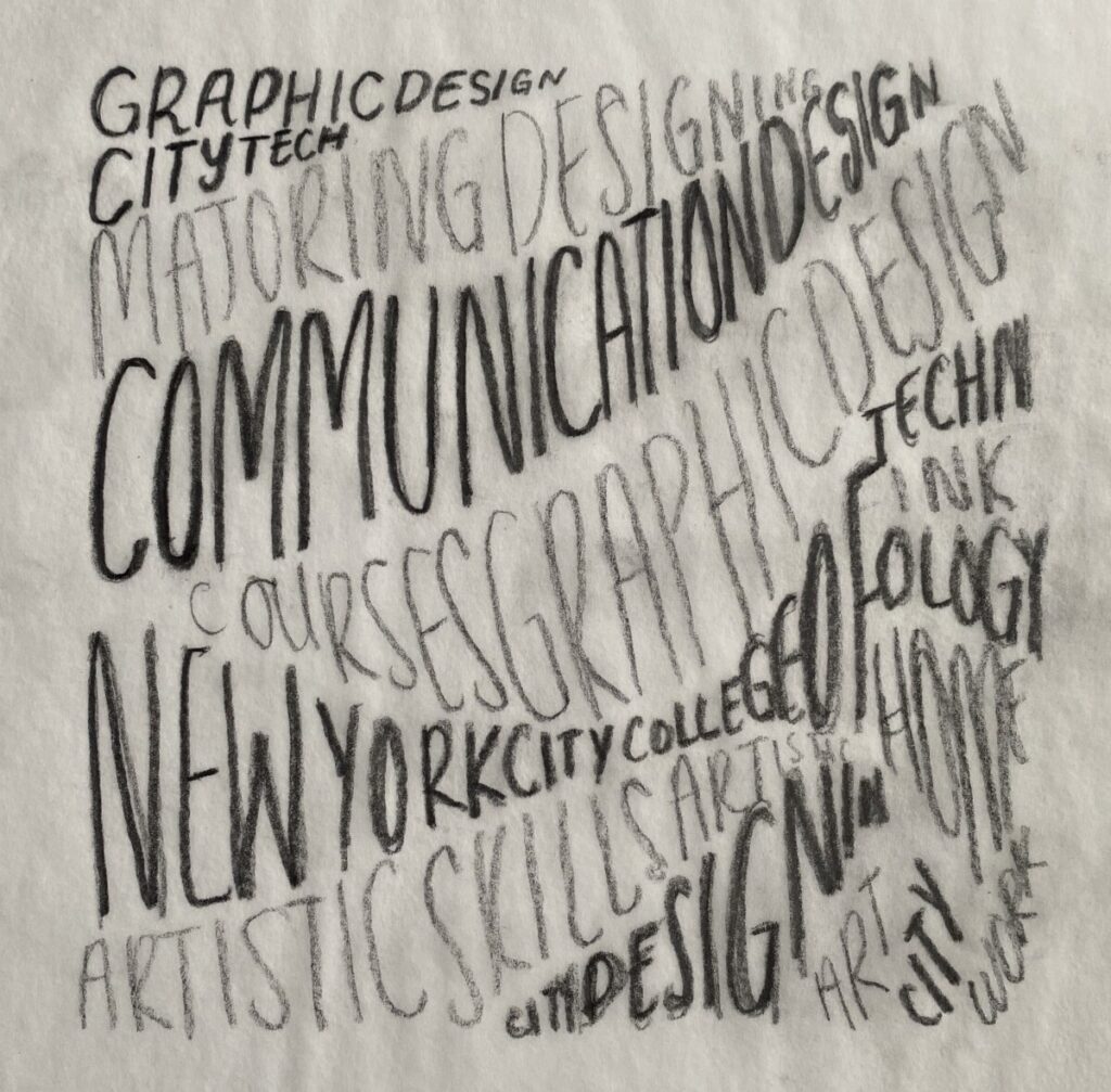
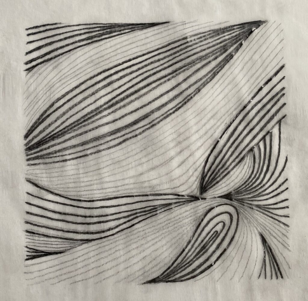
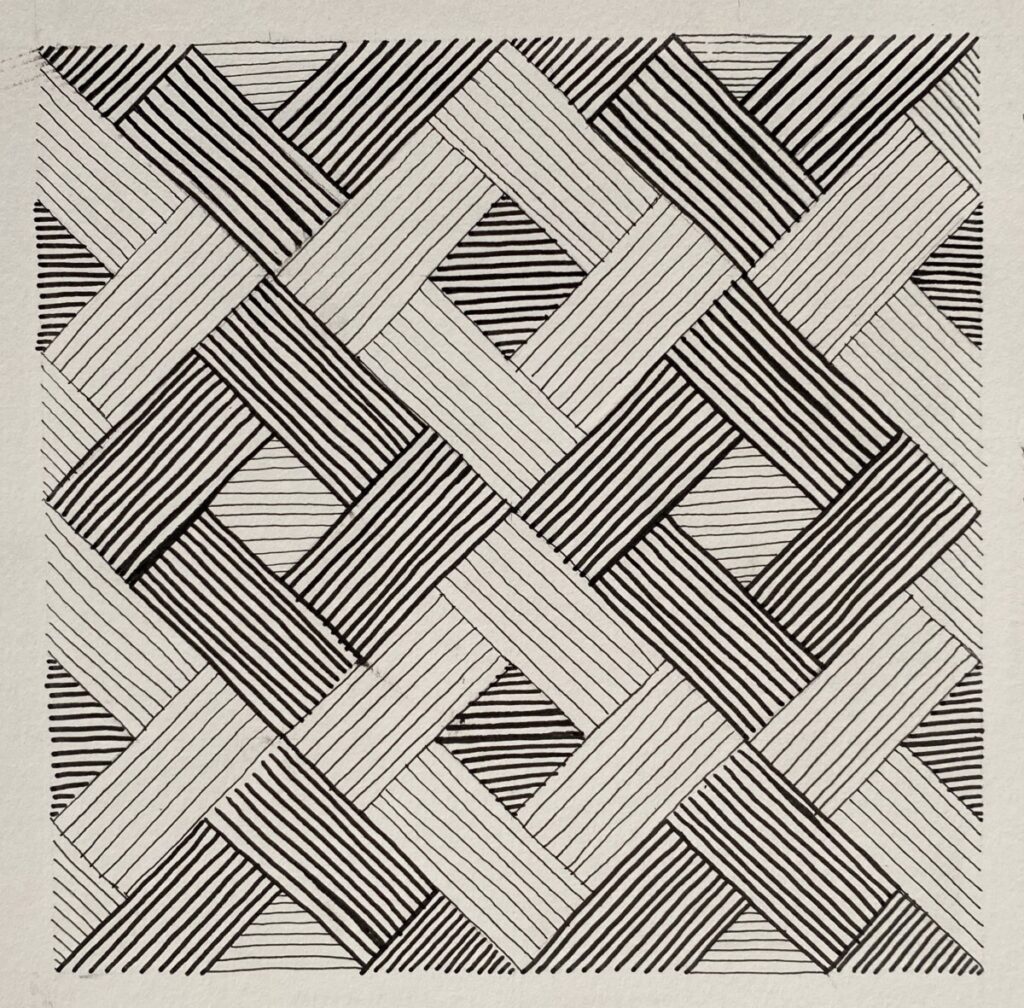
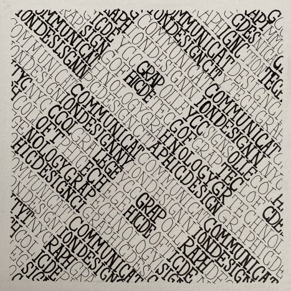
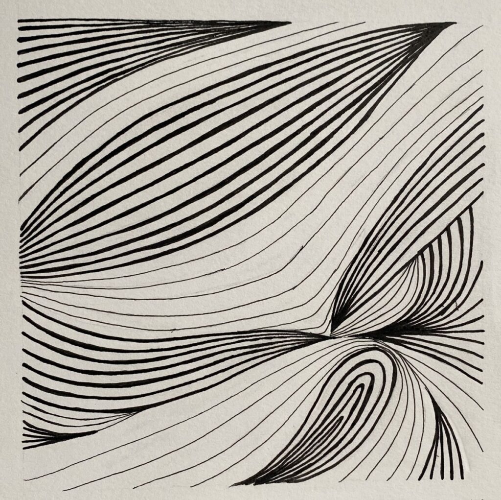
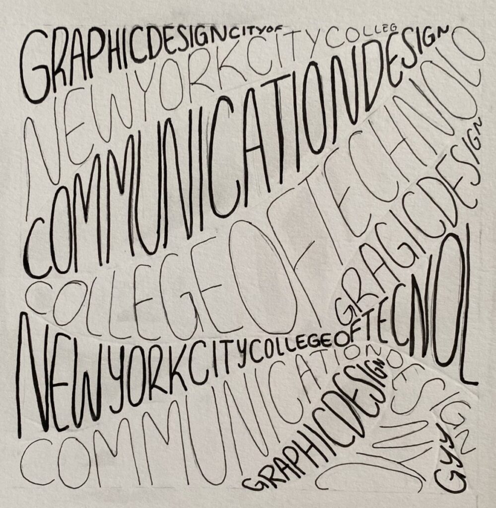
Overall, I enjoyed the concept of this project. I think the final products look very graphic. I think I understand more about how to fill in shape with text or lines. This restriction to fill it in with only line/text forces the mind to find different and creative ways to do so. Once I created all of my sketches, I was able to compare and choose my favorite designs. The inking would have been the most tedious part of the project. I would like to have a much more steady hand to keep some lines cleaner than they came out. I am definitely a perfectionist, so I would’ve liked as much neatness as possible. Never the less, I enjoyed the learning process throughout this project. You can fill in shapes (and keep the shape) through text/lines rather than coloring in.
Pencil Sketches and Ink Creative Process
Project 2 – Deliver

Noe

Deliver

Pattern: This pattern reminds me of a old school kitchen floor and of my own kitchen floor from before I was born. This pattern gives me a vibrant feeling even if there aren’t any colors on the picture. When I see this pattern I think of past memories that I have or ones that were told to me because of the type of pattern that looks like tiles.
texture: This picture of stone floor reminds me of times I would play at the park as a little girl and of times when I’d fall but still get back up. This reminds me of the feeling of when my knees would hit the ground as I was running in the playground. When I see this picture I think of a hard but smooth textured rocks.
Deliver Ashley Lopez
Deliver

texture:
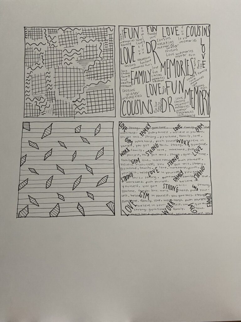
The raindrop texture reminds me of when i was younger and it would rain outside. Mostly good memories of me going to the movie theatre with my parents and brother pop in my head as well as the times that i’d visit my grandparents in Puerto Rico and it would rain for at least 30 minutes each day.
pattern:
The textile pattern gives me a soft, warm, and comfortable feeling. It reminds me of when i used to have a cat. My cat was a big part of my childhood life until she passed away when i was in the 5th grade. Though it was a very sad and unfortunate time for me, i still like to look back and reminisce on the things I can still remember about her and bring light to the void since her death was a long time ago.

