As for this project, I chose this sunset picture that I took from the windshield of my car. I felt like the picture gave a lot of different tones of grays by the way the sunset was being projected between … Read More
Category: Project 3 Posts (Page 2 of 3)
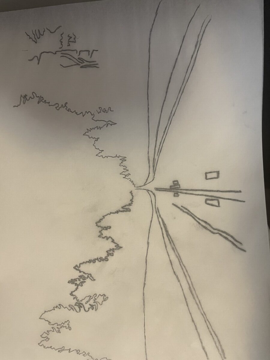
To start of this project I tired my best to focus on the light to dark range scale.
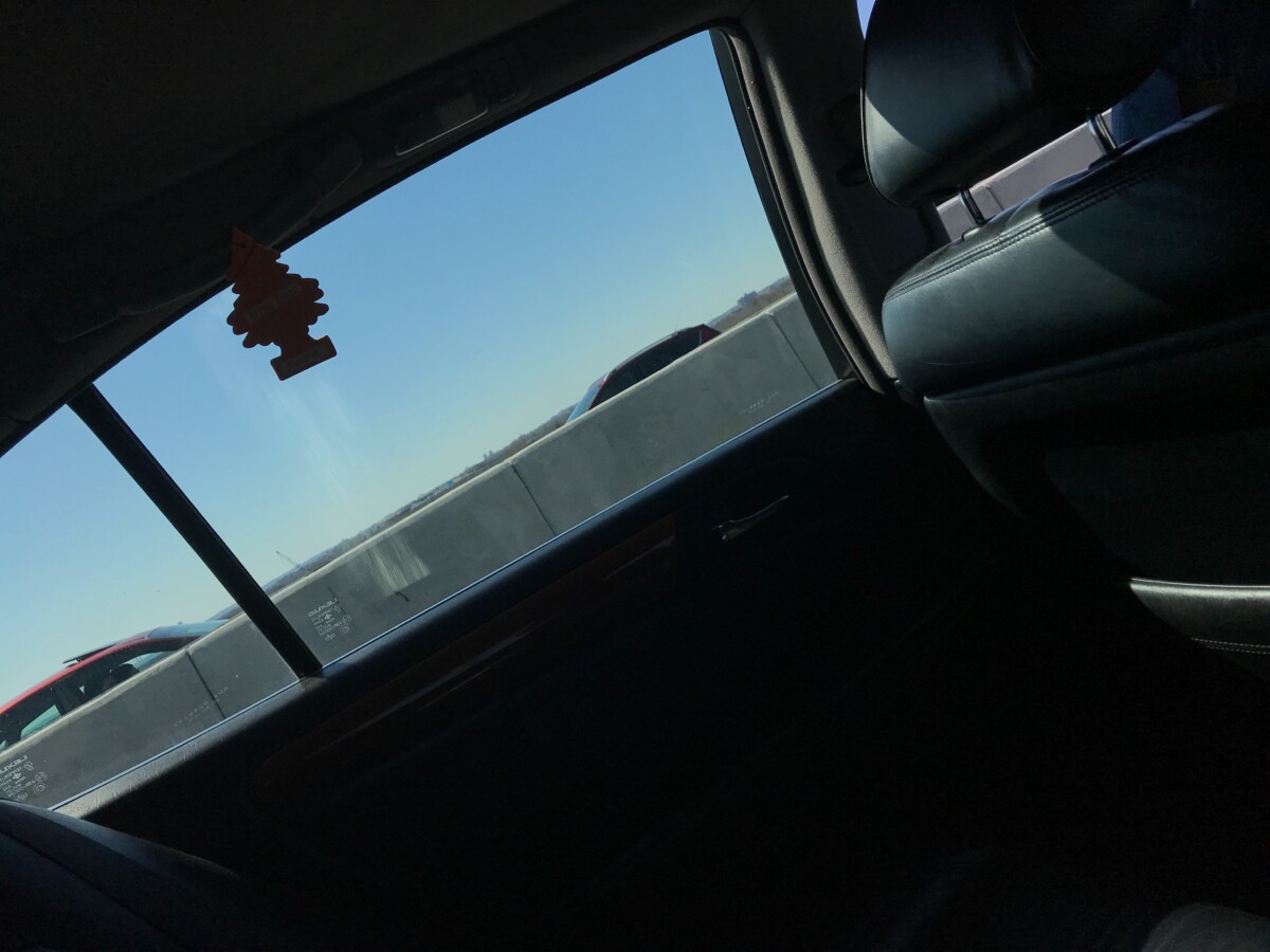
This is the original image I chose, there’s already a lot of contrast here and I love the lighting that I captured in this image.
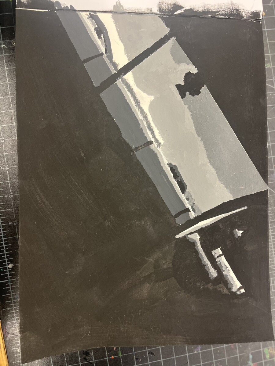
The acrylic paint worked well for me when doing this project, it took some time … Read More
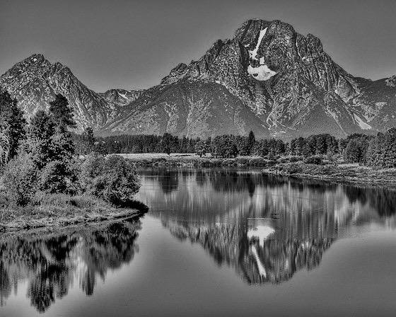
For this project I focused on the full value range scale
first I chose a landscape that I know can show different variations of light . I found my photo I put it into photoshop then I posterize it

This is the image that I chose to paint, a field with some paths, a bush and clouds. I went for something that’s simple, but still showed a range of shades, even though it is mostly gray scale. I also … Read More


