For this project we created 3 rectangular shapes on with 1″ x 1.250″ on Bristol 11″ x 14″ & Trim to size 14″ x 7″ to select 6 types of complementary & mix both to reveal the middle color. Then 4 rectangular shapes for Analogous, Monochromatic,Triad, and Split Complementary.
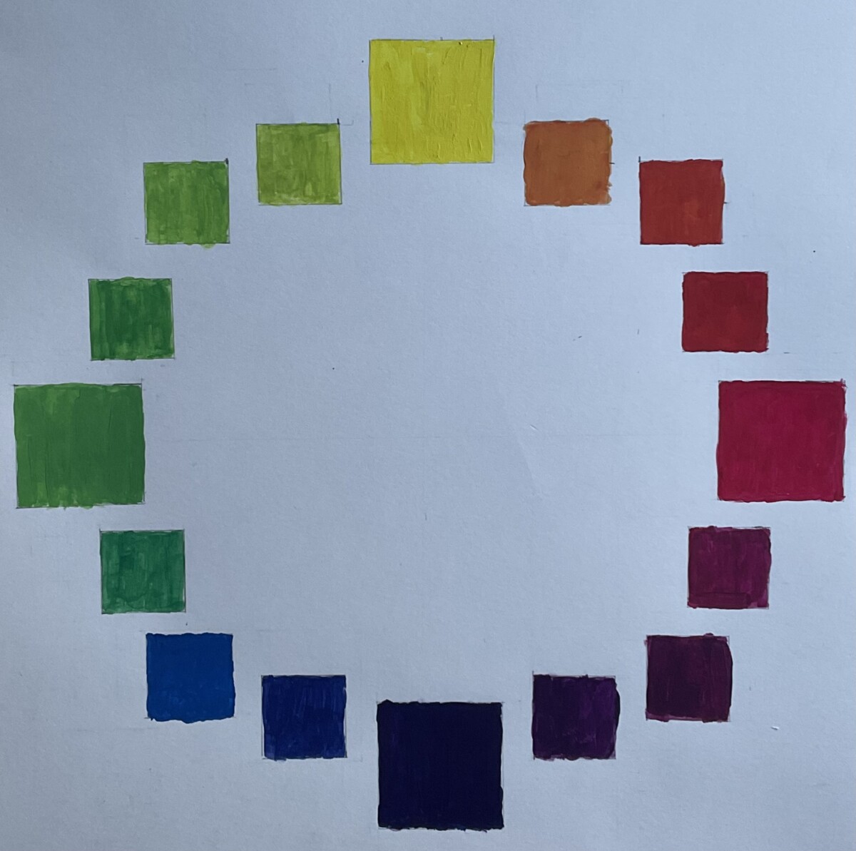
I used red, yellow, and blue for the primary colors used to build the color wheel. Then, the primary colors were mixed in order to create complementary colors.
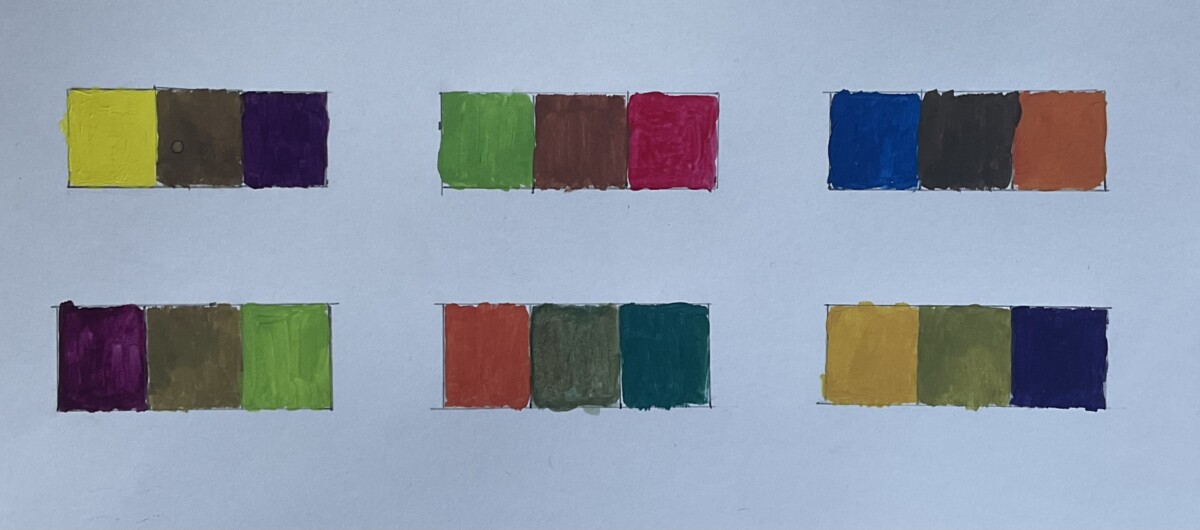
For the 6 types of complimentary colors, I mixed the colors that are opposite to each other to reveal a neutralized tone in the middle.
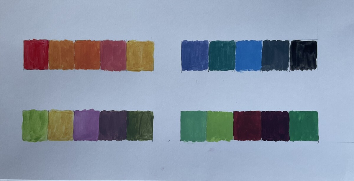
Analogous (similar color group), Monochromatic (color scheme based on only one, single color tint), Triad (comprised of three colors evenly spaced on the color wheel), and Split complementary (A variation for the complementary color scheme, but instead using three colors instead of two.
This project is self explanatory, but tricky. It required a lot of patience when it came to getting the square measurements right and the right shade of colors. However, I was able to experiment with different tones, hues and see how mixing different types of colors can make a brighter, duller, or even a complete different shade. When mixing the complementary colors, the results was different shades of brown according to whether the primary colors mostly carried blues and yellows, it reproduce different tones such as brick toned brown or live tones brown. Some things I found difficult is replicating the same colors and keeping it in a vivid hue. Working with gauche takes prescribe because it cannot get too thick or watery in consistency. But overall, I was able to get the results needed.


Leave a Reply