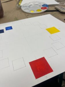
There were two parts to this project. First part required me to make a color wheel using a 11″ by 14″ bristol pad and primary colors. Each of the four squares measures 1.5 inches by 1.5 inches. Every other square is one inch by one inch. There’re 16 squares total.
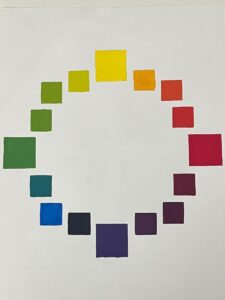
Red, yellow, and blue are the primary colors used to build the color wheel; and the primary colors were mixed in order to create the complimentary colors.
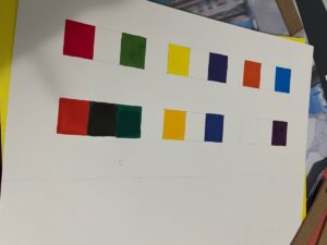
Making complementary and saturated palettes was the second stage of the project. Create three rectangular forms on Bristol 11 x 14 by measuring 1 x 1.250 inches, then trim to 14 x 7 inches.
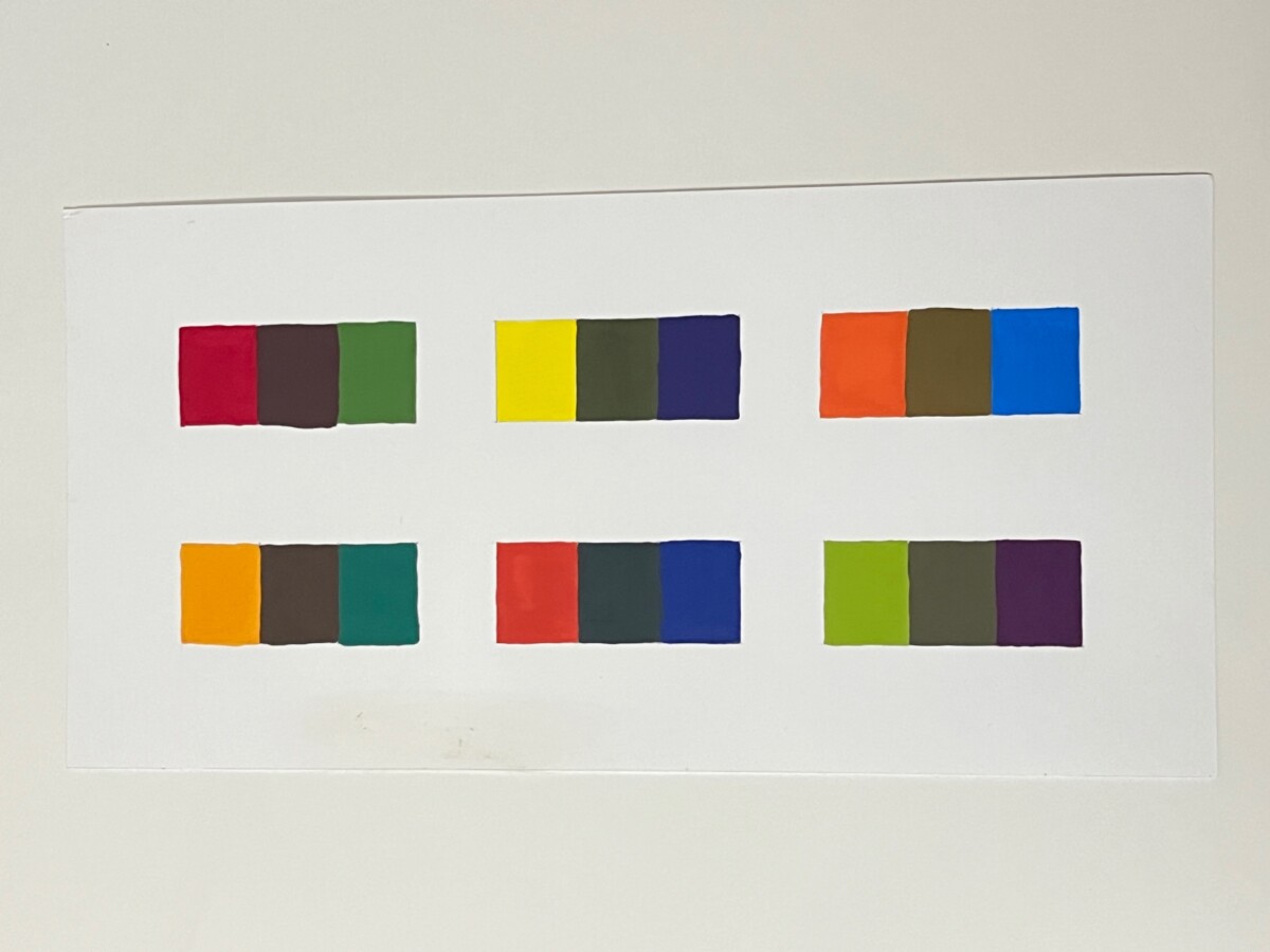
Complimentary and Saturated Colors- 6 types of complementary & mix both to reveal the middle color.
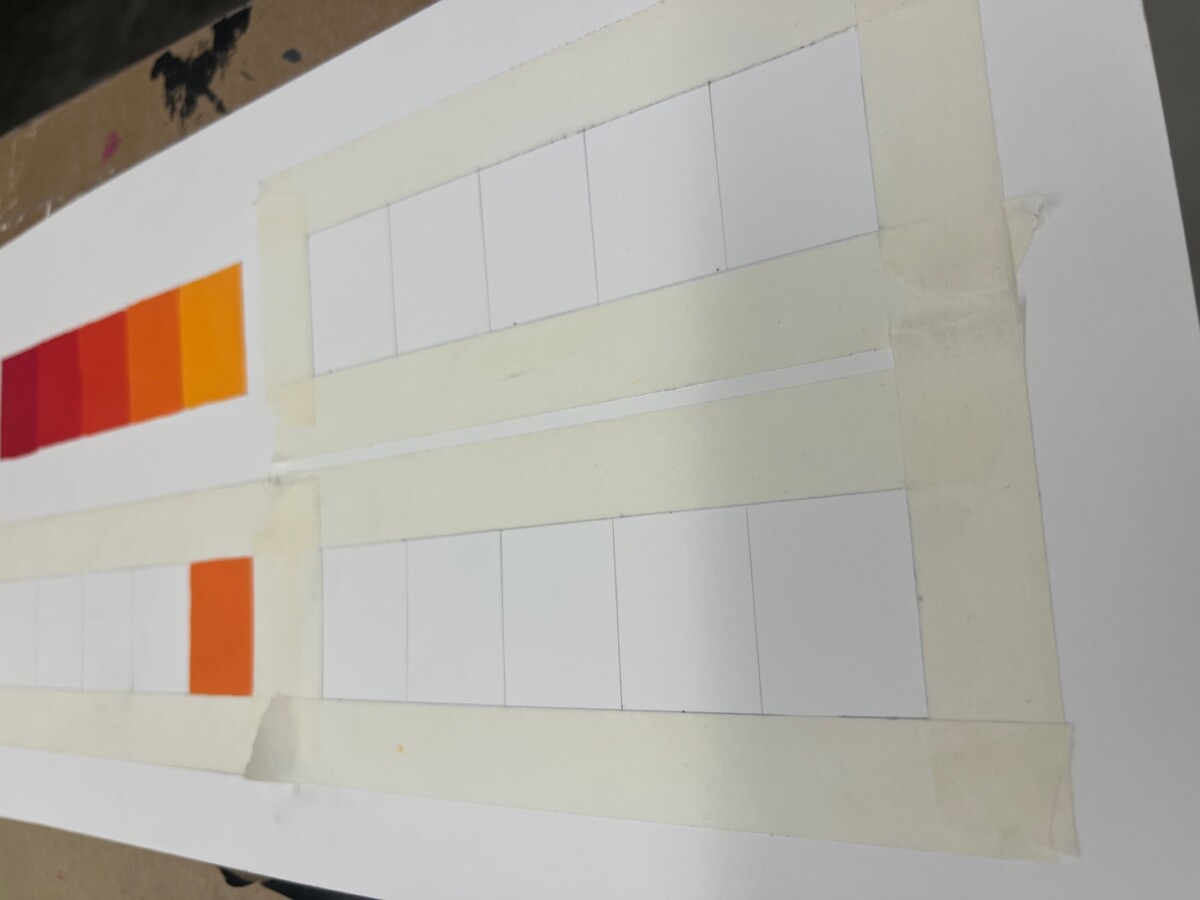
Analogous, Monochromatic, Triad, and split complimentary; for each created 5 rectangular shapes 1″ x 1.250″ on Bristol 14″ x 7″ (trimmed 11″X14″ Bristol)
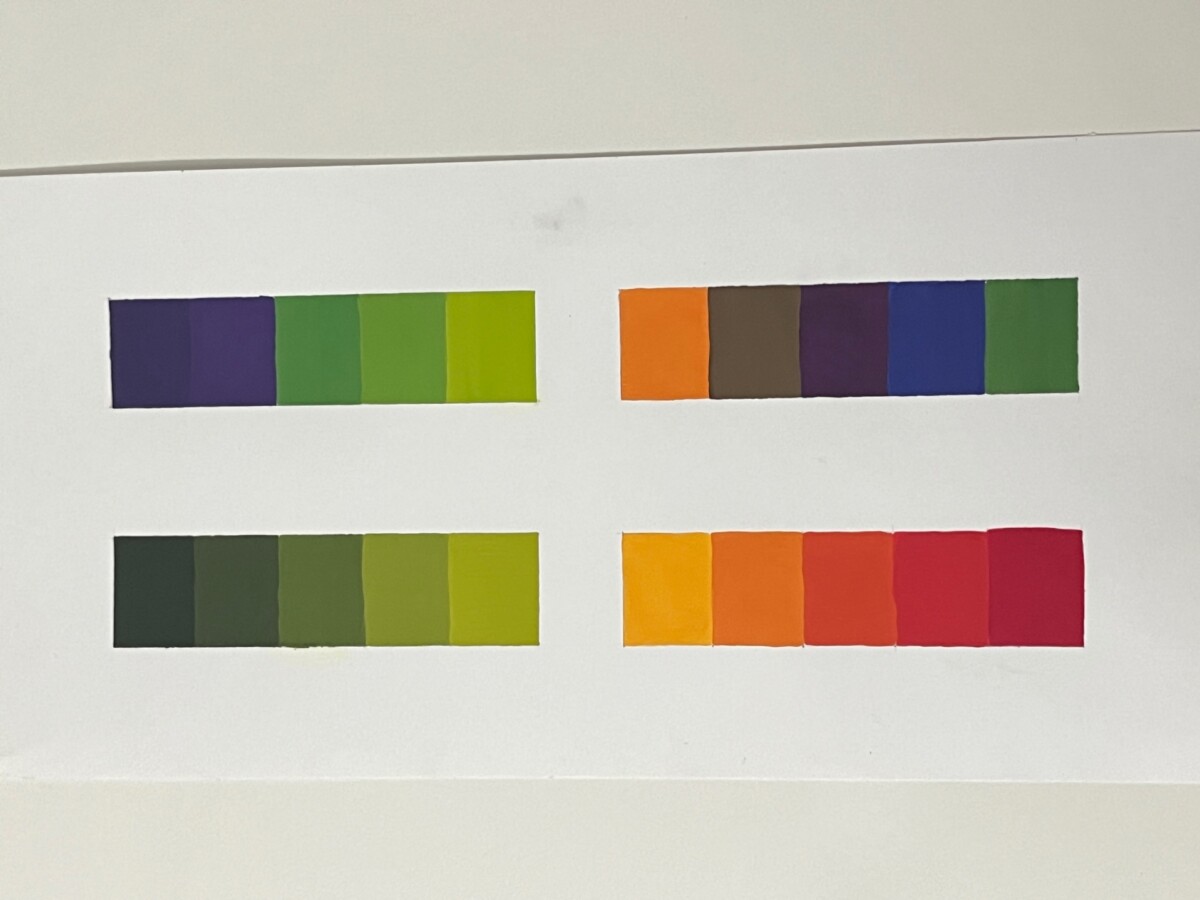
Split complimentary, Triad, Monochromatic and Analogous.
This project required some persistence. However, I got a lot of knowledge about mixing colors to make new ones. I also learned that when you mix two complementary hues, if there is any red, the mixed color would be brown; if there is blue in the complementary hues, the mixed color turn into an olive brown. I used primary colors by Winsor Newton; they are highly pigmented, and little goes long way. Replicating the same colors and making sure the hue was vivid on the color wheel were some of the things I found difficult. At the end of the project I attempted to use the tapping approach to achieve the perfect line.


Leave a Reply