Gallery #1: aperture foundation Matthew pillsbury
Exhibit: city stages by Matthew pillsbury
This was the first exhibit we attended in our field trip, His show is very interest and was definitely my favorite of the rest of the shows we saw as a class that day.
His photographs are strictly black and white images by choice because there were taken in mainly between 2011 and 2012.
At first glances the images appear blurry , but that is what I love most about them. At a second glance you notice that blurry effect is indeed objects in motion such as people or cars that at first glance you may have thought it was dust. This effect is mainly causes by high exposure in the photographs. The mood in the photographs are mainly happy energetic photography’s.
Popular elements the photographer used in his photographs along with high exposure is wide dept of field and strong use of lines in his photographs
Gallery #2: Robert Mann;
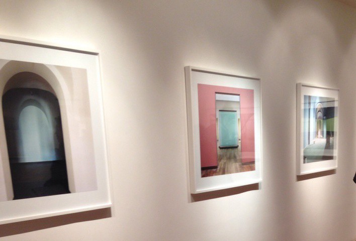
Exhibit : rijksmusem by Wijnandoo Deroo
My second favorite exhibit for the day, the exhibit feature photography of behind the scene process of setting up for an actual exhibit.
The photography have a strong usage for bright and bold colors , strong lines . The images are very sharp and use a great deal of depth of field and are very balanced images.
The overall mood for the photographs are very cheerful and interesting and he deliver a story of setting up on exhibit with his photographs and keeps you on wanting to see what will. Happen next
Gallery #3: Clamp Art
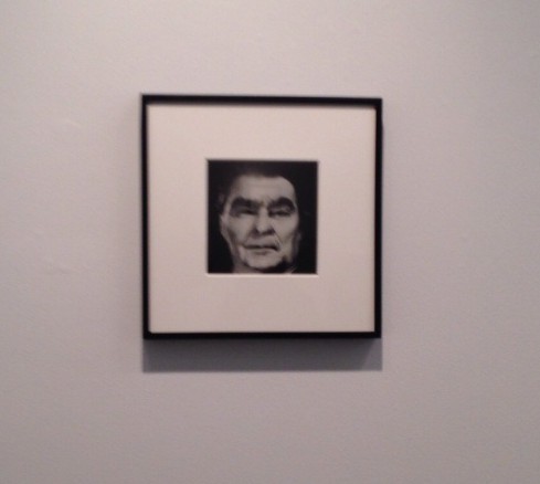
Exhibit: composites by Nancy Burson
This exhibit is definitely the most intestine and most strange exhibit we saw during this trip.
The exhibit features black and white process images using film.
The photographs include multiple images of famous celebrity and famous figures as well as other random people and pets, resulting in a portrait of a whole new subject that is some what unrecognizable from the original but as well keeping a hint of the original subject and if there were famous you are we’re able to say for example ” they have the eyes of Audrey Hepburn and the nose of grace Kelly”
The overall mood of the images is defiantly creepy and strange , and he photographer focuses in her images on light and low contrast and close ups.
Gallery #4: Danziger Gallery
Exhibit: the heart and the eye by Henri Cartier and Robert frank
What I loved most about this exhibit is that it features vintage images taken in some of my favorite locations in the world such as New York and Paris.
The photographs and mainly in black and white but unlike Matthew pillsbury from city stage it was not a choice but a limitation of the camera from that era.
The photographers mainly shot still action and people in action in there everyday like , as if the didn’t notice them while they were taking the photographs . In there photographs they mainly used long shots and shallow depth of field as well as the rule of thirds.
Gallery #5 : Bruce Silverstein
Experts for silver meadows by Todd hido
Todd hido exhibits is the exhibit that I considered the closed and had a fine art feel to it.
His photographers used strong elements that gave it a feel that is was painted instead of it being a photograph. The use of diffused lighting in the photographs give the images a feel of being lonely and. Gloomy . The photographer definitely showed a strong usage wide depth of field as well as a range of different framing ( long shot,medium shot, close up and extreme close up.


Very well observed. I am impressed that you are aware that Cartier-Bresson and Robert Frank used black and white because that was all that was available to them when they were active photographers while Matthew Pillsbury made the choice to shoot b/w. Do you have any theories as to why he made that decision?