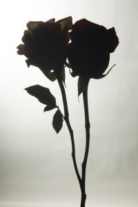
The Lighting direction in this photo is from the back(Backlight). Being that the lighting direction is from the back it creates a silhouette that kind of reminds me of a silhouette of a couple kissing. I also like the negative space is this photo. However the direction the photo was taken makes it seem as if the flowers are merged in together. Also one flower is a bit lighter then the other which shows that the two flowers were different colors. Overall this is the best picture to me.


Beautiful. It was worth the effort.
On Thursday, the class has only 8 students due to the snow storm and so I had time to set up backlight with two lights for every group. If you ever want to do this again, two lights makes it very easy.