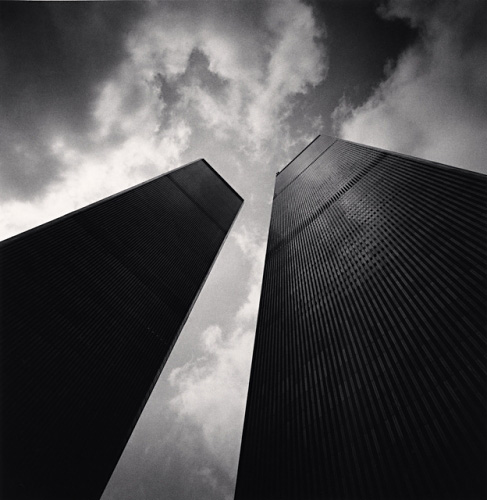
A photo that stood out to me was the “Twin Towers, Study 2, New York City, USA, 2000” by Michael Kenna. What i like about this image is how you can see that the top of the towers have light falling on top of them while the bottom of the towers are darker. The actual sun is blocked by the shorter tower giving a very nice looking glowing effect on the side of the tower. These two towers form very sharp lines and draw the viewer right to the middle of the photo.
Another thing i like about this image is how the clouds seem to be in the perfect position in this photo. They seem to surround everything except the center of the photo. The photographer either got very lucky at the moment he took it or had to wait for this perfect moment for everything to line up just as it did. and also has the same dark to light effect as the buildings do. The point of view is quite impressive as well because the photographer managed to get the buildings to meet in the middle of the photograph and give them a real grandiose feel.
Besides having a light to dark contrast, there is also evident depth of field here. You can see how sharp the top of the building as well as the clouds in the center are. The further down you look though, the blurrier the image gets.
This photo also speaks to me because the twin towers are the most iconic buildings in the world and after the 9/11 tragedy photo’s such as these have real feeling and mean a lot to some people.


I think the strongest element in this photo is the contrast of light and dark.
On the subject of depth of field, I think it is the photographer’s intention for everything to be as sharp as possible. We call that extensive depth of field.