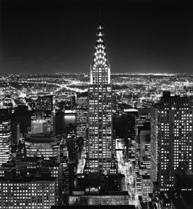
 Chrysler Building by Michael Kenna
I chose this photo because it really shows how great the city of New York is. This photo really shows New York as the city that never sleeps. With all the bright lights on you can tell that this photo was taken during the night. You get a feeling of excitement from this photo due to the bright lights and the busy nature. With the great view presented in the photo how could one not help but want to visit. Looking at this picture alone to me represents the “American Dream” that many seek. Opportunities and the chance to live a better life all at your disposal as well as a new hope. New York City is all that and more and it couldn’t be seen as any better through this photo. The view of the skyline, the busy streets, opportunities are endless.
There are also many elements used within this photograph. There is minimum contrast between light and dark besides the obvious light in the buildings, streets and skylines. There is use of line throughout the photo in every building, window, street etc. The lines also serve as a view of perspective due to the different points in the photo. These being the foreground and the background. There is strong use of shapes as everything in the photo is in the of shape of something. I believe the strongest element of the photo though would be the balance. The angle at which he took the picture presents the viewer with a clear centered look of the city as it places emphasis on the Chrysler Building. Although the focus is on the center it doesn’t take away from its surroundings. The photo has equal proportions throughout with obvious symmetry also. I feel that my favorite aspect of the photo is how simple it really is, yet how much it shows.


