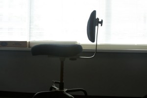
I chose this photo because of the positioning of the chair. Its not rule of thirds and has a different kind of balance going on. Also the contrast between the dark wall and the light from the window really bring out the composition of the chair making it look almost like a silhouette figure.


