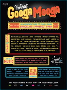
I was intrigued by the design for the recent Great GoogaMooga festival in Prospect Park. These were created by Mark Miller & Dave Franzese, who worked on the branding for Bonnaroo 2012, which is a huge music festival that takes place every year. The team said that for the Great GoogaMooga posters, they were inspired by Brooklyn Bodega storefronts. I really love this style of vintage typographic design. What do you think?


The design definitely gives that “carnival” feeling… like you’ll have a great time if you go.
I like this design, I think it’s fun and really matches what it is trying to portray. I’ve never seen a Brooklyn bodega storefront look this good.
I like this design as well! It has that funky carnival-like design to it. It definitely matches what it advertises.