I like the poster Spring 2013 that is created by Jake Barton. I like how the letters have this 3D effect. They use bold sans serif to make the poster stand out more, it’s in black in white and it … Read More
Category: Student Posts (Page 1 of 15)

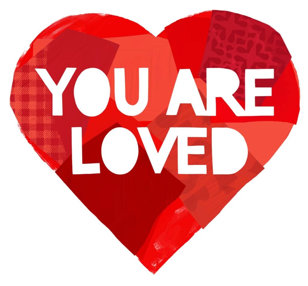
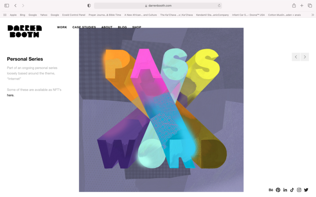
The artist who’s lettering caught my attention is Darren Booth. He uses both color and sans serif typefaces that help give off a feeling of modernity. Personally, I resonate with this piece due to … Read More
The artist I was most particularly most interested in had to be Danny Pelavin, his logo work and wide range of color was really attracting to see. He uses a wide range of type, most of which include Bold and … Read More

… Read More
- Who did you choose
Darren Booth
- What do you like about this piece?
- I love how the artist combined the letters with highlights.
- What do you like about the style of this artist?
- the artist uses a lot of color


