The artist I was most particularly most interested in had to be Danny Pelavin, his logo work and wide range of color was really attracting to see. He uses a wide range of type, most of which include Bold and Display type faces. The artworks resemble something you would see back in the 80’s or 90’s and he does this by using the using the same types of font and color schemes from that time to portray that era.
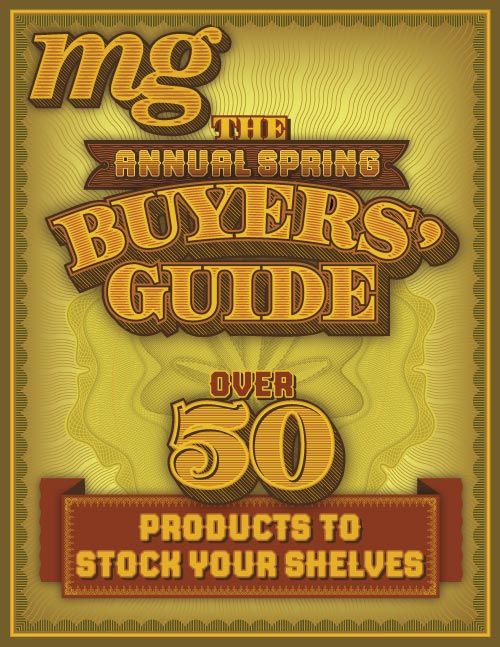
Here’s a n example of a magazine cover, This piece uses 4 different typefaces, warping, tracking, kerning, and patterns along the entirety of the poster and as well as each of the letters themselves to give this western, vintage vibe for the advertisement.


Leave a Reply