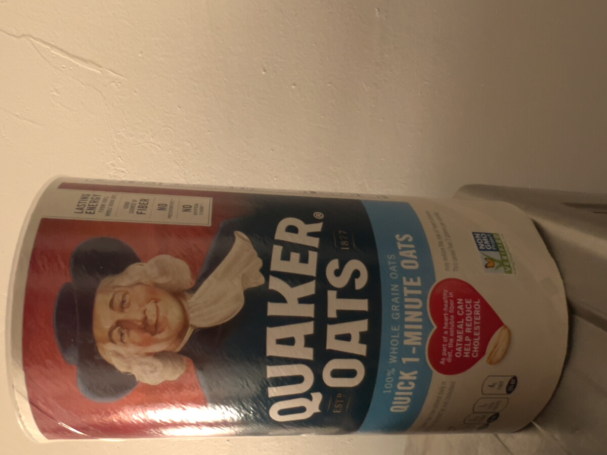


It’s clear to see the differences in design choices made by companies when presenting their product, from curved text to titles with very tight kerning giving a compacted look to them.
M.Giuliani | D038
It’s clear to see the differences in design choices made by companies when presenting their product, from curved text to titles with very tight kerning giving a compacted look to them.

© 2024 COMD1127 Type and Media Spring 23
Theme by Anders Noren — Up ↑
The OpenLab is an open-source, digital platform designed to support teaching and learning at City Tech (New York City College of Technology), and to promote student and faculty engagement in the intellectual and social life of the college community.


Leave a Reply