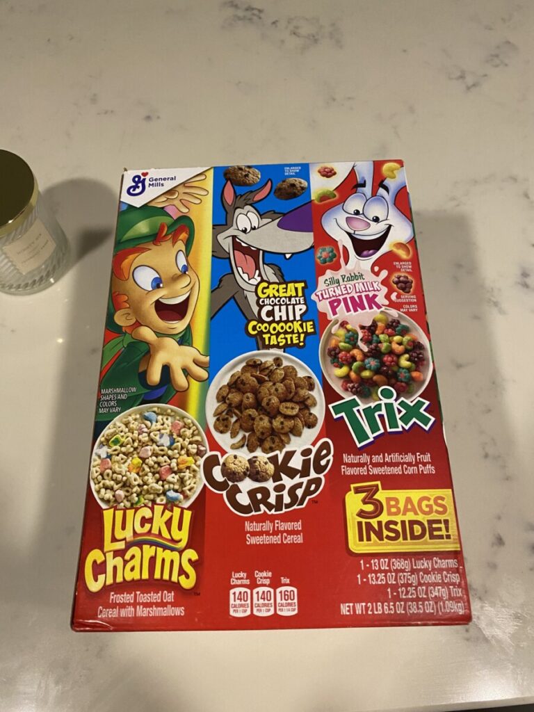
With each logo they have their own style that pop’s out and stands out. With Lucky charms the y is elongated and has a rainbow. Cookie crisp has two cookies for the O’s
Pay attention at the arrangement of type how does it differ from what we’ve done so far?
In class we haven’t done anything like this. In the future we’re probably going to experiment with using art into our sentences


Leave a Reply