
<ref name=CH>{{cite web |url=https://collection.cooperhewitt.org/objects/1108955851/ |title=Sidewall, Beautiful Inside My Head Forever, 2008 |author=Cooper Hewitt, Smithsonian Design Museum |accessdate=4 October 2017 |publisher=Smithsonian Institution}}</ref>
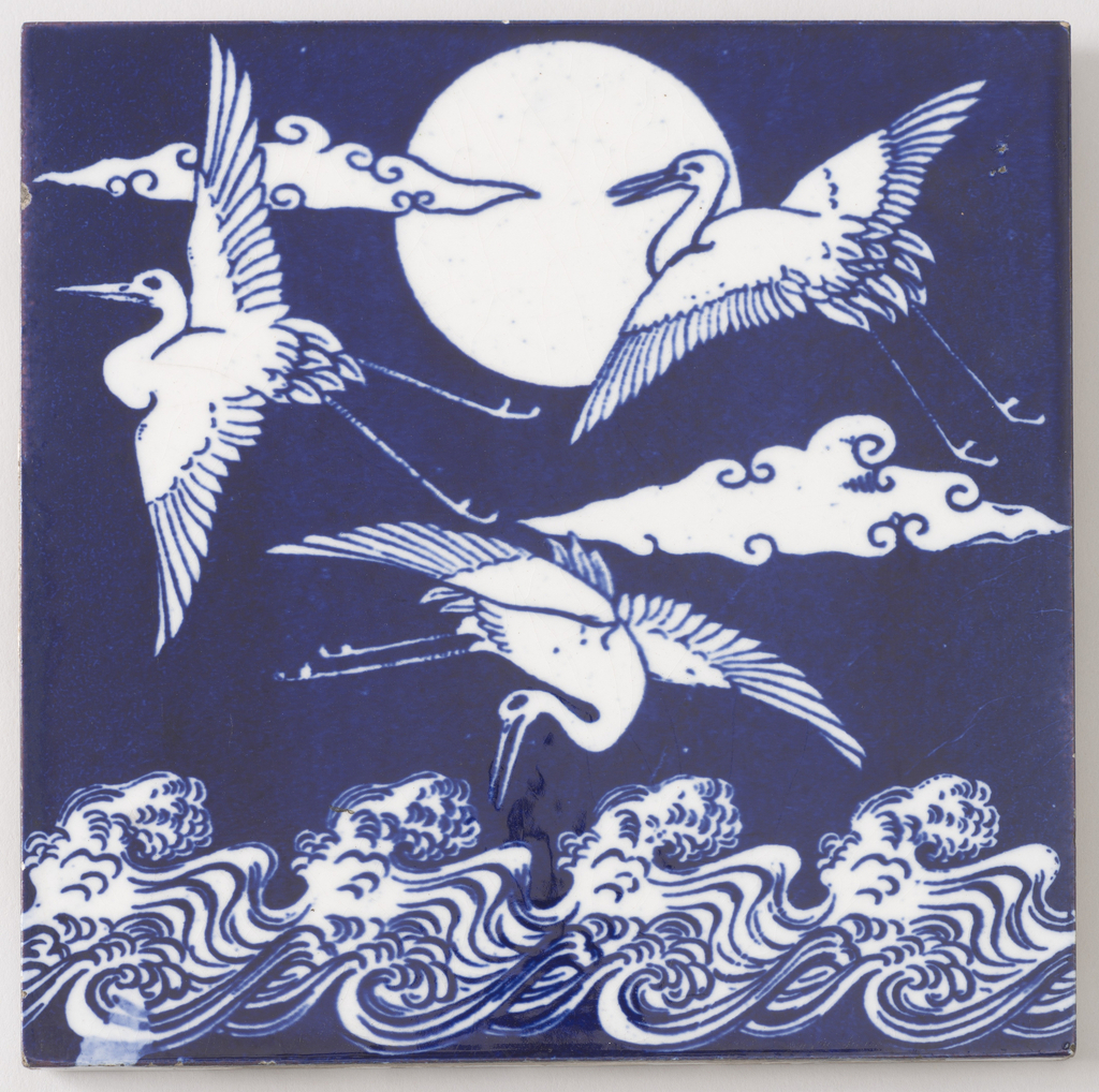 <ref name=CH>{{cite web |url=https://collection.cooperhewitt.org/objects/18634329/ |title=Japanese Cranes Over Waves Tile, ca. 1870 |author=Cooper Hewitt, Smithsonian Design Museum |accessdate=4 October 2017 |publisher=Smithsonian Institution}}</ref>
 <ref name=CH>{{cite web |url=https://collection.cooperhewitt.org/objects/1108726395/ |title=Sheet Music, Sugar Blues, 1949 |author=Cooper Hewitt, Smithsonian Design Museum |accessdate=4 October 2017 |publisher=Smithsonian Institution}}</ref>
These three examples work quite well as examples of contrast. The first example of different colored flowers contrast each other well in high color contrast. The second example the colors dark blue and white equal to high contrast which makes the design work so well. The final example has high contrast with the light blue and white typeface color.

