
The Cooper-Hewitt museum was really fun and intriguing trip. Some of the interesting exhibits were the Pixar animation, Poster designs and the architecture exhibition. I spent most of my time in the poster design and graphics section. There is also a digital stylist pen that is very easy to use. I feel it’s an efficient way of note taking. The pen worked as an interactive stylist that saves information about designs you liked or enjoyed. To save the information about a poster or art piece just press the other end of the stylist against a small cross symbol. The stylist can be used on touch screens to find other pieces of art pieces, and designs in the Cooper-Hewitt. The stylist works as you draw a illustration on one of the touch screens, a similar design or art piece will pop up. I really loved that you can retrieve all the designs you enjoy on the website with a code. Instead of just having to take notes yourself and possibly forget something. The pen really saves a lot of time and helps in getting great notes about the exhibits.
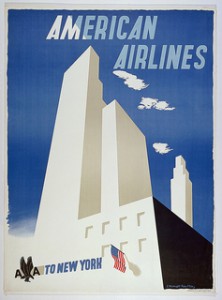 American Airlines poster by Edward Mcknight, 1948
The image displayed is of a New York City skyscraper with a typographic title American Airlines above the skyscraper. This poster reminded me of vector illustration someone would’ve made now. It seems very modern it looks very similar to a noir feel to it. It also has this cartoon feel to it’s overall design of the buildings. This poster has “minimal color palette” of mostly white, light blue, black and different values of white. I think that the “American Airlines” type design is very nice addiction to the design because it blends in with the light blue sky and the clouds. Which gave off a nice little contrast in color to pop the words out.
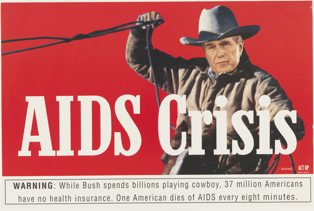 Aids Crisis by Gang, 1990
Another poster I enjoyed was the “Aids Crisis” by Gang released in 1990. This poster depicts George Bush Sr. as a cowboy with a lasso. This poster looks like old Marlboro cigarette packaging. There’s also a warning disclaimer on the bottom that says “ George Bush is playing cowboy. while 37 million Americans don’t have healthcare. One American dies of aids every minute.” I had a feeling that the designers who made this poster must really dislike George Bush. It reminded me of the different PSAs about Aids in 80’s and 90’s my health class in high school use to show. The color palette are minimal as well with a bright red, white and black for the warning disclaimer. The design of it works kind of like a cigarette advertisement. I like the concept a lot I feel it gets the point across that Bush isn’t taking enough action on the aids epidemic. I liked that designer used the basis of a Marlboro ad for the design of George Bush playing cowboy. I felt it perfectly fit with the concept of Bush playing cowboy because I always thought of Marlboro advertisement as a western cigarette company.
The Cooper-Hewitt was a blast in learning new elements that I can possibly use in the future on my own projects. While also providing innovative note taking techniques with the digital stylist. I would definitely recommend it to anyone interested in Art, Animation or design.

