Day 6

Thursday, June 11, 2015

What did I learn?

Today I learned the importance of consistency. I was in-charge of designing the icons for the app project we are working on. I had to make sure the each icon were similar to each other. some important aspects that should be considered when making consistent design are the width, the corners and the amount of detail in the design.

What were my challenges?

Today’s challenge was coming up with a logo with our app. We must of brainstormed for about a hour coming up with different ideas. It is always hard to choose an idea when there are so many great concepts. I believe we all came up with some good concepts that could fit, but ultimately we left it up to Raciel to create the logo.

How did you help each other?

Once again we had a brainstorming session, this time is was about the logo for the app. We were able to come up with some great ideas such as including a magnifying glass as an element of the logo.

Other comments:

After creating some of the icons, I sent them to Mandy and she put them onto the layouts. It was starting to look really good and has the potential to become something real. This makes me more encouraged to finish this project.

Day 5

Wednesday, June 10, 2015

What did I learn?

Today I learned the importance of presentation. Presenting causes you to really know about your project. It is easy to allow for your work to just be displayed, but to explain your thought process on the project requires more attention. Also presenting allows for you to receive feedback. With the feedback I received I was able to touch up my project and make it look better.

What were my challenges?

Today’s challenge was coming up with a name for the new project we are working on. It was very difficult to decide what it should be. We came up with many great names such as: Reach, Mentor Me, and Find My Mentor. We came to the conclusion of choosing Find My Mentor.

How did you help each other?

Today we bounced a lot of ideas off of each other and decided for our project we were going to create an app. The app is going to be for new students to find mentors for themselves. We are each in charge of something different. I will be having to work on the icons for the app.

Other comments:

This new project seems like it can turn into something real and would be so exciting if it did.

Inspiration

Where does your color inspirations come from?

My Color inspirations comes from the idea of color theory. I believe that color theory sets a standard that is most practical when it comes to design. When thinking of a palette to use on a project I instinctively apply the use of color theory.

Who is the visual artist that you identify yourself with? Why?

There are two artist that I like to identify myself with and they are Banksy and Paul Rand. The reason I identify myself with Banksy is because I learned from his work the meaning of art being conceptual. Art was a last minute choice I made when graduating from middle school. I was pressured into thinking that I would have to make a definite career choice for the rest of my life, so I choose art. Not knowing much about it entering high school, I viewed art simply as drawing or painting portraits or landscapes. After being exposed to Banksy’s art I realized the importance of art having meaning. Now it is always in the back of my head, how important it is to give meaning to your work. The reason I identify myself with Paul Rand is because much like him, I like to be experimental with my work and try new ideas. Due to him stepping out of the norm and trying out new things, he was considered ahead of his time. I always like to look at my work as a new project entirely different from the last. I believe the more experimentation you do with design the more you learn.

Day 4

Tuesday, June 9, 2015

What did I learn?

Today I learned a lot. I learned about the print system that we have here at City Tech, that is mysteriously located in the basement. I also learned a bunch of new shortcuts and tricks to designing faster. I also had a bit of a self reflection and reminded myself of knowing when to take a different approach on a project. Sometimes the amazing concepts that we come up with might not come out executed the way we intended.

What were my challenges?

My biggest challenge today was taking a different approach on the Banner project we have been working on. I was so focused on one approach that I tried to force it to make it work. Fortunately I was able to move on and come up with more approaches that were better executed.

How did you help each other?

Mandy taught me a couple of new tricks I can add to my repertoire, that help me maximize time when designing. I also received a lot of good feedback that I will take into consideration when finalizing the banner project.

Other comments:

Today I had my first meeting with my client and I believe it well successful. I am looking forward to working with them

The Design Process

1 Brief

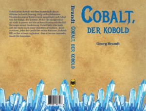
The element I chose off the periodic table was Cobalt. I plan on making a on book cover that pays homage to the discoverer of the element and its origin. I plan to have this designed to print.

2 Research

From my research on the element I was able to find out cobalt is a metal that was discovered by Georg Brandt. It’s name came from the German word, Kobald, which means goblin. It is silvery-blue and number 27 on the periodic table. It is used for magnets and jet engines.

3 Concepts

-All text in German because of the element’s name of origin

-Title: Cobalt, the goblin; Wordplay between the element and it’s name of origin

– Author: Georg Brandt; use the discover of the element as the author for the book

-Use Germany’s national bird as a logo for the publishing company

-Have metal crystals at bottom of page to directly represent the element

-Use black letter or edgy fonts to convey  vintage look of book cover

-Use scroll texture to convey medieval look

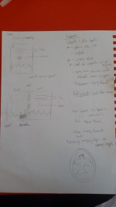
4 Sketches

20150609_083654

5 Execution

I initially started this project working on a 11 in. x 8.5 in. canvas and then decided to change it to 13.5 in. x 10.25 in. canvas.  I did this because it was looking more like a poster instead of an actual book cover.  I used Metal Mania for the Header on the front and Georgia for the rest of the text on the design. I used images off Google such as the scroll texture for the background, barcode, German eagle, and metal crystals. I made a .5 gutter for the spine. I stuck to using a blue color palette for the text because that is the color of the element. I created the bodycopy myself in English, then I translated it into German.

Cobalt Book Cover

Day 3

Monday, June 8, 2015

What did I learn?

Today I learned of the app Genius Scan. It easily allows you to turn photographs into scans, which you can then transfer to your computer or laptop as pdf. I used this technique a lot for designing the Faculty Commons Open Lab banner. I found it to be very useful and most likely plan to use it in the future.

What were my challenges?

My biggest challenge was trying to create a shadow fading out on the edges of my design for the Element design project. I relentlessly tried many ways to execute my idea. I was unable to get it exactly how I originally intended, but I still liked how it came out. I also learned the proper way to name our files. This method is key for organization.

How did you help each other?

I received assistance from Mandy with using the genius scan app. Loubna also helped me my idea of creating a shadow on the edges. I also helped Loubna with the organization of the blog post

Other comments:

I am looking forward to presenting my Element Design project tomorrow!

Day 2

Friday, June 5, 2015

What did I learn?

Today I was given the project to create some sort of design pertaining to an element of our choice. I chose Cobalt and was able to learn things about it that helped to my design process. Had I not done research I would be stuck, which goes to show how important research is part of the design process. I was able to find out that Cobalt’s name of origin is from the German word kobald, which means goblin. Also I learned that it is used for magnets and jet engines.

What were my challenges?

my biggest challenge today was using the camera to photograph objects in my surroundings that can help with creating a design for the element project. At first I found it hard to find objects that can relate to the design, but soon I realized that the photographs were taken mostly dark areas. This led me to the idea of having a shadow fade around the edges of my design.

How did you help each other?

Loubna kindly reminded me of the dimensions for the Faculty Commons Open Lab banner. I also received help from Kevin and Mandy with photographing my ideas and transferring them to the computer.

Other comments:

The Element design project was an interesting task to take on. I cannot wait to finish it!

– William Luperena

First Day

Wednesday, June 3, 2015

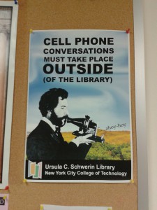
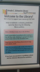
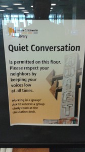
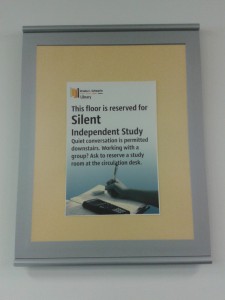
These were images I took on my phone of signage in our own City Tech Library:

IMG_20150603_141301 20150603_14062920150603_140925IMG_20150603_141205

What did I learn?

Knowing when to use CMYK and RGB is extremely important because they are each used for different mediums. I learned how to swap RGB colors to CMYK colors in Indesign. Had I not learned this easy method of switching between the two scales, I would probably have a difficult time creating a file for print and a file for web. I also learned that Trade Gothic is the font that is commonly used for City Tech.

What were my challenges?

My biggest challenges was during the poster replication exercise. The first was identifying the typeface that was used. I used a mixture of Univers and Trade Gothic. My other challenge was matching the body copy exactly to how it looked on the real published poster. It took a lot of messing around with the tracking to finally get it.

Other comments:

I really enjoyed my first day and look forward to learning more tricks to better myself as a designer.

– William Luperena