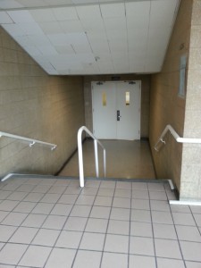
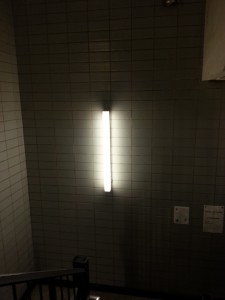
These are two of five pictures that I took that represent high key and low key. The first image shows how there’s a lot of white and creme colors, meanwhile the second image shows darkness with a hint of light. Even though they both have a mix between light and dark they both share a dominant color which defines them as high key or low key images.
About Me
Write a brief paragraph about yourself and your academic or career goals.Contents
Learning Blog Archives
-
Recent Posts
Categories
Tags
- adv1100
- analagous
- black and white
- blue
- chromatic
- collage
- colors
- cool
- cut out
- cutpaper
- figure ground
- gold
- green
- grey
- greyscale
- high key
- hue
- inked thumbnails
- interactions
- interlocking shapes
- logo
- low key
- mosaic
- muted
- portrait
- prismatic color
- purple
- saturation
- split complementary
- spring
- squares
- stable ground
- symmetry
- Topography
- value
- warm


These are excellent photographs displaying high and low key values. The first photo is a good representation of low key since it was taken during the day and the environment around the photograph was bright. There is a good portion of white as well as light creme colors as you have explained. The second photograph is a good representation of high key since the setting was in a dark gloomy area. The only bright color was the light in the middle of the photograph. Even though the light made the area a little bit brighter I can understand that you know what high key was and that it was difficult finding anywhere in the school to take a photograph of a dark environment.