ADV1100 – Color Harmony Palettes

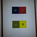
The purpose of this assignment was to create and analogous color scheme and a split complementary color scheme. I think I did okay with this, the only problem I see is like the redish color in the left composition should be a little more pink to match with the other two colors but then everything else is okay. The only thing I really am proud though is how I managed to make it so neat. Compared to all my previous painted compositions this by far the most neat.
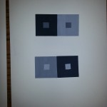
Posted in Coursework | Tagged , , , | Leave a comment

ADV1100 – Color Interaction Pairings

For this assignment we had to create small color interacting squares, The center squares are the same color for each pair and must appear as different depending on the surrounding color. In the beginning of the assignment I had trouble actually seeing the change, the way the surrounding color affects the center square to appear as if it was a different color but eventually I started seeing it. Its amazing how when certain colors are put next to each other they can produce a kind of energy that may intrigue the viewer but also in contrast may be too overwhelming, for example a lime green next to a bright yellow may be a little hard to look at… Although this was a fairly easy assignment there was a lot to be learned.

Posted in Coursework | Tagged , , , | Leave a comment

Saturation Studies – Free Study #2

Departures and Arrivals

For this assignment we had to recreate our own version of Departures and Arrivals by Ben Snead. As you can see I chose to do deaths and births at the top. I chose this because it is similar to departures and arrivals yet not exactly the same, new things come as old things go. I made this by cutting out pieces from magazines, next I scanned the image and used Photoshop to reflect the image horizontally, this gave it the symmetry it needed to be more like Snead’s mosaic. I didn’t realize thought how overwhelming it was till the very end. How bright and colorful it was. This inst really my style but I’m happy with it, something new. The only struggle I had with the whole assignment was how it wasn’t specific enough meaning it took me longer to come up with an idea than it did me actually creating it.


Posted in Coursework | Tagged , , , , | Leave a comment

ADV1100 – Saturation Studies — Free Study #1

Free Study #1 – Spring

For this assignment we had to work in groups. I really enjoy working in groups because I never know what to expect when the work is finished. The assignment was to choose a word that represents either warm tones or cool tones, the word we came up with was spring, and spring is a hard one to represent because it could go either way. We decided to do cool tones and made the composition fully green. we cut out different shades of green out of magazines and arranged them to interact with each other. We cut out the text in bright green to make it stand out and placed it somewhere off the center to draw the viewer in another direction.

Posted in Coursework | Tagged , , , , , | Leave a comment

ADV1100 – Saturation Studies — Prismatic Color

Prismatic Color Studies

Prismatic Color Compositions

This is my prismatic color composition. For this assignment I could only use primary colors and secondary colors. My personal challenge while completing this assignment was finding ways to accentuate the color scheme but yet not mix colors to create new shades and also having to repaint the same areas twice to bring out the colors.

Posted in Coursework | Tagged , , | Leave a comment

ADV1100 – Saturation Studies — Muted Color

Muted Color Studies

Muted Color Compositions

This is my muted colors composition. For this assignment I made many different shapes so I can paint in different shades of the same color. The image to the left is my broad value range composition, I chose colors that will make the image stand out compared to the other one. The image to the right is my narrow range value composition. For this image I chose colors that are more relevant to each other, unlike the other image which looks like it has more contrast. This assignment was really fun, the colors were a challenge to make but I really like the outcome.

Posted in Coursework | Tagged , , | Leave a comment

ADV1100 – Saturation Studies — Chromatic Gray

Chromatic greys

Chromatic Grey Compositions

 This is my chromatic grey color composition. This took me a while to complete. This was my first attempt at mixing the gauche paint to get a desired color so it is not my best. The composition to the left is too dark. I had trouble getting my colors to look just right, they either came out too dark or too light almost muted. although it was a challenge I enjoyed the whole process and I learned a lot from it.

Posted in Coursework | Tagged , , , , | Leave a comment

ADV 1100 – Value-Added Portraits collage

Narrow Value

Narrow Value

Assignment #3

This is My broad Value composition. This assignment was a challenge for me because it involved painting, something I wasn’t very familiar with. I learned a lot while doing this painting about how to blend colors transitioning from high key to low key. My favorite part of this assignment was being able to recreate the printed composition with paint. I love painting although I don’t have much experience I really enjoyed that part of the process. For my next project I will definitely have a more neat and finished painting because of what I learned to do.

Posted in Coursework | Tagged , , | Leave a comment

ADV 1100 – Digital Paintings Free Study


Broad Value portrait

This was the last part to assignment #3 it was to recreate a collage we made using Photoshop. I already know how to use the program so it wasn’t anything new but I admit it was a little challenging to not have measurements. I had to measure just by looking at the image and guessing which spots I had to copy and paste.


Posted in Coursework | Tagged , , , | 2 Comments