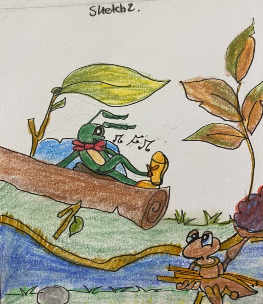
Phase 1 Sketches
The selected quote is” Wanting to be someone else is a waste of the person you are.” by Kurt Cobain who was an America artist and vocalist of the band Nirvana.
In the first part I wanted to be very descriptive to the quote. I developed 4 sketches with diverse characters and colors.
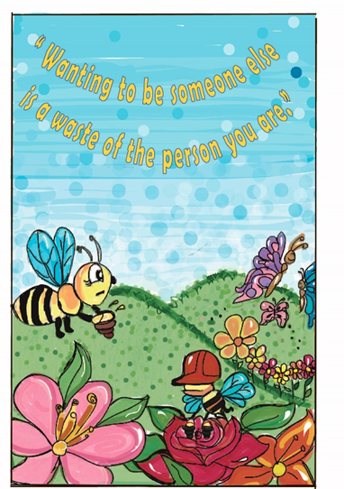
The first sketch was inspired in “Bee Movie” which shows the importance of bee’s work. As a result, I include the quote and I got a matched sketch of quote and movie.
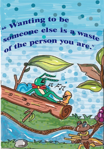
My second sketch is inspired in the classical fairy tale “The ant and the grasshopper”, which shows the same ideal of a hard worker and a relaxed grasshopper.
My third sketch shows admiration for the cat which is down to the tiger. Although both are felines, and they have their virtues I think that I could represent why people sometimes admire virtues of another person more than their virtues.
My last sketch is about nature I changed characters for a landscape to avoid comparison.
Phase 2: Concepts
Concept 1
I chose my first sketch for this concept because it is a focused description with the quote. I corrected the size of the sketch, and I used the portrait orientation to avoid losing some details of my sketch. I used Illustrator to make it colorfully. Also, I made some changes in this version because I used a texture, vivid colors, and curvilinear type to design the quote. I used yellow color to make a contrast between the blue sky and type.
Concept 2
In this concept, I used the same idea, tools, and technique as the first. The things that I had implemented are three lines of a blue type to fill out the sky-blue space. In this concept I wanted to show a traditional animation. I mean the colors less vivid and more dark as brown, green, blue, and gray. Although both of my concepts are hand-drawn I wanted to make a little contrast between modern and older colored animation.
Concept 3
In my third concept, I wanted to make an idea more realistic. I selected a photo of myself, and I made some changes in the photo. I used Photoshop and Lightroom to make the texture on the floor and the shadows deeper and increase the light in the area of the window. Finally, I selected a gradient type with a blue stroke to match the windows blue.

Concept 4
In this concept I used illustrator to develop a mix of colors, designs and type. I combined some hot colors as yellow and orange to make the background. Also, I used blue and cyan colors to do the stroke and type . About the shape I decided to make the Koons’s ballon dog to have something animated in this version.