Personal Logo


A Day in my life traveling is a combination of several clips I took throughout a regular day of me traveling to and from school. The video was editing in Adobe Premiere Pro, using different elements like cutting down clips, adding text, fading text, and fading audio. When using the program you have to start with importing all the files you want to use, more can be added in later if needed. Then, you take clips individually and drag them onto the timeline, doing it individually is easier so you know what order to place your clips in. After this you can start trimming down your videos. Originally, I had around 9 minutes of footage and by the end of editing it was 1 minute 30 seconds. After, you can add in text right onto the video and adding pictures by dragging them onto the timeline. You can make the pictures and text fade from a scene by using the opacity tool on the editing section of the program, using markers to indicate when the fade should start. Lastly, you can add music by importing it into the file, dragging it onto the timeline, and cutting it down to when the video ends if it’s longer than the video duration. I used the audio fade effect at the end so the music wouldn’t end so abruptly.
Edward Burtynsky, a Canadian artist, is known largely in the photography world for his sustained investigation of the human effects on the world. Burtynsky’s works have been featured in collections in over sixty museums worldwide. Starting his interest in photography at age 11 after his father gave him his own camera, he started by photographing machinery at the factory his father worked at. This led to him eventually studying photography at Ryerson University, and founding Toronto Image Works, a darkroom rental facility, custom photo laboratory, digital imaging, and new media computer-training center. Burtynsky’s major projects throughout his career include Quarries, Oil, Water, and Anthropocene. He’s dedicated over 40 years into witnessing the impact of humans on the planet.
Read the paper here:
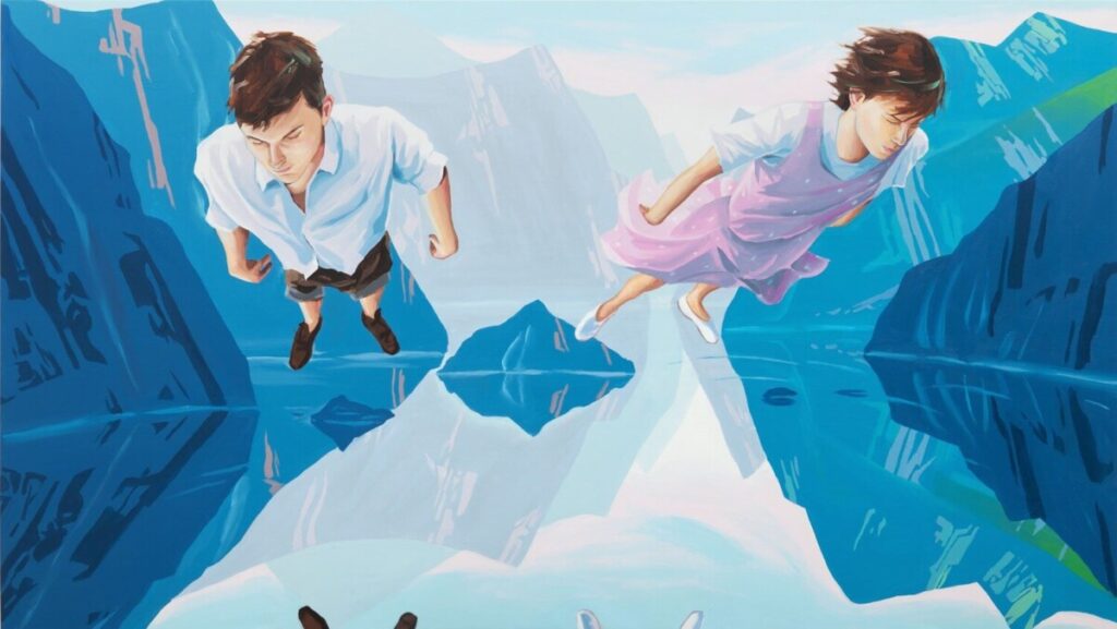
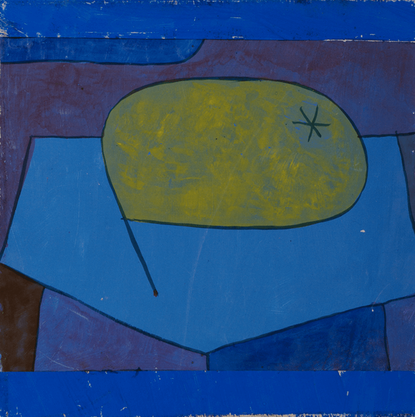
As a class, we took a virtual tour of the exhibition “blue.” at the Nassau County Museum of Art. The color blue can mean a lot of different things to many different people. It can represent things like the sky and sea, and associate itself heavily with matters like freedom, imagination, loyalty, and faith. Different tones of blue can set a mood within art and can convey different emotions throughout. During the exhibition, these three-painting stood out to me the most for its compositions and how they convey blue in their own ways.
The first painting is ‘Huxley’s Guide to Switzerland, 2011’ created by Christopher Winter, a Berlin-based English artist. This work combines storytelling with qualities of intimate prints of Japan. This is shown by the figures soaring over the lake, while keeping the rest of the surroundings untouched and peaceful. Winter has expressed that the blue within the painting is something ‘transcendental and soothing’. To me, this painting feels oddly serene and freeing. Seeing the figures able to travel around, the world seeming to freeze around them, like they’re the only things to truly exist within this universe.
The second piece is ‘Beulen Birne [Bulgy Pear], 1934’ by Paul Klee. This piece follows the life of a pear, seemingly insignificant but still holds a small impact. Klee talked about how within this painting he “reveals the reality that is behind visible things, thus expressing the belief that the visible world is merely an isolated case in relation to the universe…”, which is expressed within his own ‘God-like’ role by creating his own ‘deformed’ pear. The blue in this piece seems to convey the isolation he was attempting to express, seemingly putting this pear into a box, nothing truly in its surroundings.
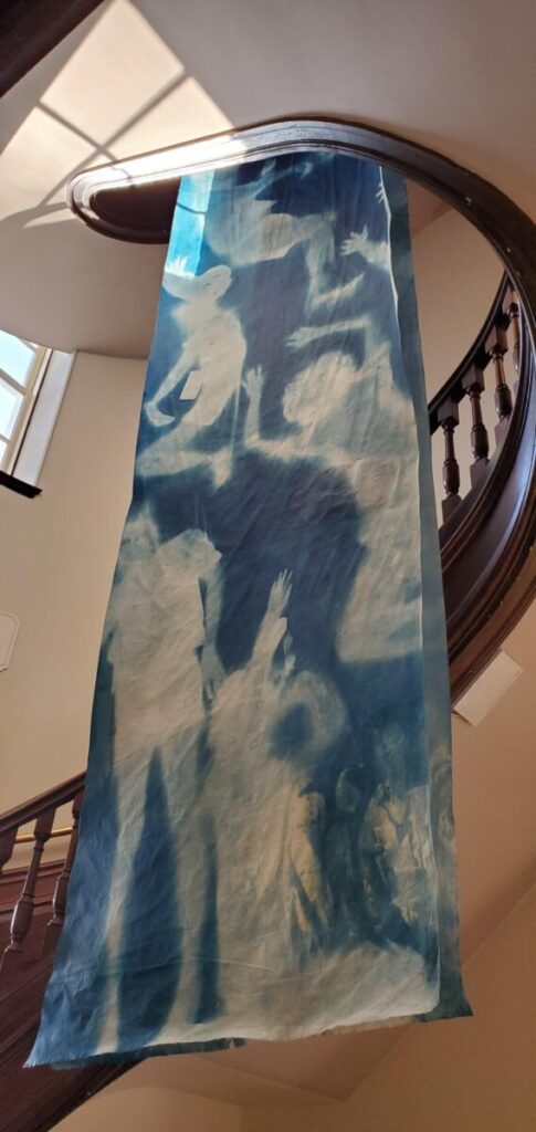
The third piece is ‘The Direction of Migration (Diptych), 2019’ by Han Qin, apart of his cyanotype series on the theme of immigration. This comes from her own experience of going from the “water city” of Hangzhou, located in China, to Long Island, New York. She expresses how she felt lost until one morning while watching birds nesting and recalling how she watched her fellow passengers on the flight scatter upon arrival at JFK to seek their new homes. Qin at one time in her life danced professionally, so she choreographed a ballet based on these works. This is shown in this piece by how the figure is seemingly within motion throughout the work. The blue in this piece to me shows a new beginning, a sense of figuring yourself out with all the erratic motions shown, and a newfound freedom.
I really enjoyed seeing the pieces within this exhibition, they all convey an interesting and beautiful story and tie in the color nicely into the theme.
Nintendo’s Switch in Games
Nintendo, whose current net worth is more than $95 billion, is the third most valuable company in Japan. Well-known for their video games and consoles today, they didn’t originally start as a video gaming company. Founded on September 23rd, 1889, by Fusajiro Yamauchi, the company originally started out as a playing card-selling business in Japan. The translation of the phrase Nintendo is debated a lot, but the consensus believes it means “leave luck/fate to heaven” or “the temple of free hanafuda” – hanafuda being a style of Japanese playing cards. The company went through a lot of phases, which is shown through their progression of logos with their different ventures. From 1889-1963 the company’s focus was on playing cards, then shifting its focus from 1963-1970 to different ventures like taxi services, ramen noodles, and short term ‘love’ hotels. From 1970 on, their focus completely shifted to making arcade machines, game consoles, and video games.
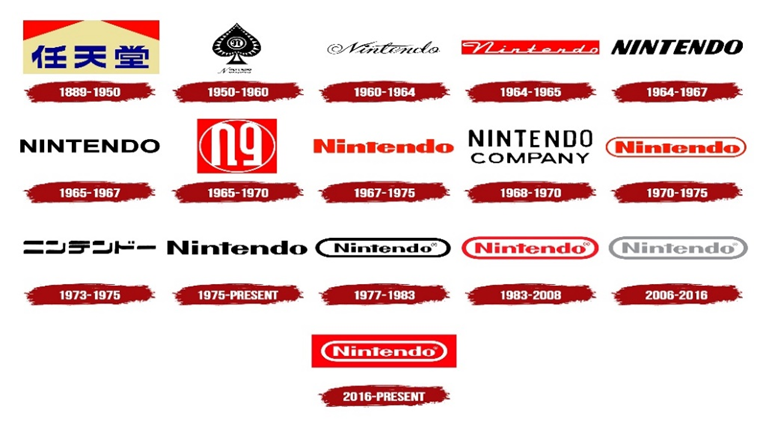
One of the flaws in Nintendo’s past is that there is no official credit to who has created any of their logos throughout the years other than the ‘Nintendo creative team’. Though, the team has talked about why the logo is presented the way it is. Nintendo’s first logo in 1889 is in the Japanese lettering Kanji, 任 meaning nin, 天 meaning ten, and 堂 meaning do. However, in 1950, they changed their logo to the Latin alphabet because they wanted to westernize their logo, since they were starting to expand their company into European and American markets. Notably, the only other time they’ve changed back to any kind of Japanese lettering was in 1973-1975, when they used another type of lettering system called Katakana. When it came time to make their westernized logo, they wanted to find a happy medium that would appeal to both local and international markets. This led their designers to create four different official Nintendo fonts, each being different from each other. Also, Nintendo has logos for several different products, most notably their gaming systems like the Nintendo Switch, Wii, Wii U, etc. Their creative team comes up with hundreds of different possible logos for just one of these products.
For More:
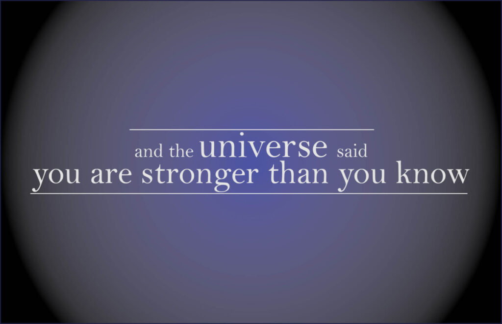
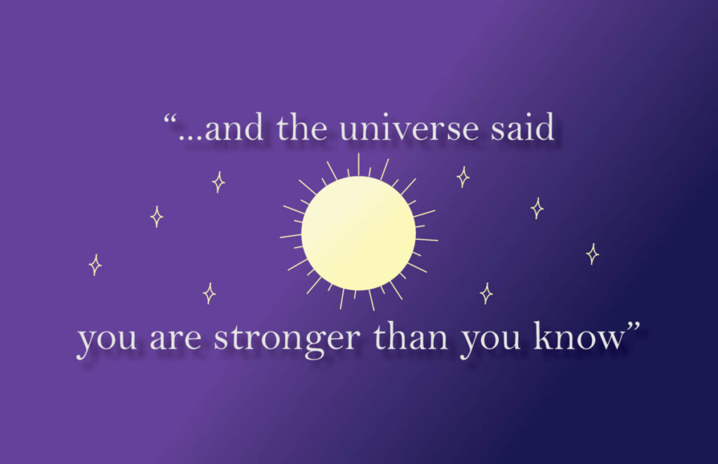
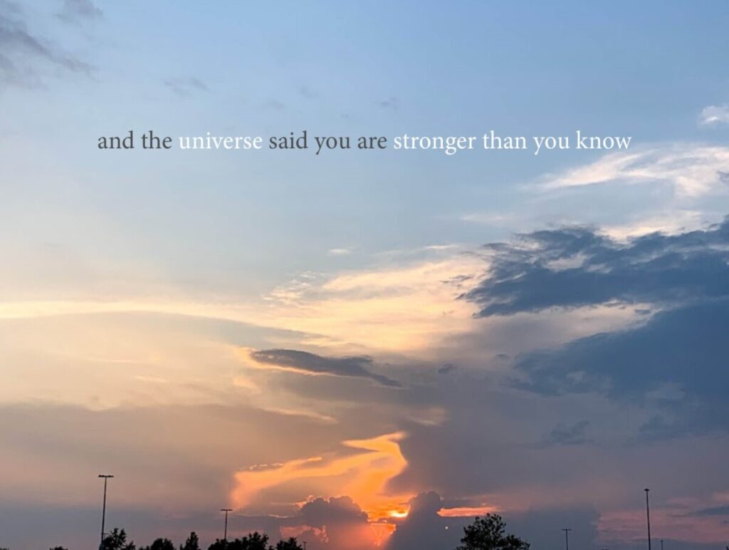
With my three designs, I wanted to try and do something very different with each. The quote “and the universe said you are stronger than you know” comes from the minecraft end poem.
The first design I wanted to focus on the text only. A darker background with a gradient that took shape of a planet felt like it fit the best for the common themeing I use of the universe, due to the quote. In my first draft of this design, the background had been a solid blue color and there was only a line under the ‘you are stronger than you know’. I wanted to even it out with adding a line to the top to make it more symmetrical.
The second design went through a lot of changes, but this is the version I personally liked the most. I had made 2 drafts for this one particularly, the first one with a solid background with the quote to the right and the sun to the left with no stars. The second draft I replaced the sun with saturn instead and put it in the middle with the text top and bottom of it. This one is what really inspired this last design. I went back to the sun design because even though it is more cartoon-y, I wanted each design to stand on their own and look as different as possible. I went back to using a gradient background since I felt it felt the best and with adding a drop shadow to the letters it’s almost like the light is shining towards them.
The third design I wanted to incorperate something from the real world into this. Obviously, it’s kind’ve impossible to get a picture of the galaxy from earth, so I wanted to go with something that is the closest we’ll get to see from earth. The conclusion I came up with is the sky, I didn’t want it to be a night sky or something with stars because I felt it would be too close to my other designs. The sunset is a beautiful sight we get to see on earth everyday and no matter how many times we see it, I tend to still be drawn to take photos. With the text I wanted to have ‘universe’ and ‘stronger than you know’ pop out the most because I feel that these are the most important words within the quote.