
Communication is a key factor in expression, and nothing can display it in a variety of ways than art. Art is a conversation of passion, concerns, and value that is conveyed through many outlets such as creative visual design or display and audio. Music has a fantastic way of speaking to our hearts through sounds just as visual art can reach us through interpretation. However, both are still relaying a message to their respected audience in their own way by creating perspective. The message I took for this visual project was a lyric from the song “Smile” by Mikky Ekko, which states in the chorus “We’ll be lucky if we ever see the sun”. This message speaks to me on a level that allowed me to correlate it to the life we all live. To capture the feeling this lyric evokes I made 3 different sketches.
Sketch1/Concept 1


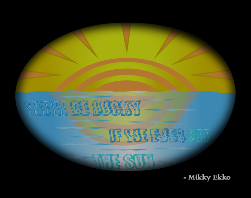
In this first sketch I attempt to capture the sense of reminiscing or the idea of what could be or could’ve been. Upon developing the sketch in Illustrator, I went with an intention to match the lyrics with the idea of seeing from a first-person point of view. I added a black blurry background to match a first perspective to someone’s eyes while leaving the interpretation of whether the eyes are opening or closing to be unbeknownst to the viewer. I used quite a bit of gradients to balance out the blurs in contrast to the brightness of the overall scenery. By using the Wishing Wave font, I was able to grasp the wave affect of the ocean which help match my sketch. By using a flipped copy of the sun layer and lowering the opacity I was able to create the reflecting effect to match a realistic view.
Sketch2/Concept 2


In my second sketch I attempt to capture a sense of mortality while keeping the interpretation of the design ambiguous to the viewer. The overall idea of time and death is intended to portray the limitations of the distant future and possible things we will see or miss with how short life is. To capture this concept, I first made the overall circle shape of the design set in the shape of the sun. The flames of the sun; a depiction of life, is inverted with the reaper being in the center to represent the end with a yellow background to hold the idea in place. Each layer of flame overlaps the other, creating a sense of depth to give the reaper the perspective of being the end.
Sketch3/Concept 3
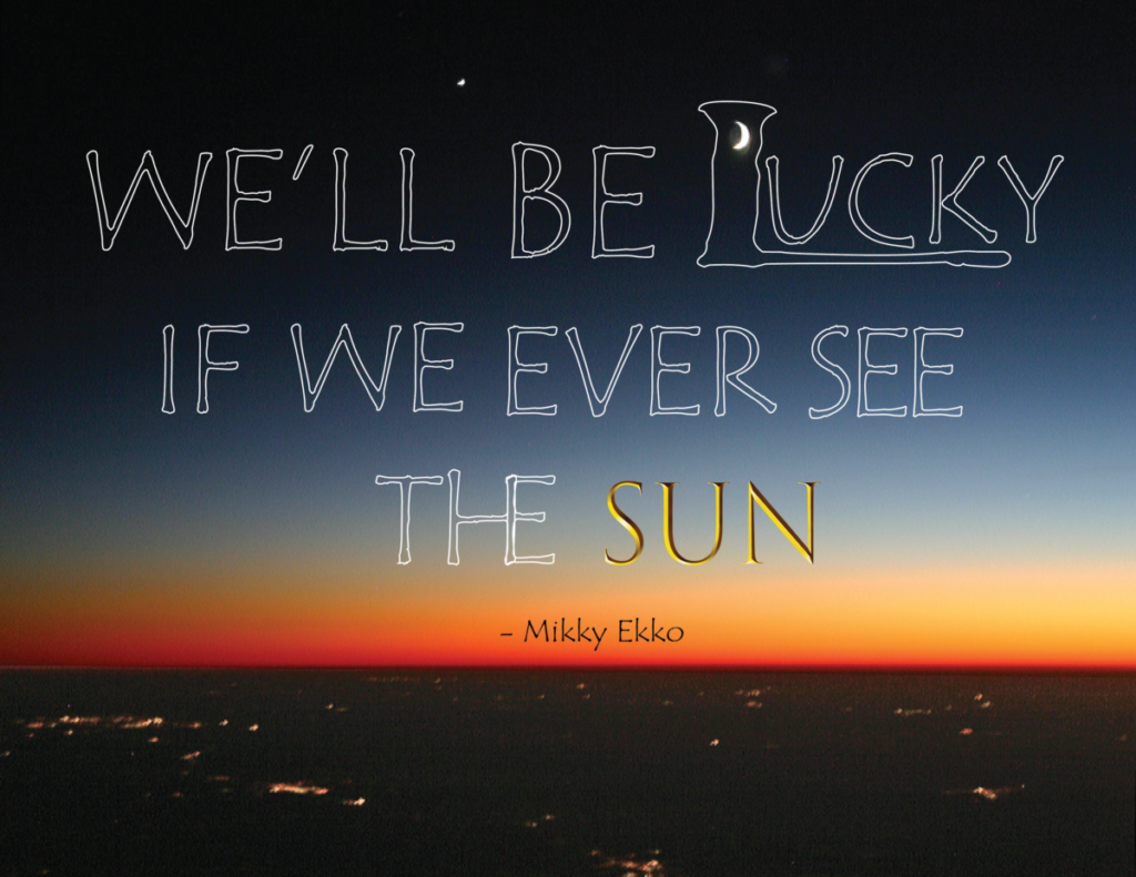

In this third design I approach the quote with a text only concept. The font style Tempus Sans ITC allowed me to fully grasp the sense of peering further into the image and solidifying the mood. Converting the text into a shape, then emptying the fill with a transparency made it possible to achieve that goal. Attempting to lean more towards a photogenic focus resulted in obtaining a photo that would align more to the theme of the quote. The addition of the red-orange borders are made to compliment the sunset in the image and balance out the color in the form of frames and the white lines are also used to reclaim the attention to the quote. Finally, using Trajan Color font for the text “SUN”, I gave the sun a golden appearance while positioning it by the sunset to connect the idea of seeing it with the glimmering attributes of our golden star.


